The Biggest UX/UI Trends for 2025

As we move deeper into the digital age, UX/UI Design continues to shape how businesses connect with users. Whether you’re a startup finding your footing or an established business aiming to innovate, staying ahead of the latest trends is crucial. At U1CORE, a UX/UI design agency, we’ve identified the top trends for 2025 that are sure to transform the industry. Let’s dive in!

Why These Trends Matter

In today’s competitive landscape, it’s not enough to have a standout design; you need strategic, user-centric solutions. The trends we’ll discuss go beyond aesthetics — they solve real problems, enhance user experiences, and help businesses stay relevant. By aligning your projects with these innovations, you’re not just meeting user expectations; you’re exceeding them.

If you’re more of a visual learner, check out our detailed breakdown of these trends in our latest YouTube video.

We specialize in UX/UI and Web Design and would be happy to help you bring all your ideas to life. Check out the U1CORE website to learn more!

1. Hyper-Personalized Experiences

Personalization is no longer a luxury; it’s an expectation. Leveraging AI and user data, designers can create dynamic, tailored experiences that adjust to individual preferences in real-time.

Example: In one of our e-commerce projects, we implemented AI-driven recommendations that adapted to user behavior. This resulted in a significant boost in engagement and sales. Want to see how we did it? Watch our YouTube video for the behind-the-scenes process.

2. Problem-Solving Focus

UX/UI design in 2025 will prioritize solving real-world problems over purely aesthetic improvements. Simplified workflows and intuitive navigation are at the core of this trend.

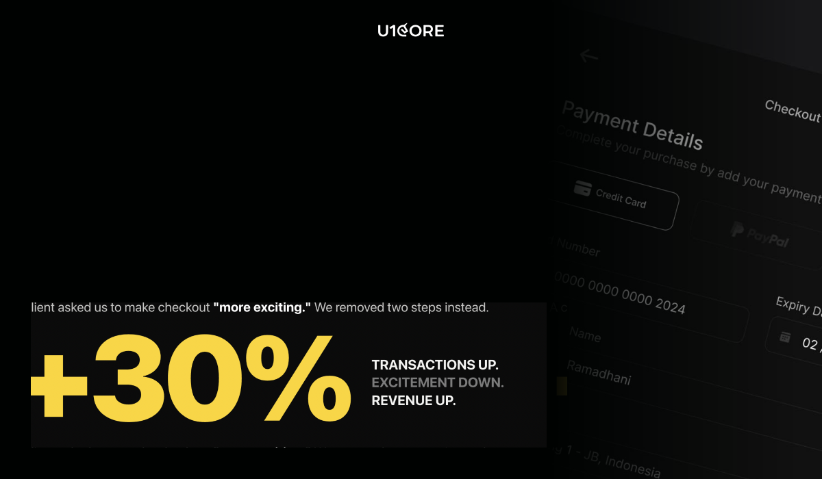
Example: For a retail app, we reduced unnecessary steps in the checkout process, leading to faster transactions and improved conversion rates. Learn more about this project on our YouTube channel.

3. Eco-Driven Design

Sustainability is not just a buzzword; it’s a growing user demand. Eco-friendly design includes dark modes, optimized apps for lower energy consumption, and thoughtful digital minimalism.

Example: For TeamPurple, we implemented features like dark mode and energy-efficient optimizations. These changes not only reduced battery usage but also aligned with users’ values.

4. Neurodesign Principles

Neurodesign focuses on how the brain processes information, making interfaces more intuitive and less cognitively demanding.

Example: In a financial app, we simplified the navigation and enhanced visual cues, leading to higher user retention and satisfaction. Want to dive deeper? Check out our video that explains neurodesign in action.

5. 3D & Immersive UI

With advancements in AR/VR, 3D interfaces are creating more engaging and interactive user experiences.

Example: In a recent AR project, we developed a product try-on feature, giving users a hands-on shopping experience. This innovation not only boosted user engagement but also drove higher sales conversions.

6. Advanced Accessibility

2025 will see accessibility move beyond compliance to a more inclusive approach. Designs will increasingly accommodate a broader range of abilities.

Example: For a healthcare app, we introduced customizable font sizes and high-contrast color schemes, making the app more user-friendly for individuals with visual impairments.

https://cdn.embedly.com/widgets/media.html?src=https%3A%2F%2Fwww.youtube.com%2Fembed%2FFjwhY-27o48%3Ffeature%3Doembed&display_name=YouTube&url=https%3A%2F%2Fwww.youtube.com%2Fwatch%3Fv%3DFjwhY-27o48&image=https%3A%2F%2Fi.ytimg.com%2Fvi%2FFjwhY-27o48%2Fhqdefault.jpg&type=text%2Fhtml&schema=youtube

Final Thoughts

These trends are paving the way for the future of UX/UI design. By embracing them now, you’ll ensure your business stays ahead of the curve and continues to deliver exceptional user experiences.

Which trend excites you the most? Let us know in the comments! For a more detailed analysis, including practical examples. And if you’re ready to integrate these trends into your next project, let’s connect. We specialize in UX/UI and Web Design and would be happy to help you bring all your ideas to life. Check out the U1CORE website to learn more!

Why Your Beautiful Design Isn’t Converting: The Psychology Behind Effective UX/UI

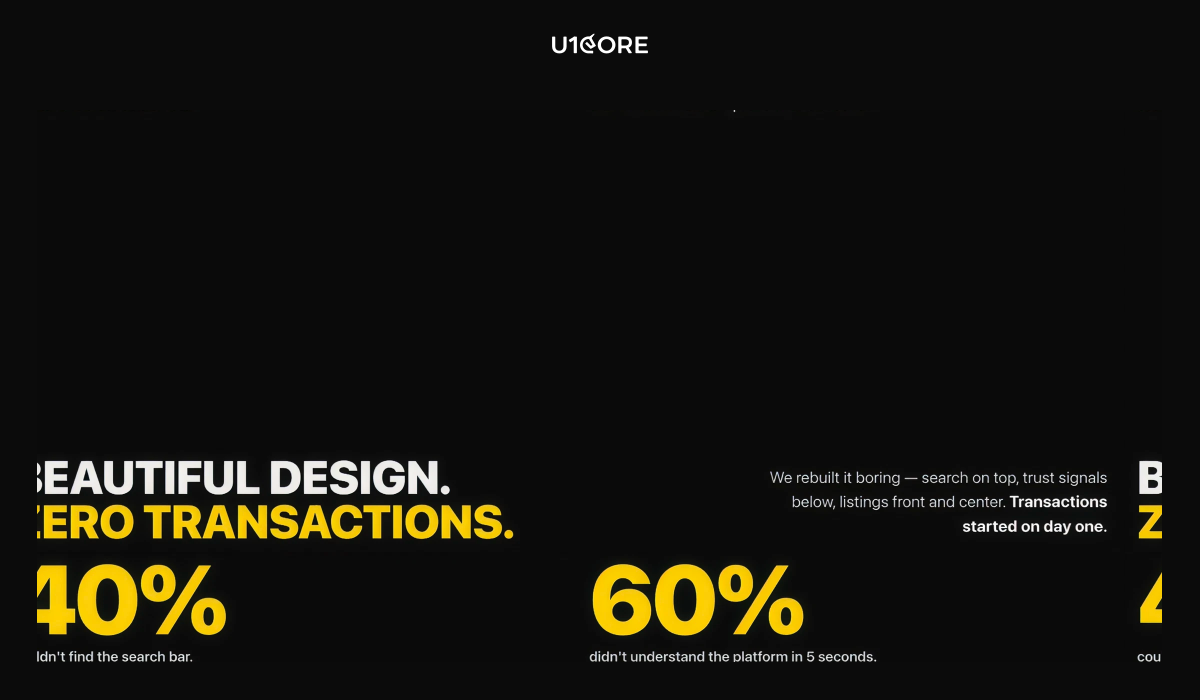
It’s easy to fall in love with a visually stunning design. A sleek color palette, elegant typography, and striking imagery can captivate anyone’s attention. But here’s the truth: beauty alone isn’t enough to convert users. If your design isn’t meeting its business goals, the issue likely lies beyond aesthetics. Let’s explore why even the most beautiful designs can fail and how applying psychology-backed principles can turn things around.

The Problem with “Just Beautiful”

A design that prioritizes appearance over functionality risks frustrating users rather than engaging them. It’s not just about looking good — it’s about guiding users seamlessly toward actions that fulfill their needs and align with your business objectives. When conversions aren’t happening, it’s often due to a disconnect between the user experience (UX) and the visual design (UI).

Think of it like this: a luxurious sports car might look incredible, but if the controls are confusing or it’s uncomfortable to drive, how many people will buy it?

Key Psychological Principles for Better Conversions

To make your design not only beautiful but also effective, you need to incorporate the following psychological principles:

1. Hick’s Law

The Principle: The more choices a user has, the longer it takes for them to make a decision.

The Problem: Overloading users with options (e.g., too many buttons, links, or CTAs) leads to analysis paralysis, causing them to leave your site without taking any action.

The Fix: Simplify your design by prioritizing key actions. For example, a well-designed e-commerce site like Amazon ensures users are guided through a straightforward checkout process without unnecessary distractions.

2. The Aesthetic-Usability Effect

The Principle: Users tend to perceive aesthetically pleasing designs as easier to use.

The Problem: While beauty creates a positive first impression, it can mislead designers into thinking usability isn’t as critical.

The Fix: Combine beauty with functionality. Test your designs thoroughly to ensure they’re intuitive, not just attractive. For example, Apple’s product pages are visually stunning but also guide users effortlessly through product details and purchase options.

3. Fitts’s Law

The Principle: The time it takes to click a target is a function of the distance to the target and its size.

The Problem: Small buttons or poorly placed interactive elements make it harder for users to complete actions.

The Fix: Make important buttons large and easy to click, especially on mobile devices. For instance, primary CTAs (like “Buy Now” or “Sign Up”) should be prominent and positioned where users naturally look.

4. Cognitive Load

The Principle: The human brain has limited capacity for processing information.

The Problem: Cluttered interfaces or too much text can overwhelm users, leading them to abandon your site.

The Fix: Embrace white space and focus on clear, concise content. Break information into digestible chunks and use visuals strategically to guide the user’s journey.

Real-World Example

Take the website U1COREwhich specializes in UX/UI and web design. Every design decision is rooted in functionality and user behavior. By incorporating principles like Hick’s Law and Fitts’s Law, the layouts not only look stunning but also drive conversions by offering seamless navigation and clear CTAs. This balance of form and function is key to success.

Actionable Takeaways

If you want your design to convert effectively, remember these key steps:

  1. Simplify the experience: Prioritize what truly matters to your users.
  2. Test usability: Beauty is subjective, but usability isn’t.
  3. Leverage psychology: Use principles like Hick’s Law and Fitts’s Law to optimize interactions.
  4. Iterate constantly: Design is never done. Test, refine, and improve based on user feedback.

A visually appealing design is a powerful tool, but it’s not the endgame. By weaving in the psychology of user behavior and aligning your design with clear business objectives, you can transform your “pretty” website into a conversion powerhouse.

What’s your biggest challenge when balancing aesthetics and usability in design? Let us know in the comments or visit U1CORE to explore how we can help optimize your digital presence.

How Not to Get Lost in the Job Market and Choose a Role with the Right Mindset

Today’s job market is overflowing with opportunities: big corporations, startups, hybrid setups, full remote. There’s no shortage of options.

But with more choice comes more anxiety:
“Am I choosing the right one?”
“Will this job mess with my life balance?”
“What if I burn out again in six months?”

Choosing a job today isn’t just about employment. It’s about your lifestyle. And your mindset is the compass that keeps you from getting lost.

Mindset is more than just thoughts.

It’s a way of thinking — how you see yourself, others, and the world.
It’s your internal setting: do you believe you can learn new things? Do your thoughts embrace growth, or do they shut the door on change?

Mindset is quiet but powerful. It shapes your decisions, your reactions, and even the limits you place on yourself.

In life and especially in work, mindset is crucial.
It determines whether you stop after failing, or whether you learn and grow. It helps you see crises as opportunities rather than collapses.

People with open, flexible thinking learn faster, collaborate better, aren’t afraid of change, and grow more quickly in their careers. That’s why modern companies focus so much on nurturing the right mindset — where development is encouraged, initiative is welcomed, and people are valued not only for outcomes, but for their drive.

Choosing a job today is more than just submitting a résumé.
In the past, things were simpler: find a stable employer, stick around, and climb the ladder.

Now, your job has to match your professional goals and your personal values and life rhythm.

You could have the “perfect” job and still feel empty.
Or you could join a company that genuinely supports work-life balance, personal development, and care — and thrive like never before.

That’s why job choice today is really about a bigger question:
“What kind of life do I want to build?”

So how can you choose wisely?

Start with yourself. Understand which values are non-negotiable for you — freedom, support, growth, stability. Make a list of what matters most.

Look deeper into companies. Beyond websites, check real employee reviews, social media culture, and talk to people you trust.

Don’t be blinded by salary or brand names. A shiny logo doesn’t mean happiness. Focus on real working conditions — whether people are respected and if balance truly exists.

Pay attention to how you feel in interviews. Are you comfortable asking questions? Do the answers feel honest?

Ask what really matters:
How is work-life balance supported?
Is taking time off normal and pressure-free?
What does a regular workday look like?

Give yourself space to think after receiving an offer. Don’t rush — listen to your gut. If doubt grows, that’s a signal.

And most importantly, remember: a job is a partnership.
You’re not just asking for work — you’re offering your time, skills, and energy. You deserve to choose an employer who truly values you.

How AI Is Reshaping the IT Industry — and Why the Future Still Looks Bright

How AI Is Reshaping the IT Industry — and Why the Future Still Looks Bright

The rapid rise of artificial intelligence is transforming every corner of the tech world — and the IT industry is at the forefront of this seismic shift.

From automating code to redefining workflows, AI is changing how work gets done, who does it, and what skills are most valuable.

But here’s the surprising truth:
Despite all the disruption, the future of IT isn’t fading — it’s expanding.

AI is Changing the Rules of the Game

In just a few short years, tools like ChatGPTGitHub Copilot, and other generative AI platforms have completely reshaped what developers, analysts, and IT professionals are capable of.

  • Repetitive coding tasks? Automated.
  • Data analysis? Faster, smarter, and more accessible.
  • Infrastructure management? Now guided by AI-driven optimization tools.

These are not small tweaks — they’re major shifts.

Of course, change brings uncertainty. Many worry that automation could replace traditional IT roles like developers, sysadmins, or QA engineers.

But that’s just one side of the story.

The Demand Is Shifting — Not Disappearing

Let’s be clear: AI doesn’t eliminate jobs. It transforms them.

We’re seeing a clear evolution in the industry. Yes, the need for manual, repetitive tasks is decreasing — but the value of strategic thinking, creative problem-solving, and human-AI collaboration is rising fast.

Today’s IT professionals aren’t just expected to write code — they’re expected to understand how to work with AI to build smarter, more adaptive systems.

This shift is already spawning new roles, like:

  • AI integration specialists
  • Machine learning engineers
  • Prompt engineers
  • Data ethicists

We’re also seeing hybrid roles take off — where tech meets business strategy — like AI product managers and consultants helping companies adapt AI across departments.

New Opportunities in Unexpected Places

As AI becomes a built-in part of the modern tech stack, the demand for IT professionals is spreading far beyond traditional tech companies.

Industries like:

  • Healthcare
  • Logistics
  • Education
  • Manufacturing

are all investing in AI — and they need people who can implement, manage, and scale these tools responsibly.

Even better? The barriers to entry are lowering.
With AI handling much of the “heavy lifting,” junior developers and newcomers to IT can contribute earlier and grow faster.

This means the tech world is becoming more inclusive, more dynamiс — and more open to fresh talent than ever before.

The Mindset Shift: From Coder to Collaborator

Perhaps the biggest transformation in IT is a mindset one.

We’re moving from “pure coding” to collaboration with intelligent systems.

The most successful IT professionals in this new era won’t just be great with code — they’ll be:

  • Excellent communicators
  • Curious learners
  • Adaptable thinkers

They’ll understand both the technology and the real-world context in which it’s being used. And most importantly — they’ll know how to bridge the gap between machine capabilities and human needs.

This Is Just the Beginning

Yes, AI is changing the rules. But it’s not closing doors — it’s opening them.

For those willing to adapt, learn, and embrace new tools, the IT industry has never been more full of opportunity.
This is not the end of tech jobs — it’s the start of something even bigger.

If you’re in IT or thinking about joining the field, now is the time to lean in.
Because the future isn’t just coming — it’s already being built.

By people like you.

Why Everyone’s Talking About Minimal Brutalism in 2025

How a Rebellious Design Trend Is Giving Edge to AI and Web3 Products

The New Face of Digital Aesthetics

Minimal brutalism is everywhere in 2025 — from startups and creative agencies to personal portfolios and SaaS dashboards. It’s bold, unapologetic, and somehow… still clean.

If you’ve ever seen a site with massive fonts, harsh grid lines, unexpected color choices, and almost too simple of a layout — that’s minimal brutalism at work. It’s not just a trend — it’s a rebellion. And like any good rebellion, it’s rooted in something deeper.

What Is Minimal Brutalism?

Minimal brutalism is the collision of two worlds:

  • Brutalism, inspired by the raw honesty of architecture from the mid-20th century — think exposed concrete, hard angles, and functionality over form.
  • Minimalism, focused on clarity, whitespace, and reduction to essentials.

Together, they form an aesthetic that says: “We don’t need decoration. We need design that does its job.”

It’s about showing the grid. Letting buttons feel like buttons. Breaking visual hierarchy intentionally — but never randomly.

Why It’s Gaining Momentum in 2025

1. Post-AI Visual Fatigue
As generative AI floods the internet with polished, perfect, and soulless designs, minimal brutalism cuts through with honesty and imperfection. It feels real in a sea of fake.

2. Short Attention, High Impact
Bold type, harsh contrast, and deliberate spacing demand attention. These layouts aren’t pretty — they’re effective. That’s what today’s overstimulated user needs.

3. Gen Z’s Influence
This generation grew up with chaos. They don’t need harmony — they need personality. Minimal brutalism speaks their language: “We’re not here to please. We’re here to say something.”

4. A Natural Fit for AI and Web3 Products
Minimal brutalism’s raw, transparent aesthetic aligns perfectly with the principles of AI and Web3 — where openness, decentralization, and functional clarity are valued. For AI products, it strips away the artificial polish and showcases core capabilities. For Web3 interfaces, it visually mirrors the transparent, trustless architecture underneath. It’s not about making tech look sexy — it’s about making it feel real, tangible, and user-controlled. In these emerging fields, minimal brutalism doesn’t distract — it grounds.

The Core Ingredients of Minimal Brutalism

  • Massive typography. Often grotesque or monospace fonts, uncomfortably large.
  • Intentional asymmetry. Layouts that feel slightly off, on purpose.
  • Visible grids and borders. Nothing is hidden — structure is part of the design.
  • Minimal color palettes. Usually 1–2 accent colors with lots of white or black.
  • Zero gradients or shadows. Pure, raw elements.
  • Deliberately “unpolished” details. Scrollbars, default buttons, rough edges.

When to Use It (And When Not To)

Use it if:

  • You want to stand out in a saturated market.
  • Your brand is bold, experimental, or anti-corporate.
  • You’re targeting creatives, Gen Z, or indie audiences.
  • You’re building a product in AI, Web3, or any cutting-edge space.

Avoid it if:

  • You work in finance, healthcare, or highly regulated industries.
  • You need to convey trust, tradition, or luxury.
  • Your audience expects “smooth and refined” interfaces.

Minimal brutalism is not for everyone — and that’s the point.

How to Make It Work (Without Just Copying It)

  • Start with purpose. Don’t just slap a brutalist font on your site. Ask: what message are we sending? What are we rebelling against?
  • Design around functionality. Every element should have a reason to exist — not just to look cool.
  • Test real usability. Brutalist doesn’t mean broken. You still need clarity, flow, and responsiveness.
  • Blend with your brand. You can use brutalist principles in typography or layout while keeping your color palette or imagery consistent with your identity.

Final Thought: It’s Not Just a Style, It’s a Statement

Minimal brutalism isn’t just about how it looks — it’s about what it says:
“Design doesn’t have to be safe to be effective.”

In a world where design is becoming algorithmic, predictable, and polished to perfection, minimal brutalism reminds us of the power of human-made, opinionated, and imperfect work.

If you want your product to feel like something real — maybe it’s time to break the grid.

How AI Agents Are Quietly Replacing Freelancers: Should We Be Worried?

In recent years, artificial intelligence has evolved from a futuristic concept into a real, daily tool for businesses and creators. But while tools like ChatGPT, Midjourney, and ElevenLabs have empowered individuals to do more with less, the emergence of autonomous AI agents is quietly reshaping the landscape of freelance work — without many noticing.

From Assistants to Executors

At first, AI was a productivity booster — something that helped freelancers write faster, edit images, generate code snippets, or brainstorm ideas. Now, it’s becoming something else entirely: a self-operating unit. With the rise of agent-based platforms like AutoGPT, AgentGPT, and OpenDevin, AI no longer waits for step-by-step instructions. It initiates tasks, performs research, builds workflows, and even executes actions across platforms.

In short: the AI no longer assists the freelancer. It becomes the freelancer.

The Silent Disruption

This shift is not loud. There’s no big media campaign announcing it. But it’s happening. Startups are using AI agents to:

  • Draft and schedule social media content
  • Write and publish blog posts
  • Generate and A/B test ads
  • Research competitors and suggest strategy
  • Build landing pages using no-code + AI combos
  • Offer customer support via AI-powered chat

These tasks once made up a significant portion of freelance income. Now, they can be completed at a fraction of the cost and time — by machines.

What’s Driving the Transition?

  1. Speed & Scale — AI can execute work faster than any human and scale it instantly.
  2. Cost Efficiency — A one-time subscription or API call replaces ongoing human billing.
  3. 24/7 Availability — Agents don’t sleep or miss deadlines.
  4. Improved Interfaces — Plug-and-play tools are making AI agents more accessible to non-technical users.

But Are They Really Replacing Humans?

Yes — and no.

While AI agents are becoming capable of doing much of the execution work, they still lack context, empathy, and strategic depth. Freelancers who think, interpret, and create nuance still bring irreplaceable value. However, those offering purely executional work — basic copywriting, template design, surface-level research — are seeing the most impact.

The Freelancer’s New Role

Rather than competing with AI agents, freelancers can:

  • Offer AI + Human hybrid services (e.g., AI-enhanced copywriting with human storytelling)
  • Specialize in AI integration for clients
  • Focus on strategy and creative direction, where human insight still reigns
  • Educate clients on when AI is useful — and when it’s risky

Should We Be Worried?

Yes — if you’re ignoring the shift.
No — if you’re evolving with it.

Just like stock photography changed design, and Canva changed content creation, AI agents are the next tool redefining freelance work. The key is not to fight automation, but to position yourself where the human touch still matters most — and build from there.

Final Thought

The AI agent era isn’t about replacing people. It’s about replacing processes. Freelancers who understand this — and learn how to work with AI rather than against it — won’t just survive. They’ll thrive.

At U1CORE, we create bold, intelligent designs tailored to your product’s unique needs — by combining human insight with future-forward thinking. If you’re building something big, we’re here to make it look and feel just right.

Is Web3 Still Alive? A Realistic Look at Where We Are and What’s Next

Back in 2021, Web3 was everywhere. NFT launches flooded Twitter timelines, DAOs promised to rebuild the internet, and venture capitalists poured billions into decentralized protocols. But fast forward to 2025, and the buzz has gone quiet. Many projects have vanished, token values have plummeted, and mainstream media rarely mentions the term “Web3” at all.

So, is Web3 dead? Or is it simply evolving — out of sight, but not out of relevance?

The Rise and Retreat

Web3 began with a promise: decentralization, ownership, and a new internet powered by users, not corporations. The movement saw explosive early traction, thanks to a perfect storm of pandemic-era hype, speculative investing, and social momentum.

However, as markets cooled and regulation caught up, the ecosystem faced a harsh correction. Many NFT projects turned out to be unsustainable. DAOs struggled with governance and decision paralysis. Layer 1 chains competed aggressively for users, often without product-market fit.

But beneath the surface, something else was happening: infrastructure matured, tools improved, and quieter, more focused builders stayed.

Signs of Life

Despite the decline in headlines, Web3 is far from dead. Here’s what’s still thriving:

  • DePIN (Decentralized Physical Infrastructure): Projects like Helium and Hivemapper are creating tokenized incentives for real-world data and connectivity.
  • Gaming: Games like Illuvium and Shrapnel are introducing sustainable, player-first token economies — learning from Axie Infinity’s rise and fall.
  • Identity & Reputation: Projects like Lens Protocol and ENS are evolving beyond domain names into full-stack decentralized identity solutions.
  • On-Chain AI: The merge of AI with blockchain is gaining momentum. Protocols are exploring how to decentralize compute, data labeling, and even AI agent coordination using smart contracts.
  • Regulated Tokens & RWA (Real World Assets): Tokenized real estate, carbon credits, and even T-bills are being adopted within compliant frameworks.

In short: the attention has shifted from speculation to utility.

What Died (and Should Stay Dead)

  1. Low-effort NFT projects: The era of pixelated avatars with no roadmap is over.
  2. Hype-first launches: Users now expect clear value before buying in.
  3. Anonymous teams with no accountability: Trust and transparency are non-negotiable.

Case Study 1: Uniswap
While many DeFi platforms lost steam, Uniswap quietly continues to dominate on-chain liquidity. With its recent v4 launch, it introduced hooks for customizable trading logic — a move that mirrors the composability spirit of Web3.

Case Study 2: Base by Coinbase
Instead of rejecting regulation, Coinbase built a compliant Layer 2 chain (Base), now hosting thousands of developers and projects, bridging the gap between Web2 and Web3.

Case Study 3: Friend.tech
Despite initial hype and dip, Friend.tech demonstrated a new use case: tokenizing social relationships. It also exposed how fragile virality-driven products can be without long-term utility.

So… What’s Next?

The future of Web3 won’t look like 2021 — and that’s a good thing.

  • Utility-first adoption: Users will come for real solutions, not promises.
  • Better UX: Projects that abstract complexity will win. Wallets, onboarding flows, and gas management are being rebuilt from the ground up.
  • Hybrid models: The line between Web2 and Web3 is blurring. Expect more products to use blockchain on the backend — while keeping a seamless frontend experience.
  • AI x Web3: New forms of coordination, decentralized model training, and agent-based economies are on the rise.

So, is Web3 still alive?

Yes — but it’s different. The hype wave has passed, and what remains is more thoughtful, grounded, and long-term.

At U1CORE, we’ve seen firsthand how user experience and product clarity can make or break a Web3 idea. That’s why we build smart, elegant designs tailored to Web3’s unique challenges — ensuring that great tech also feels great to use.

If you’re building something in this space, let’s make sure it’s not just alive — but thriving.

Why It’s Great to Work at U1CORE: Speed, Quality, and Real Respect

At U1CORE, we don’t call ourselves a family — but we do have each other’s back.
We’re a team of thinkers, doers, and builders united by one big goal:
to create unicorns — not just cool products.

We Move Fast — But We Don’t Break Things

Speed is in our DNA.
We believe in fast decisions, rapid feedback, and lean processes. But we never sacrifice quality in the name of speed. Every decision goes through a clear logic, every detail is thought through, and every result is tested before it goes out the door.

Fast doesn’t mean careless — it means focused.

We’re Not a Family. We’re Something Stronger.

“Work family” sounds nice — until it’s used to blur boundaries or avoid hard conversations.
At U1CORE, we choose honesty over comfort, and clarity over clichés.
We’re not afraid to challenge ideas (even from the top), and we make space for disagreement — because that’s how the best work happens.

And yet, we always support each other.
When someone is stuck — we help. When someone wins — we celebrate.
It’s not performative. It’s how real teams operate.

What We Value Most

We don’t hand out fake praise or talk over people in meetings.
At U1CORE, the currency is respect and recognition — earned through ideas, actions, and outcomes.

  • We recognize results, not just effort
  • We treat junior and senior voices equally
  • We build an environment where people grow fast and feel safe being real

Because in the end, great companies aren’t just built on code or design — they’re built on trust.

Mental Health Matters Here

We know that performance comes from balance, not burnout.
That’s why we regularly organize psychological workshops — not as a perk, but as a necessary tool for self-awareness, communication, and sustainable growth.

Whether it’s navigating stress, improving team dynamics, or simply learning to pause — we invest in our people far beyond the project level.

Transparency: The Good, the Bad, and the Retros

Every few weeks, we run full-team retros with company updates — where we share wins, lessons learned, and yes, even our failures.
No corporate filters. No hiding behind “everything’s great.”
We believe that transparency builds alignment — and real alignment builds momentum.

Want to build unicorns with us?
We’re always looking for people who share our mindset — curious, sharp, honest, and ambitious.

Let’s make something exceptional. Together.

Why Complex SaaS Doesn’t Need a Complex UI

Subtitle:
How simplicity builds trust, adoption, and scalability in high-functionality software.

Introduction
SaaS products are becoming increasingly sophisticated. From AI-powered analytics to multi-step automation workflows, complexity in functionality is inevitable. But complexity in interface? That’s a choice.

At U1CORE, we’ve worked with dozens of SaaS companies — each with unique features, user bases, and business logic. And we’ve seen a consistent pattern: the more complex the product, the more vital it is to simplify its UI.

1. Complexity Behind, Clarity in Front
You may have 40 micro-features in the backend, but your user only needs one clear way to get their task done. When users see buttons, forms, or dashboards overloaded with options, anxiety creeps in. Cognitive overload = user drop-off.

The solution? Hide complexity, reveal intent.
Use progressive disclosure. Guide users with step-by-step UX flows. Prioritize clarity over coverage.

2. Clean Interfaces Build Trust
Cluttered UIs often signal poor structure or rushed development. In contrast, minimal, clean designs evoke confidence and professionalism.

Ask yourself:

  • Does the interface feel premium?
  • Can users find what they need in under 5 seconds?
  • Is there breathing room, or are you trying to fit everything “above the fold”?

The best SaaS UIs feel invisible — because they just work.

3. Think in User Stories, Not Feature Lists
Too often, SaaS platforms are built around internal logic: “this is how our system works.” But users don’t care about that. They care about outcomes.

Design for stories:

  • “I need to onboard my team”
  • “I want to see which campaign performed best last week”
  • “I need to export clean data for my investor deck”

Map your UX around real-life goals, not internal modules.

4. Mobile-First ≠ Feature-Restricted
SaaS is no longer desktop-only. Founders check metrics on their phones. Marketers approve changes between meetings. That doesn’t mean you need to shrink the whole dashboard — but it does mean designing mobile as a first-class citizen.

A clean interface naturally adapts better to mobile screens.

5. Scaling? Simple Systems Win
Here’s the hard truth: if your UI is hard to understand for a new user today, it’ll be 10x worse once you scale.
Every layer of UI debt slows down onboarding, increases support tickets, and complicates future feature releases.

Investing in simplicity now pays off in agility later.

Conclusion
A sophisticated SaaS product deserves a sophisticated UI strategy — but not a visually complicated one.

At U1CORE, our mission is to help SaaS founders and teams simplify without dumbing down.
Because clarity isn’t basic — it’s a competitive advantage.

Design Tip for Startups: Building a Scalable, User-Centered Experience

Inthe fast-paced world of startups, design is often overlooked as a long-term strategy in favor of quicker solutions. However, in a competitive market, startups that invest in thoughtful, user-centered design stand out, build stronger connections with customers, and pave the way for scalable growth. At U1CORE, we’ve seen first-hand how effective design transforms a business — from its initial brand identity to a seamless user experience. So, if you’re a startup founder looking to make an impact, here’s our number one design tip for scaling your business effectively.

Focus on User-Centered Design (UCD)

A great product starts with a great user experience (UX). While it may seem tempting to prioritize features or even the latest design trends, the most important factor is always the user. At U1CORE, we practice User-Centered Design (UCD), which emphasizes putting the user at the heart of every decision you make. This approach leads to intuitive products that people not only want to use but love.

How to Implement UCD in Your Startup

🔹Understand Your Users
Begin with research. Dive into your target audience’s pain points, preferences, and behavior patterns. Use surveys, interviews, and analytics to understand what makes them tick. The more specific you are, the better your design will resonate with the right people.

🔹Iterate with Feedback
Don’t assume you know what’s best for your users. Build prototypes, launch MVPs (Minimum Viable Products), and constantly collect feedback. This allows you to refine and iterate quickly, ensuring your product is aligned with user needs from day one.

🔹Simplicity is Key
Especially for startups, time and resources are limited. It’s easy to get carried away adding new features, but simplicity always wins. Focus on a clean, easy-to-navigate interface that allows users to achieve their goals with minimal friction. Remember: good design is invisible — users should feel like they’re not interacting with your interface, but rather the solution itself.

🔹Consistency Across Touchpoints
A consistent design across all touchpoints (website, app, marketing materials, etc.) builds trust and reinforces your brand identity. Make sure your visual elements, tone of voice, and user interactions feel cohesive, regardless of where users encounter your brand.

🔹Invest in Design for Long-Term Success
It might be tempting to cut costs in the design phase when starting a business, but investing in quality design from the beginning pays off exponentially in the long run. Well-designed user interfaces (UI) and user experiences (UX) boost user engagement, improve customer retention, and ultimately lead to higher revenue. Moreover, great design can help differentiate your startup from competitors.

At U1CORE, we’ve worked with numerous startups in sectors like AI, fintech, and Web3. One key takeaway is that startups that prioritize design have a stronger ability to scale, acquire customers, and establish a lasting brand presence.

Conclusion: Design is an Investment, Not an Afterthought

As a startup, your design should not only reflect the aesthetics of your product but should also serve as a tool to solve real problems for your users. With a user-centered approach, iterative testing, and long-term thinking, design will become one of your startup’s greatest assets.

If you want your startup to grow and thrive, start by prioritizing design as a strategic investment — not an afterthought. At U1CORE, we believe that great design transforms businesses, and we’re here to help you every step of the way.