AI in Product Development: How Artificial Intelligence Is Changing Design and Engineering

AI isn’t coming for product development. It’s already here — in the design tools, the code editors, the research platforms, and the testing pipelines. The question isn’t whether to use it. It’s where it helps, where it breaks things, and where it creates more problems than it solves.

This guide covers how AI is changing product development in practice — from UI/UX design and software engineering to user research and analytics. Not the hype. The reality of using AI tools on production products in 2026.


How AI Changed the Development Market

Two years ago AI in product development meant ChatGPT writing copy and Midjourney generating concept images. Today it’s embedded in every stage of the product lifecycle.

Designers use AI to generate layout variations in minutes instead of hours. Engineers use Copilot to write boilerplate code that used to take a full sprint. Researchers use AI to analyze thousands of user sessions and surface patterns no human would catch in time.

The market shifted fast. Clients expect faster timelines. Competitors ship faster. The teams that integrated AI into their workflow deliver in weeks what used to take months.

But the shift isn’t uniform. AI dramatically accelerated the mechanical parts of product development — generating code, producing variations, processing data. The strategic parts — deciding what to build, understanding user needs, making architecture decisions — remain fundamentally human.

The product teams winning in 2026 aren’t the ones using the most AI. They’re the ones using it in the right places and keeping humans where AI fails silently.

AI in UX/UI Design

Layout Generation

AI layout tools can generate 10-20 screen variations from a text prompt in minutes. What used to require a designer spending half a day exploring directions now happens before the first coffee.

This is genuinely useful for exploration. Early-stage concepts, wireframe alternatives, rapid iteration on spacing and hierarchy — AI compresses the divergent phase of design significantly.

Where it breaks: AI generates layouts that look plausible but lack product logic. It doesn’t know that the seller dashboard needs different information hierarchy than the buyer dashboard. It doesn’t understand that the checkout button needs trust copy above it.

At U1CORE we use AI for layout exploration after the product architecture is defined — never before. The architecture decisions are human. The visual exploration is accelerated by AI.

Interface Personalization

AI-driven personalization adapts interfaces based on user behavior. Different dashboard layouts for power users vs new users. Personalized onboarding flows based on user role. Dynamic content ordering based on engagement patterns.

This works well at scale. A marketplace platform with 100,000 users has enough behavioral data for AI to surface meaningful patterns.

Where it breaks: at early stage. A product with 500 users doesn’t have enough data for AI personalization to be meaningful. The recommendations are essentially random — but they look confident, which is worse than showing nothing.

Rule of thumb: AI personalization needs 10,000+ interactions to be useful. Below that, curated defaults designed by humans outperform any algorithm.

Automated Testing

AI-powered testing tools can run through user flows automatically, identify visual regressions, and flag accessibility issues across hundreds of screen states. What used to require a QA team spending a week now runs overnight.

Where it adds real value: regression testing across responsive breakpoints. A web design that works on desktop may break on 4 different mobile viewports. AI catches these inconsistencies at a speed no manual QA matches.

Where it falls short: AI can tell you something changed. It can’t tell you whether the change is correct. Human judgment still decides what’s a bug and what’s a feature.

AI in Software Engineering

Copilot and Development Speed

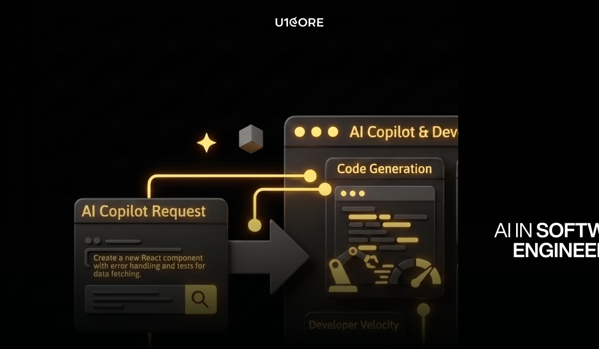
GitHub Copilot, Claude Code, Cursor — AI coding assistants have become standard tools in 2026. The impact on speed is real: boilerplate code, repetitive patterns, and standard implementations happen 2-3x faster.

For straightforward tasks — API endpoints, CRUD operations, form validation — AI assistants are genuinely productive. A developer who used to spend 30 minutes on boilerplate now spends 5 minutes reviewing AI-generated code.

Where it breaks: complex architecture decisions. AI can write an escrow payment flow. It can’t decide whether your marketplace product needs escrow in the first place. It can generate a notification system. It can’t determine which notifications matter for seller retention.

The pattern we see at U1CORE: AI speeds up the 60% of development that’s well-defined. It creates problems on the 40% that requires understanding the product and business logic. Teams that use AI for everything ship faster and debug longer. Teams that use AI selectively ship at the same speed and debug less.

One more reality: AI coding tools moved to token-based pricing in 2026. Teams that used AI for everything saw bills go from $29/month to $750+. The tool that was supposed to make custom software development cheaper became an unpredictable cost center.

AI in User Research and Analytics

This is where AI delivers the most underrated value in product development.

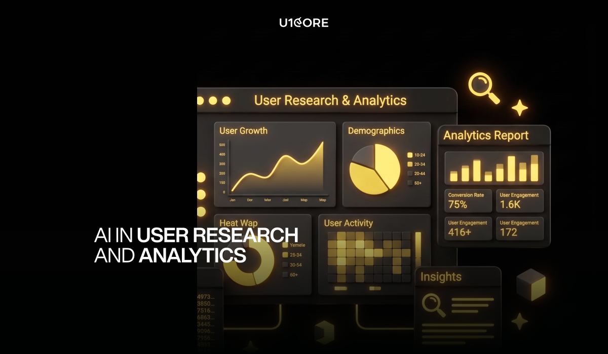
Session analysis at scale. Tools like Hotjar and FullStory now use AI to analyze thousands of user sessions and surface patterns. A researcher would need weeks to find these insights manually. AI surfaces them in hours.

Survey analysis. Open-ended responses used to sit in spreadsheets, manually coded by theme. AI categorizes thousands of responses in minutes. The themes it surfaces are usually correct. The nuance it misses is usually important. Best used as a first pass that a human validates.

Behavioral prediction. AI can identify users likely to churn based on behavioral patterns — login frequency, feature usage, support ticket history. Product teams can intervene before the user leaves rather than analyzing why they left.

Competitive analysis. AI tools can monitor competitor products, track feature changes, and summarize review sentiment across platforms. What used to require a full-time analyst now runs in the background.

Where AI research fails: it finds patterns but doesn’t understand context. “Users drop off at step 3” is a finding. “Users drop off because they don’t trust the platform enough to enter payment details” is an insight. AI delivers findings. Humans deliver insights. A product audit that combines AI-powered analytics with human interpretation consistently outperforms either alone.

Risks and Limitations of AI in Products

The confidence problem. AI outputs look polished regardless of whether they’re correct. The more confident the output looks, the less likely teams are to question it.

The homogeneity problem. AI tools are trained on the same data. Every AI-generated landing page converges toward the same layout. Differentiation requires human decisions that deviate from the average.

The context problem. AI doesn’t understand your specific users or business constraints. It generates from patterns. Your competitive advantage usually lives where you break patterns intentionally.

The cost problem. AI tools that were flat-rate are moving to usage-based pricing. The “AI saves money” narrative is being replaced by “AI shifts costs from salaries to subscriptions.”

The accountability problem. When AI-generated code breaks in production, who’s responsible? AI generates output. Humans own consequences.

The Future of AI in Product Development

AI agents will handle multi-step workflows — not just generating a screen but researching the need, proposing the solution, and testing it. Early versions exist. Impressive in demos. Unreliable in production.

AI will become invisible — embedded in Figma, code editors, and analytics dashboards. Doing work in the background without requiring a prompt.

The human role will shift from production to judgment. When everyone has the same AI tools, the differentiator becomes the human decisions: what to build, who to build it for, what to cut. These require experience, empathy, and judgment — exactly the things AI doesn’t have.

AI Tools for Product Teams

Design: Figma AI, Galileo AI, Relume, Midjourney and DALL-E.

Development: GitHub Copilot, Claude Code, Cursor, v0 by Vercel.

Research: Hotjar AI, Dovetail, Maze, Synthetic Users.

Testing: Applitools, Percy, Playwright with AI assertions.

Analytics: Amplitude AI, Mixpanel, FullStory.

Project management: Linear, Notion AI, Gamma.

The tools change fast. The principle doesn’t: use AI for speed on well-defined tasks. Keep humans on strategy and decisions where being wrong is expensive.


At U1CORE we use AI tools across our workflow — and we know exactly where to stop. AI makes us faster. Experience makes us right.

U1CORE is a product design and development studio. We offer UI/UX design, web design, mobile design, custom software development, app development, branding, and product audit. $720M+ processed through products we’ve built. Book a strategy call.
SaaS Landing Page Design: How to Build a Page That Actually Converts

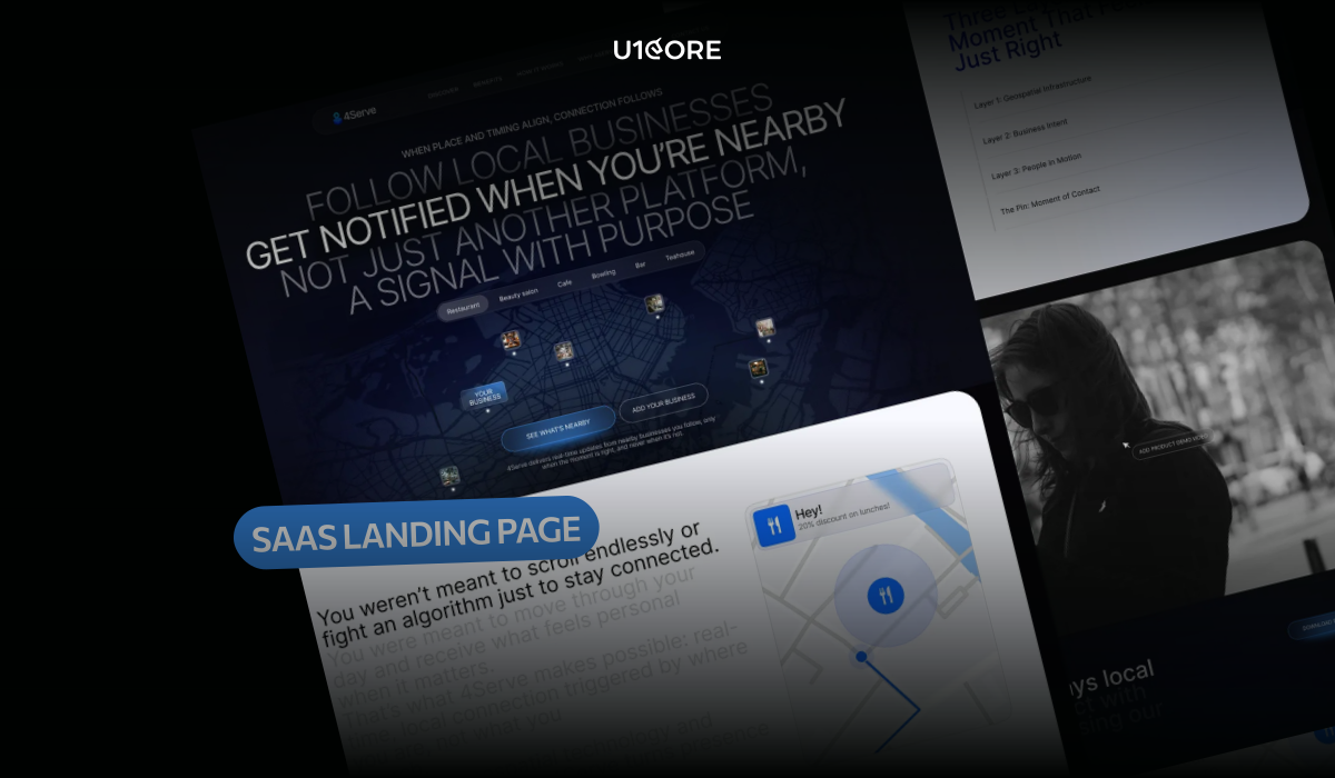
Most SaaS landing pages fail before the visitor reads the second paragraph. Not because the product is wrong. Because the page doesn’t answer three questions every visitor asks in the first ten seconds: what does this do, who is it for, and why should I trust you.

This guide covers how to structure a high-converting SaaS landing page — from hero section to pricing to CTA. At U1CORE, landing page design is one of our most requested services for growth-stage SaaS companies. Here’s what actually moves conversion.


Why SaaS Products Need a Dedicated Landing Page

A SaaS homepage serves multiple audiences: existing users, potential customers, investors, job candidates. A landing page serves one audience with one message and one goal.

A landing page built for a specific acquisition channel converts at two to five times the rate of a generic homepage because the message matches the visitor’s context. Every significant acquisition channel deserves its own landing page.

Structure of a High-Converting SaaS Landing Page

Hero Section and Value Proposition

The hero section is the only part of the page every visitor sees. If it fails to communicate what the product does and why it matters in under ten seconds, the rest of the page doesn’t get read.

A high-converting SaaS hero has four elements.

Headline: a specific, outcome-oriented statement. Not a tagline. A clear answer to “what is this.” The best SaaS headlines follow a simple structure: Verb, outcome, audience. “Close more deals without updating your CRM.” “Build and ship features twice as fast.”

Subheadline: one or two sentences that expand the headline with the specific mechanism or audience. Together, headline and subheadline answer: what does this do, who is it for, what’s different.

Primary CTA: one action, clearly labeled. “Start free trial” is better than “Get started” because it tells the visitor what they’re starting. Avoid generic labels — Sign up, Learn more, Submit — that could belong to any product.

Hero visual: a product screenshot or short product video. Not a stock photo. Visitors want to see what they’re buying. A realistic product screenshot reduces the “is this real” question and increases time on page.

Stripe’s hero shows a code snippet and a payment interface simultaneously — answering “what does this do” and “how does it work” in a single visual. Linear’s hero shows the actual product interface at high resolution, communicating product quality before a word is read.

Social Proof and Testimonials

Social proof reduces the purchase anxiety every SaaS visitor carries. The most effective forms, in order of credibility:

Named testimonials with photos and company logos. A quote from “Sarah M., VP of Operations, Acme Corp” with a headshot and company logo is more credible than a generic five-star review. Specificity signals authenticity.

Customer logos. A row of recognizable company logos communicates that the product has been adopted by credible organizations.

Usage statistics. “50,000 teams use this product” or “4.8 from 2,000+ reviews on G2” are credible because they’re specific and verifiable. Vague claims are less credible.

Case study snippets. A one-paragraph outcome story is more persuasive than a generic testimonial because it describes a specific result.

Place social proof immediately below the hero — not buried at the bottom of the page.

Pricing Section

The pricing section is the highest-intent moment on a SaaS landing page. A visitor who scrolls to pricing is actively evaluating. A high-converting pricing section has three properties.

It shows the actual price. “Starting at $49/month” is more credible than “pricing available on request.” Hiding price creates friction at the highest-intent moment.

It has a clear recommended plan. Label one plan as “Most popular.” Visitors who are unsure which plan to choose are more likely to convert when the page removes the decision.

It addresses the objection at the decision point. “Free to cancel anytime” and “14-day free trial, no credit card required” belong in the pricing section — not in the FAQ at the bottom.

CTA Blocks

A long SaaS landing page needs multiple CTA placements. The minimum structure: hero section, after the features section, adjacent to the pricing table, and footer. Each placement uses the same primary action with varied supporting copy.

Common SaaS Landing Page Mistakes

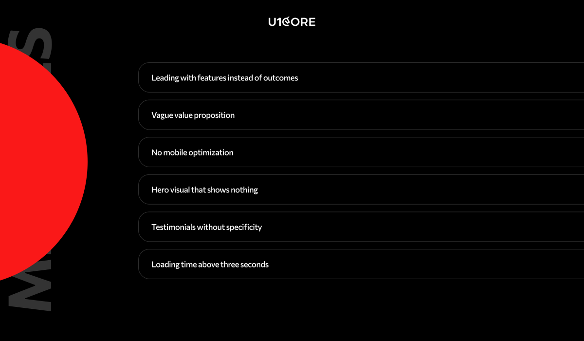
Leading with features instead of outcomes. “Automated reporting, custom dashboards, and API integrations” describes what the product has, not what it does. Reframe: “See the data that drives your decisions — automatically, in real time.”

Vague value proposition. “The platform for modern teams” could describe a thousand products. Be specific about who the product is for and what it specifically solves.

No mobile optimization. A significant share of initial SaaS research happens on mobile. A desktop-only design loses mobile visitors immediately.

Hero visual that shows nothing. A gradient background or stock photo communicates nothing. If visitors can’t see what they’re buying, they leave.

Testimonials without specificity. “Great product, highly recommend!” from “John D.” is not social proof. Real testimonials name a specific outcome, from a named person with a real role, company, and photo.

Loading time above three seconds. Every additional second of load time reduces conversion. Unoptimized images and render-blocking scripts are the most common causes.

Tools to Build a SaaS Landing Page

Webflow is the strongest choice for design-quality landing pages that marketing teams need to update independently. It produces clean code, strong Core Web Vitals performance, and a visual editing interface that non-developers can use after initial setup. Our Webflow development service covers end-to-end delivery on this stack.

Framer has emerged as a strong alternative for design-led teams. It supports advanced animations that Webflow handles less elegantly, and its AI-assisted design features accelerate initial builds.

Unbounce and Instapage are purpose-built for conversion-optimized landing pages with built-in A/B testing. They produce pages faster. The trade-off is design flexibility.

Next.js or Astro for custom development is appropriate when the landing page needs to integrate tightly with the product’s authentication system or when performance requirements exceed what no-code tools deliver.

For most early and growth-stage SaaS products, Webflow is the best default.

How to Test and Improve Conversion

A landing page is a starting point for ongoing conversion optimization, not a finished deliverable.

Start with qualitative data. Before running A/B tests, understand why visitors are not converting. Session recordings from Hotjar or Microsoft Clarity, user interviews with recent trial signups, and exit surveys tell you more than aggregate metrics alone.

Identify the highest-impact test. The element with the most traffic and the most visible drop-off is the first test candidate. For most SaaS landing pages, that is the hero headline and primary CTA.

Test one element at a time. Testing two elements simultaneously makes it impossible to know which change drove the result.

Measure conversion, not engagement. Time on page and scroll depth are engagement metrics. Trial signups and demo requests are conversion metrics. Optimize for what you actually want.

Give tests sufficient time. Most meaningful conversion tests need at least two weeks and sufficient traffic to reach statistical significance.

Best SaaS Landing Page Examples

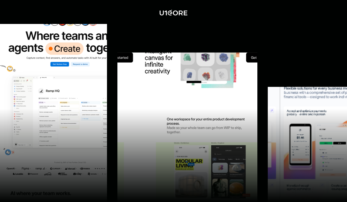
Linear shows the actual product interface at high resolution in the hero. The value proposition is specific. No stock photography. Social proof consists of named testimonials from engineering leaders. The page loads in under two seconds.

Notion segments immediately in the hero — showing different use cases for different audiences — and uses user-generated content as social proof. The result speaks to multiple buyer types without losing specificity for any of them.

Stripe uses the hero to speak simultaneously to two audiences: developers (code snippet showing API integration) and business owners (payment success interface). Technical sophistication and business legitimacy, communicated at the same time.

Figma uses video in the hero — a short demonstration of real-time collaboration that differentiates the product from alternatives. The video communicates the core differentiator faster than any written description could.

The common thread across all four: specific value propositions, real product visuals, specific social proof from named sources, fast loading, and a single conversion goal per page.


Need help designing a SaaS landing page that converts? U1CORE has shipped landing pages and SaaS UI/UX design for growth-stage companies across marketplace, fintech, and Web3. Get in touch to discuss your project.

U1CORE is a product design and development studio specializing in SaaS, marketplace platforms, and custom software development. $720M+ processed through products we’ve built.

How to Conduct a UX Audit: Step-by-Step Guide for Products and Websites

Most products don’t fail because the idea was wrong. They fail because somewhere between the first user session and the tenth, something breaks — and nobody caught it before it became a churn problem.

A UX audit is how you find exactly where that break is happening, before it shows up in your retention numbers.


What Is a UX Audit and Why It Matters

A UX audit is a structured evaluation of a digital product or website — its usability, information architecture, user flows, and design consistency — against defined criteria. The output is a prioritized list of problems and recommendations, not a general impression.

The difference between a UX audit and a design review: a design review is an opinion. A UX audit is evidence.

Most teams know something is wrong — conversion is lower than it should be, support tickets cluster around the same flows, users drop off at a specific step — but they don’t know exactly what to fix or in what order. A UX audit answers both questions.

At U1CORE, a post-audit redesign of a marketplace onboarding flow increased seller activation by 34% in 60 days. The audit identified the exact step where sellers were abandoning — not a guess, a finding backed by analytics and session recordings.

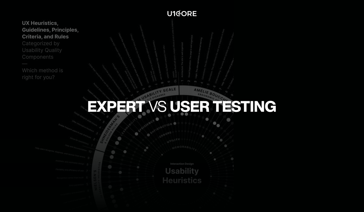
Types of Audits: Expert vs User Testing

Expert evaluation (heuristic analysis): an experienced UX designer evaluates the product against established usability principles without involving users. Fast and doesn’t require recruiting. Limitation: it reflects what an expert thinks will be a problem, not what actual users experience.

User testing: real users complete defined tasks while observed. Catches what expert evaluation misses — the assumptions your team made that users don’t share, terminology that confuses externally, flows that test well in theory and fail in practice.

For most products: start with expert evaluation, then validate critical findings with user testing before committing to redesign. Five users is the minimum to surface the majority of usability problems.

UX Audit Process Step by Step

Analytics Review

Before evaluating any screen, look at the data.

Drop-off rates by step in key flows. If 60% of users complete step 2 of onboarding but only 35% complete step 3, step 3 is your first audit target.

Time on page by section. Unusually high time on a single step can mean engagement or confusion. Session recordings will tell you which.

Search queries within the product. What users search for is a direct signal of what they can’t find through navigation.

Support ticket categories. The top three categories are almost certainly UX problems, not user errors.

Tools: Google Analytics 4, Mixpanel, Amplitude. Session recordings: Hotjar, FullStory, Microsoft Clarity (free).

Heuristic Evaluation

Evaluate each flow against Nielsen’s 10 heuristics:

  1. Visibility of system status
  2. Match between system and real world
  3. User control and freedom
  4. Consistency and standards
  5. Error prevention
  6. Recognition over recall
  7. Flexibility and efficiency
  8. Aesthetic and minimalist design
  9. Help users recover from errors
  10. Help and documentation

Score each heuristic per screen. Severity scale: 0 (not a problem) to 4 (must fix before launch).

User Testing Sessions

Write tasks as goals, not instructions. “You need to buy a birthday gift for a friend who likes cooking — show me what you’d do” surfaces real behavior. “Add an item to your cart” tests whether users can follow instructions.

Note: where users hesitate, where they look in the wrong place, where they give up, where they succeed faster than expected.

UX Audit Checklist

Navigation and Information Architecture

  • Primary navigation is visible and clearly labelled
  • Users can identify where they are at all times
  • Back navigation works as expected
  • Search returns relevant results with appropriate empty states

Onboarding

  • First session delivers value before asking for information
  • Progress indicators show how far through onboarding the user is
  • Users can skip or return to steps without losing progress
  • Confirmation and success states are explicit

Forms and Input

  • Labels are visible above fields (not placeholder text only)
  • Error messages appear next to the field that caused them
  • Error messages explain what went wrong and how to fix it
  • Form validation happens inline, not only on submit

Calls to Action

  • Primary CTA is visually distinct from secondary actions
  • CTA labels describe the action (not just “Submit”)
  • Destructive actions require confirmation

Empty and Loading States

  • Empty states explain why content is missing and what to do
  • Loading states provide feedback within 1-2 seconds
  • Timeout states offer a clear recovery path

Error Handling

  • 404 pages include navigation back to useful content
  • System errors are explained in plain language
  • Users are never left without a next action after an error

Mobile and Responsive

  • Touch targets are minimum 44×44px
  • Content reflows correctly at all breakpoints
  • No horizontal scrolling on any screen

Accessibility

  • Color contrast meets WCAG AA minimum (4.5:1)
  • Interactive elements are keyboard navigable
  • Images have descriptive alt text

Tools for UX Audits

Analytics: Google Analytics 4, Mixpanel, Amplitude, Heap. Session recording: Hotjar, FullStory, Microsoft Clarity (free). User testing: Maze, UserTesting.com, Lookback. Accessibility: axe DevTools, Wave, Lighthouse. Documentation: Notion for findings, Loom for walkthroughs, Figma for annotating screenshots.

How to Interpret Results

Prioritize by impact and effort.

Impact: how many users does this affect, and how significantly does it affect their ability to complete a key task?

Effort: how complex is the fix?

Fix high-impact, low-effort items immediately. Prioritize high-impact, high-effort items in your next sprint. Deprioritize low-impact items regardless of effort.

Distinguish symptoms from causes. If users drop off at step 3 of onboarding, step 3 is the symptom. The cause might be that step 2 set incorrect expectations. Fixing step 3 without addressing step 2 produces partial improvement.

What to Do After the Audit

Write findings that non-designers can act on. Each finding: a plain-language description, the evidence, the severity rating, and a specific recommendation.

Present findings in person. A written report gets skimmed. A 45-minute walkthrough creates shared ownership. Show the session recordings — watching a real user struggle changes how a team thinks about fixing it.

Build a fix roadmap. Immediate fixes (this week), short-term improvements (this sprint), structural changes (next quarter). Assign owners. Set deadlines.

Measure before and after. Define the metric each fix is intended to improve before you ship. Measure at 30 days post-launch.

Re-audit on a cadence. Build a lightweight audit into your quarterly product review. The teams that catch UX problems earliest spend the least fixing them.


U1CORE runs UX audits for SaaS products, marketplaces, and fintech platforms. If your product has a conversion or retention problem you can’t explain, an audit is usually the fastest way to find out why. Book a free scoping call to discuss your product.