Why Hiring a Generic Dev Agency for Your Marketplace Is a Mistake Most Founders Make Twice

The difference isn’t talent. It’s pattern recognition built from doing this one specific thing repeatedly.

Every week someone sends me a brief.

A two-sided marketplace. Buyers on one side, sellers on the other. A matching problem, a trust problem, a payments problem. And somewhere in the proposal — a shortlist of agencies that have built SaaS tools, mobile apps, and marketing sites for the last five years.

I don’t say this to be dismissive. I say it because I’ve watched too many smart founders spend six months building something that looked right in Figma and broke in production — and discover too late that the team they hired had never actually solved the problems that make marketplaces hard.

The question that reveals everything

There is one question I ask every agency before recommending them for a marketplace build:

“Tell me about the last cold-start problem you solved.”

A generic agency will pause. They might ask what you mean. They might pivot to talking about their design process or their tech stack.

A marketplace studio will have a story. They’ll tell you which side they acquired first and why. They’ll tell you what didn’t work. They’ll tell you what eventually created enough density on one side to pull the other.

The cold-start problem is not a marketing problem. It’s a product design problem. It has to be solved architecturally, in the product, before launch. And you can only know that if you’ve tried to solve it before.

The questions a team asks on day one tell you everything about what you’ll get on launch day.

What generic agencies actually know

Generic agencies are not bad. Many of them are excellent. They build beautiful products, they ship on time, and they understand UX deeply.

What they understand is single-sided products. A SaaS tool has one type of user. A mobile app has one type of user. The entire craft of product design, as most agencies practice it, is built around understanding one user’s needs and serving them well.

A marketplace has two types of users — and their needs are in constant tension.

Buyers want abundant, trustworthy supply. Sellers want abundant, high-quality demand. Every design decision — search ranking, onboarding flow, pricing guidance, review systems, dispute resolution — involves a three-way negotiation between buyer needs, seller needs, and platform health.

This complexity only reveals itself after you’ve built a few marketplaces and watched what breaks.

The problems that only appear in marketplaces

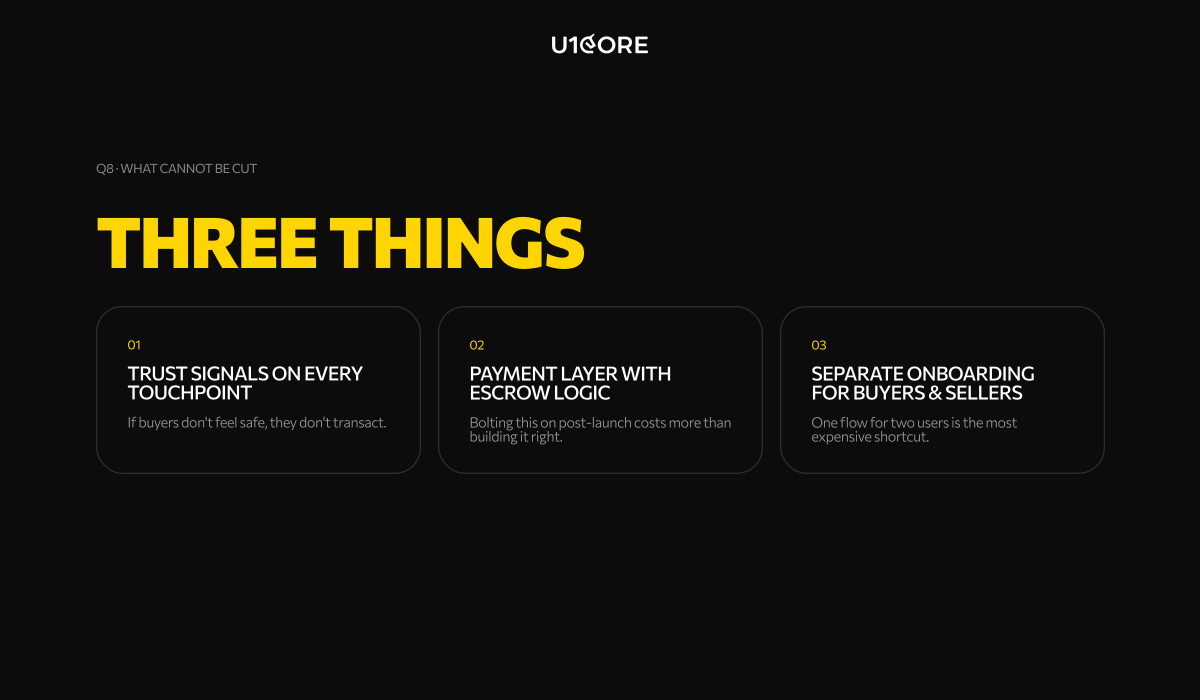
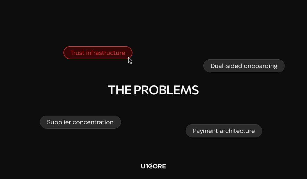
Trust infrastructure. In a marketplace, trust has to be engineered into every transaction from day one. Escrow logic. Identity verification. Dispute resolution that scales. These are not features on a roadmap. They are prerequisites. A generic agency will add them when you ask. A marketplace studio will design them in before the first transaction.

Dual-sided onboarding. Most agencies design onboarding for one user. In a marketplace, you are onboarding two simultaneously. If either side drops off before they see value, the whole platform loses liquidity. The seller who can’t get their first listing live in five minutes will not come back. The buyer who sees three listings in their category will not trust the platform.

Payment architecture. When a generic agency hears “payments,” they think Stripe integration. A marketplace payment layer involves escrow logic, split payouts, variable take rates, refund triggers, and what happens when a seller disappears mid-order. Every one of those scenarios has to be designed before the first transaction. Not after the first complaint.

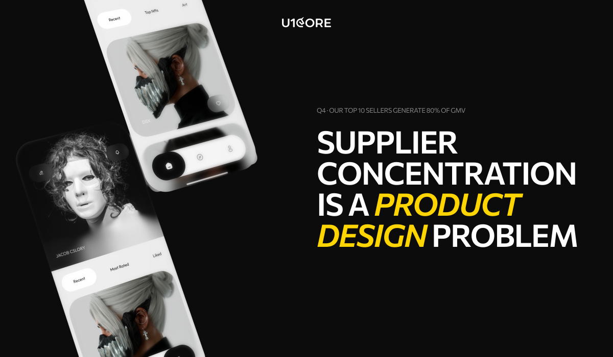
Supplier concentration. A marketplace where the top ten percent of sellers generate sixty percent of GMV is not a marketplace. It is a dependency. Those sellers know it. This problem has to be designed against from the beginning — not addressed when the first power seller starts negotiating their take rate.

What it costs when the wrong team builds your platform

The mistakes that cost the most are not made in development. They are made in the decisions that precede it — decisions about architecture, about which side to acquire first, about how to structure the payment layer, about what trust infrastructure needs to exist before any real money moves.

A team that has never built a marketplace will make those decisions based on general product principles. Those principles are not wrong. They are just insufficient for the specific problems that multi-sided platforms create.

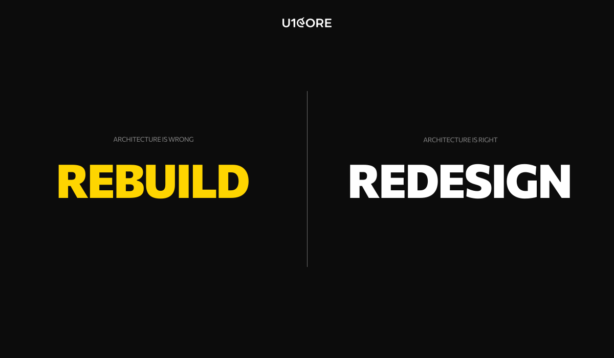
By the time the insufficiency shows up — in seller churn, in cold-start failure, in a payment layer that breaks under real transaction volume — the cost of fixing it is not a design sprint. It is a rebuild.


What specialization actually looks like

A studio that specializes in marketplaces does not just have marketplace projects in their portfolio. They have a vocabulary.

They talk about liquidity before they talk about design. They talk about take rate optimization before they talk about features. They ask about supplier concentration before they ask about user personas. They have opinions about cold-start strategies that are based on what they have tried and what has failed.

That is what pattern recognition looks like. Not a better process. Not a more experienced team. A set of mistakes already made, already learned from, already designed around.

$720M+ has been processed through platforms we have built at U1CORE. That number is not a marketing claim. It is what happens when you build the right architecture for the right problem.

How to tell the difference before you sign

Ask about the cold-start problem. Listen for a story, not a framework.

Ask about the last payment dispute they designed for. Listen for specifics about escrow logic, not general statements about Stripe.

Ask to see both sides of the onboarding flow from a past project. Not the buyer flow. Both flows. If they only show you one, you know which side got the attention.

The difference is not always visible in a portfolio. It is visible in the conversation.


At U1CORE we design and build multi-sided platforms — marketplaces, exchanges, auction systems, and fundraising platforms. If you are building something in this space and want a team that has been through it before, we would love to hear about it.

The New Rules of Marketplace Building: What the Current Global Situation Changed Forever

The playbook that built Airbnb, Etsy and Amazon doesn’t work anymore. Here’s what replaced it.

Every week someone sends me a deck.

A two-sided marketplace. Network effects. The next big platform in their space. And somewhere in the pitch — a comparison to a company that launched in a completely different world, under completely different conditions, with completely different user behavior.

I don’t say this to be dismissive. I say it because I’ve watched too many smart founders spend a year building something that would have worked in 2019 — and discover in 2026 that the ground shifted while they were building.

The global disruptions of the last five years didn’t just change the environment marketplaces operate in. They changed the foundational assumptions marketplace businesses are built on. Supply chains broke. Cross-border transactions got complicated. User trust eroded. AI commoditized the core value proposition of half the marketplaces that were in someone’s pitch deck three years ago.

Here’s what actually changed — and what it means if you’re building right now.

Trust is no longer a feature. It’s the architecture.

The original marketplace model was simple: bring buyers and sellers together, let reputation accumulate over time, handle disputes when they happen. Trust was a lagging indicator — something that built up through transaction history and reviews.

That model assumed stable participants. Sellers who would still be there next month. Supply that was predictable. Reputation that meant something because the people who built it weren’t going to disappear.

None of those assumptions survived the last five years intact.

Sellers disappeared. Platforms that had operated for years discovered that the trust infrastructure they’d built was dependent on conditions that no longer existed. And users who got burned once — by a seller who vanished, by a transaction that couldn’t be resolved, by a platform that had no answer for what happened when things went wrong — didn’t come back.

The new rule is simple and uncomfortable: trust cannot be something your platform earns over time. It has to be built into the transaction from day one. Escrow that releases on verified delivery. Identity verification that goes beyond an email address. Dispute resolution that scales. These aren’t features on a roadmap. They’re prerequisites.

Global is fragile. Local is defensible.

For a decade, the marketplace narrative was about scale. Go global. Move fast. Own the category everywhere simultaneously.

The last five years proved that global scale without local resilience is a liability.

The marketplaces that survived disruption were the ones with strong local supply. Not because local is always better — but because local held when global broke. Local sellers could deliver when cross-border logistics failed. Local trust networks stayed intact when broader systems didn’t. Local regulatory environments were navigable when international ones became unpredictable overnight.

The marketplaces that struggled were the ones that had optimized for global GMV at the expense of local depth.

The new rule: your marketplace needs to work — really work, with real unit economics — within a single city or region before it earns the right to expand. Not as a pilot. As proof that the underlying model is sound when you strip away the scale that was papering over the problems.

AI commoditized matching. Curation is the new moat.

The original marketplace value proposition was a matching problem. You had supply, you had demand, and your job was to make matching faster and cheaper than the alternatives.

AI makes matching trivially easy for anyone. That’s not a competitive advantage anymore. It’s table stakes.

What AI can’t replicate is trust. Verified quality. A community of participants who chose your platform because it gave them something they can’t get elsewhere. The defensible marketplace businesses of the next decade won’t win on algorithm. They’ll win on the quality of what flows through them and the strength of the relationships they’ve built with the people on both sides.

If your marketplace’s core value proposition is “we surface the right result faster” — that’s no longer a business. It’s a feature that any well-funded competitor can match in a product sprint.

Cold start got harder. Community became the shortcut.

The channels that made marketplace cold starts manageable five years ago — paid social, organic reach, influencer-driven growth — are all more expensive and less effective than they were. The cost of acquiring the first thousand participants on either side of your marketplace has increased significantly across almost every category.

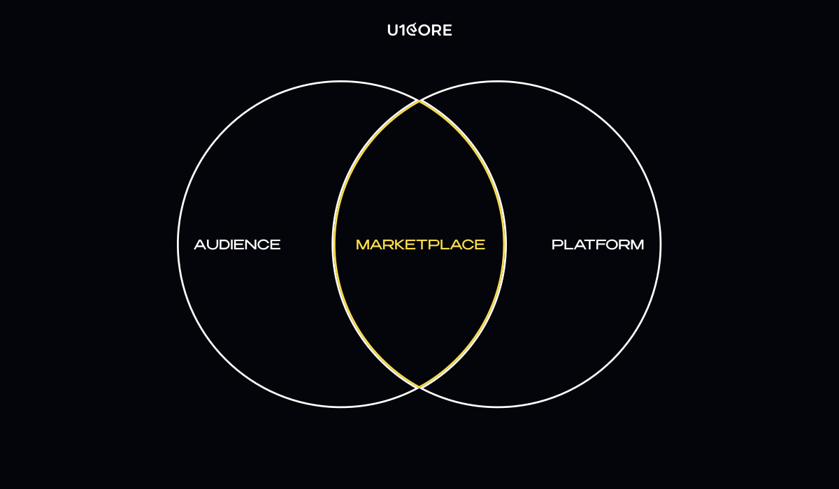
The marketplaces successfully launching today almost universally started with an existing audience. A newsletter. A community. A professional network. A following built around a specific domain. They built the marketplace as a layer on top of relationships that already existed — which meant the cold start problem was already partially solved before a single line of code was written.

This is not a coincidence. It’s a structural shift in what it takes to launch.

The new rule: if you don’t have distribution, you need to build it before you build the platform. Not in parallel. Before.

Regulation became a product decision.

Move fast and figure out regulation later destroyed real businesses. Platforms that had built genuine value for real users discovered overnight liability that changed their unit economics entirely — not because they were doing anything wrong, but because they’d made architectural decisions early that created exposure they hadn’t accounted for.

How you structure the relationship between your platform and your participants — who is an employee versus a contractor, what data you collect, how you handle cross-border transactions — these are product design decisions with legal consequences. They have to be made before you build, because changing them after is expensive in ways that go beyond the engineering cost.

The metric that matters isn’t GMV. It’s switching cost.

GMV told a story about scale. It didn’t tell a story about defensibility.

The real measure of marketplace health is what participants give up when they leave. A marketplace whose sellers make significantly more on the platform than they would through alternatives has something real. A marketplace whose sellers are constantly testing whether they can go direct has a structural problem that growth won’t fix.

Build for switching cost from day one. Not as a retention tactic — as a product philosophy. Every feature, every design decision, every operational choice should make the answer to “why stay?” more obvious than the answer to “why leave?”

The marketplaces that will define the next decade won’t look like the ones that defined the last one.

They’ll start local. They’ll be built on community before they’re built on code. They’ll treat trust as infrastructure, not reputation. They’ll have a clear answer to the switching cost question before they write their first pitch deck.

The old model isn’t wrong. It’s just from a different world.

That world is gone. Build for this one.

Healthcare UX: Design Patterns that Save Lives and Improve Patient Experience

In healthcare, a confusing interface isn’t just a nuisance — it can lead to medical errors. A misread dosage, a missed alert, a form that overwhelmed an exhausted nurse at 3 AM. These aren’t edge cases. They’re documented, recurring failures that cost lives.

According to the WHO’s Digital Health Guidelines, poor digital health design is one of the leading contributors to preventable medical errors globally. UI/UX design services for healthcare products must operate by a fundamentally different standard. This article breaks down the design patterns that matter most — and why getting them right is a matter of patient safety, not just user experience.

What is UX in Healthcare?

UX in healthcare refers to the design of digital interactions between patients, clinicians, and medical systems — covering everything from patient-facing apps to clinical decision support tools, EHR platforms, and medical device interfaces.

Unlike consumer UX, healthcare UX must account for high-stress environments, strict regulatory requirements, and the direct impact of design decisions on patient outcomes. A poorly placed button in a retail app costs a conversion. In a clinical interface, it can cost a life.

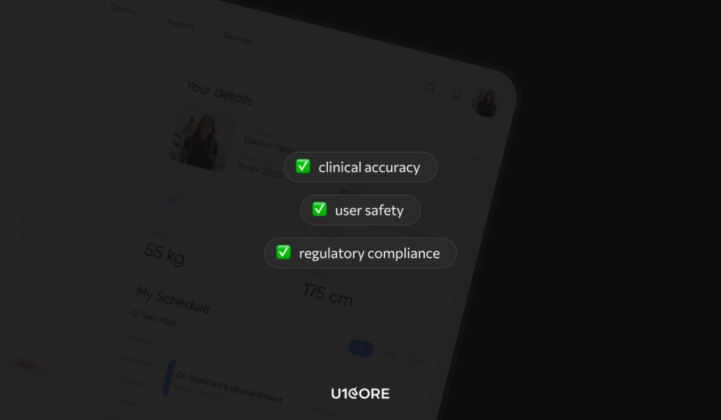
Effective healthcare product design balances three priorities: clinical accuracy, user safety, and regulatory compliance — without sacrificing usability.

Design for High-Stress, Low-Attention Environments

The core assumption of most digital product design — that the user is calm, focused, and unhurried — breaks down completely in healthcare settings.

Clinicians use interfaces mid-procedure and under time pressure. Patients interact with health apps while anxious, in pain, or managing a chronic condition. Medical app UX must be designed for the worst moment, not the best one.

Large touch targets. High-contrast typography. Single-action screens for critical workflows. Error prevention over error recovery — interfaces should make it structurally difficult to enter incorrect information, not just easy to undo it afterward.

The principle is consistent: reduce cognitive demand on users who are already operating near capacity.

Making Critical Information Impossible to Miss

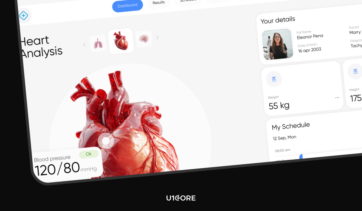
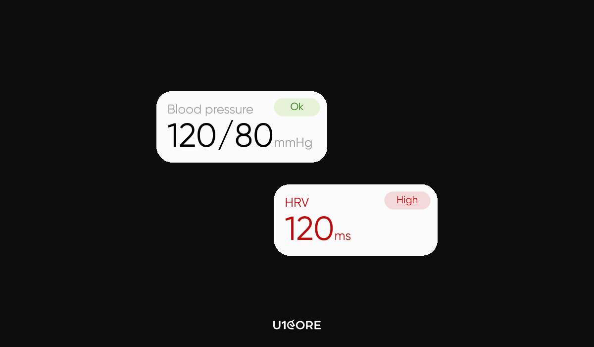
In a patient vitals dashboard, not all information carries equal weight. A heart rate of 42 bpm is not the same as 72 bpm — but in a poorly designed interface, they look identical.

Health tech UI design must communicate severity before the user has to interpret it. Progressive disclosure works: normal values appear quietly, abnormal values escalate through size, position, and visual hierarchy. Severity should never be communicated through color alone — a significant percentage of clinicians have some form of color vision deficiency.

Persistent alerts that remain visible until explicitly acknowledged are essential for time-sensitive clinical data. In consumer design, visual balance signals quality. In clinical environments, imbalance is the signal.

Reducing Cognitive Load at the Point of Action

Emergency physicians make approximately 200 clinical decisions per shift. Every unnecessary UI step, every ambiguous label, every redundant confirmation dialog reduces the capacity available for decisions that actually matter.

At U1CORE, our approach to data visualization for medical professionals prioritizes decision workflows over data completeness. Dashboards are structured around what the user needs to act on — not everything the system knows.

Smart defaults pre-populate fields based on patient context. Progressive forms surface one relevant input at a time. Confirmation dialogs appear only before irreversible actions.

If a clinician has to stop and think about what a button does, the button is wrong.

Complexity in Health-Tech

Healthcare products are among the most complex digital systems in existence — integrating real-time data, regulatory requirements, and users with radically different technical literacy.

The answer to this complexity is the same answer that applies to any complex SaaS product: complexity in the system doesn’t require complexity in the interface. The interface’s job is to absorb complexity, not expose it.

For a deeper look at how these principles apply to SaaS, see our article on [UX Design for Complex SaaS: How to Reduce User Churn].

In healthcare, the same logic applies with higher stakes. A clinician navigating a complex interface is a clinician whose attention is on the screen instead of the patient.

Accessibility Requirements for Medical Software

Accessibility in healthcare UX is not a compliance checkbox. It is a clinical requirement.

Healthcare users include patients with low vision, motor impairments, and limited digital literacy. Elderly patients who’ve never owned a smartphone. Clinicians working with gloves on, in variable lighting, sometimes with one hand occupied.

At U1CORE, our healthcare accessibility work meets WCAG 2.1 AA as a minimum, with AAA targets for patient-facing interfaces. Every interactive element is screen reader compatible. Text scales to 200% without layout failure. Patient-facing copy is written at a sixth-grade reading level.

HIPAA-compliant design adds another layer: data displayed on a need-to-know basis, visible audit trails for authorized users, and session management that balances security with clinical workflow continuity.

According to the HIPAA Journal, interface decisions that expose protected health information outside appropriate contexts create both compliance risk and patient safety risk simultaneously.

How to Design a Patient-Centric App

Patient-centric design starts with one principle: the interface should reduce the burden on the patient, not add to it.

Clarity over completeness — the most relevant information appears first, additional detail is accessible but not defaulted. Plain, warm language. Every screen answers the implicit question: what should I do next?

Offline functionality matters more in healthcare than most categories — patients in rural areas or high-acuity moments may not have reliable connectivity. And trust signals — visible security indicators, clear data sharing disclosures, explicit consent flows — are non-negotiable. Patients who don’t trust a health app don’t use it consistently, which undermines the clinical value it was built to deliver.

The Standard Is Different Here

Every industry has design challenges. Healthcare has design consequences.

The patterns in this article — designing for stress, communicating severity, reducing cognitive load, meeting accessibility requirements — are not best practices. In healthcare, they are baseline requirements.

Good healthcare UX reduces errors, builds trust, and drives the adoption through which the product’s clinical value is actually delivered. Design that fails this standard doesn’t just underperform.

It causes harm.