
- Article
Best App Development Companies for Startups (2026)


I’m going to show you two marketplace homepages.
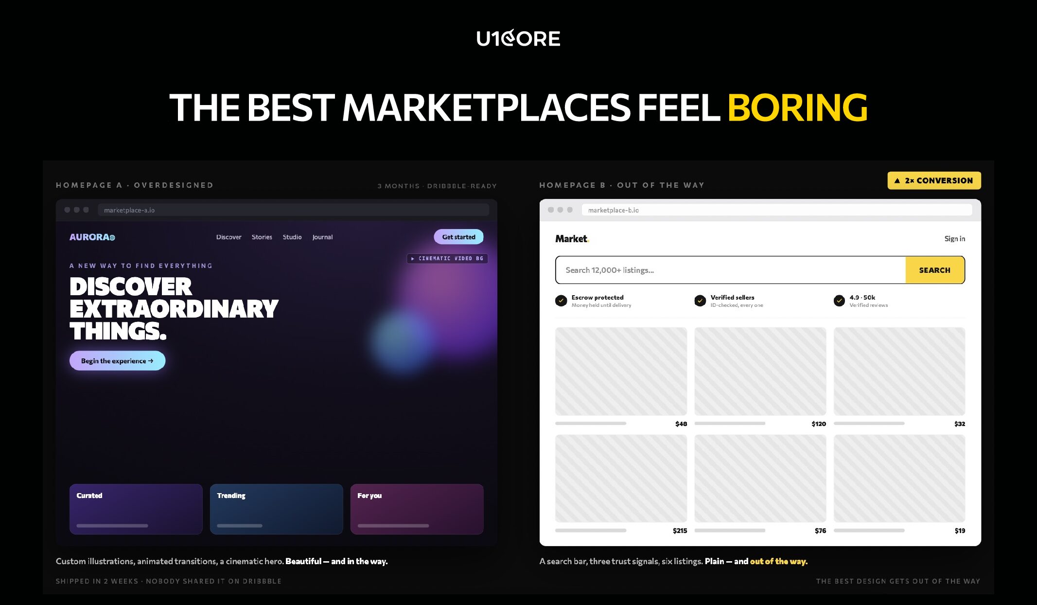
Homepage A: custom illustrations, animated transitions, a bold hero section with a cinematic video background. The design team spent three months on it.
Homepage B: a search bar, three trust signals, and six listings. Took two weeks to ship. Nobody shared it on Dribbble.
Homepage B converted 2x better. Not because it was better designed. Because it got out of the way.
When a founder comes to us with a marketplace concept, there’s almost always a moment where they say: “We want the wow factor.”
I get it. You’re building something new. You want people to be impressed.
But here’s what building platforms that process $720M+ taught us: the most successful marketplaces are the ones users forget they’re using. Not because they’re forgettable. Because the user never had a reason to stop and think.
Found it. Trusted it. Bought it. Closed the app.
That’s not lazy design. That’s the hardest product design problem there is.
A client asked us to make their checkout “more exciting.” We removed two steps instead. Transactions went up 30%. Excitement went down. Revenue went up.
On another project we showed a marketplace founder two seller profile concepts. One was beautifully crafted — custom icons, gradients, creative layout. The other was plain — but showed response time, completed deals, and a verification badge.
We tested both. Users trusted the plain one. Every time.
Not because beauty doesn’t matter. Because in a marketplace, trust beats aesthetics at the moment of transaction. And the moment of transaction is the only moment that counts.

We restructured a marketplace catalog once. Same 400 listings. Same categories. Same sellers. Zero new content.
Before — the platform felt dead. After — same inventory, completely different feeling. Users started transacting.
Nothing changed except how listings were organized and surfaced. The user didn’t notice. That’s the point. They weren’t supposed to notice. They were supposed to buy.
On a different platform we added one line above the checkout button: “Buyer protected on every transaction.” Conversion went up. Not because the protection was new — it had been there for months. Because users could finally see it.
Trust that’s invisible to the user is trust that doesn’t exist. This is where a product audit becomes invaluable — finding the gaps that are silently costing you conversions.e transaction.

A team came to us after spending six months with a studio that specialized in brand experiences. The result was gorgeous. Custom animations. Creative navigation. An art-directed homepage.
Then real users arrived. 40% couldn’t find the search bar. 60% didn’t understand what the platform did within 5 seconds. Users who did understand didn’t trust it enough to enter payment details. No trust signals. No social proof. No buyer protection visible.
Beautiful design. Zero transactions.
We rebuilt it. Search bar at the top. Trust signals below. Listings front and center. Clear path from browse to buy. “Boring.” Transactions started on day one.
Most of the time the problem isn’t what the platform looks like. It’s what the platform doesn’t say.

Most marketplace redesigns fail because they redesign the wrong layer. The team changes colors, typography, and layout — all the visible things. Meanwhile the actual problem is invisible: the information architecture, the trust signals, the empty states.
We worked on a web platform where the client was convinced they needed a visual refresh. We ran a diagnostic. The design wasn’t the problem.
New users landed on a homepage with 12 categories, all equally weighted, with no guidance on where to start. They were overwhelmed. Not by bad design — by too many equal choices.
We restructured the homepage around three entry points based on common buyer journeys. Same visual design. Same branding. Different architecture. Bounce rate dropped. Time to first transaction shortened.
On mobile the stakes are even higher. You have 3 seconds. If your hero section is an animation that takes 4 seconds to load — you’ve already lost.

When you look at your marketplace, ask yourself:
“Would I rather hear ‘your platform looks amazing’ or ‘I just bought something and it was easy’?”
If the answer is the second — you’re building a product. If the answer is the first — you’re building a portfolio piece.
The best marketplaces feel boring. That’s not a failure of design. That’s the entire point.

U1CORE designs and builds marketplace platforms — from MVP to scale. $720M+ processed through products we’ve built.

During this call we do a quick intro and discuss your project and its specific needs.
During this call we do a quick intro and discuss your project and its specific needs.

Book a free consultation with us, so we will frame your product vision and strategy.

We’ve received your request and our team is already reviewing it. We’ll get back to you as soon as possible to discuss how we can help you achieve your goals.
Looking forward to collaborating with you!

We’ve sent the download link to your email. Check your inbox (and spam folder just in case) to access the eBook.
We hope you find it valuable for your Web3 journey. If you have any questions or feedback, feel free to reach out!