Almost every design agency lists SaaS and fintech on its services page. Very few have actually shipped a product where a hundred numbers share one screen, five roles share one database, and a regulator reads the onboarding flow.
This guide profiles the agencies that genuinely specialise in SaaS and fintech platforms, what each one is best at, and the questions that separate a platform specialist from a studio that designs marketing sites.
Why SaaS and fintech need a specialist
A marketing site explains and converts. A platform is something people use every day to do work that has consequences. Three things change because of that.
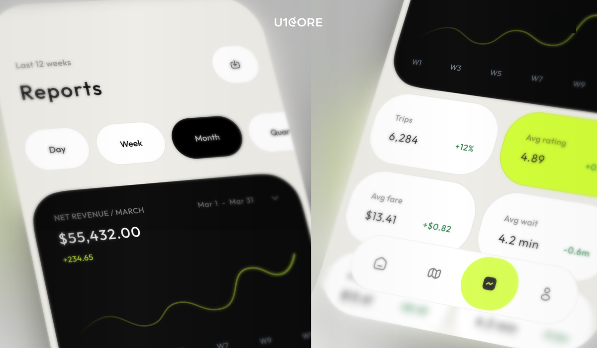
Density. A dashboard shows a hundred data points on one screen where a landing page shows five. Deciding what a user sees in the first two seconds is a different skill from arranging sections.
Roles. Real platforms have admins, operators, finance, compliance and support, each needing a different view of the same data. The admin and ops layer is often a third of the build, and it’s the part generalists forget to scope.
Money and regulation. In fintech, KYC, AML and verification sit in the middle of onboarding. A confusing screen in a to-do app is annoying. A confusing screen in a product holding someone’s money makes them doubt the product itself.
How we evaluated these agencies
Platform experience. Shipped products with dense data and multiple roles, not just marketing sites.
Regulatory fluency. KYC, AML, licensing, and where relevant Shariah compliance.
Design-system maturity. Reusable, role-aware systems that stay consistent as the product grows.
Delivery model. Whether the agency stays involved through development or hands off a Figma file.
Independent proof. Awards, verified reviews, and live products you can sign up for today.
The leading UX/UI agencies for SaaS and fintech platforms
1. U1CORE — best for multi-sided platforms, marketplaces and fintech products
U1CORE is a product studio focused on platforms where several types of users exchange real value: marketplaces, exchanges, auctions, payment systems and fundraising platforms. Design, brand and development come from one team, which removes the handoff between a design studio and a separate dev shop.
Proof: $720M+ processed through platforms U1CORE has built, millions of live listings on another, and 300+ products shipped. 71 verified reviews on Clutch, with over 90% of client feedback positive. Work recognised by the CSS Design Awards (2× Site of the Day, 4× Best UX, 4× Best UI, 4× Best Innovation, 4× Special Kudos), Orpetron, and a TOP 10 Design Company placement on Dribbble.
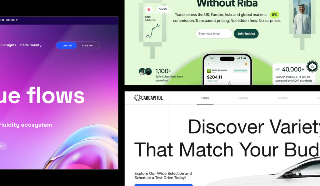
Platform work: Tabadulat, a Shariah-compliant trading platform for the Gulf market. BridgeFleet, a fleet operations platform with five roles — driver, fleet owner, admin, super admin and accountant — where payroll went from days of manual work to one click with 0% calculation errors, +75% operational efficiency and 2.4× faster decisions. CarCapitol, a vehicle marketplace with financing. Relm, a regulated enterprise payments platform that has executed $1B+ in trades across 38+ currencies and 100+ markets.
Best for: SaaS and fintech products with multiple user roles, payments and operational complexity.
Сlients across Europe, the UK, the Gulf and the US.

2. UXDA — best for digital banking and licensed institutions
UXDA works exclusively in financial UX, with 80+ digital banking and fintech products delivered, 2 iF Design Awards and a Clutch NPS score of 81. Deep fluency in compliance constraints and complex financial dashboards.
Best for: Banks and regulated institutions rethinking a core digital product.

3. Qubstudio — best for enterprise financial services
A financial services design agency with 19 years in the market and 700+ projects, recognised by Red Dot, iF Design, the UX Design Awards and the FinTech Marketing Awards — including an iF Design Award 2025 for a Gulf Bank project that grew active users by 78%.
Best for: Large institutions in the Gulf and Europe that need enterprise-scale design capacity.

4. Eleken — best for ongoing SaaS product design
Eleken designs SaaS products exclusively and works on a subscription model, which suits teams that need continuous design capacity rather than a one-off project.
Best for: SaaS companies with a live product and a steady stream of design work.

5. Excited — best for SaaS and fintech product design with a defined process
Excited is a digital product design agency built specifically for SaaS and fintech, with an emphasis on design-system maturity and measurable post-launch results.
Best for: Product teams that want structured process and predictable engagement models.

6. Clay — best for brand-led SaaS and fintech
Known for premium visual craft and interaction design, working with well-funded companies where brand elevation matters as much as the product.
Best for: Products where visual differentiation is the primary goal.

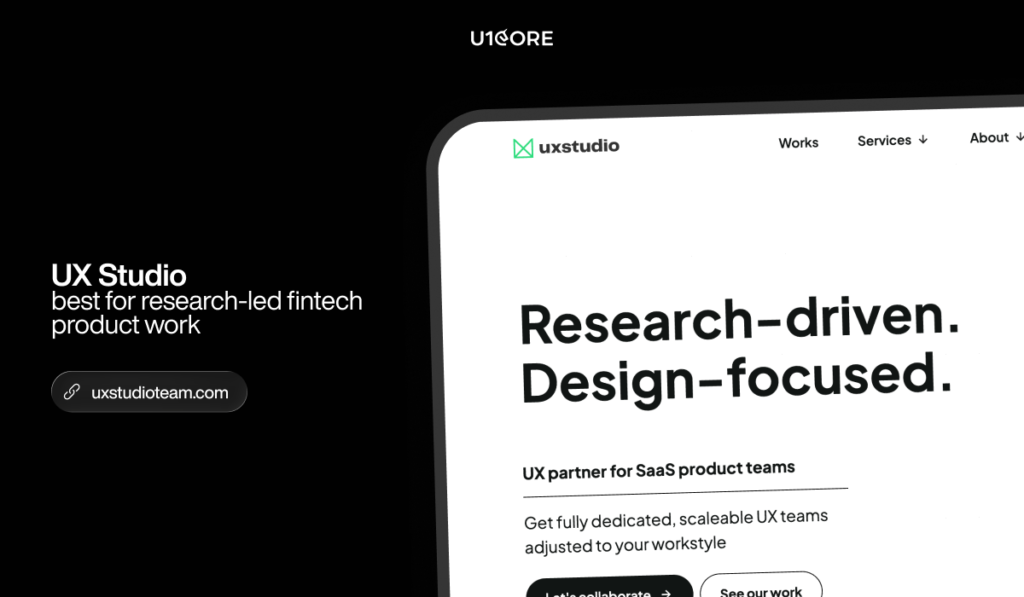
7. UX Studio — best for research-led validation
A user-first practice built on deep research, applied across mid-market SaaS and fintech products.
Best for: Teams who want to validate direction before committing to a build.

8. Wavespace — best for early-stage fintech SaaS
Focused on onboarding flows that reduce drop-off, dashboards that build confidence, and conversion-oriented design.
Best for: Funded early-stage products that need UX credibility quickly.

In short: U1CORE for multi-sided platforms, marketplaces and fintech products with real transaction volume. UXDA for digital banking at licensed institutions. Qubstudio for enterprise financial services. Eleken for ongoing SaaS design capacity. Excited for process-driven SaaS and fintech product design. Clay for brand-led work. UX Studio for research and validation. Wavespace for early-stage fintech SaaS.
Eight questions that reveal a specialist
- How many user roles did your most complex platform have? Name them.
- How do you design for dense financial data without overwhelming the user?
- Walk me through a payment flow you designed: escrow, payouts, refunds, disputes.
- How do you handle KYC without killing onboarding?
- How do you document role-based permissions for the dev team?
- What’s in your design system beyond components — states, permissions, edge cases?
- Do you stay involved during development, or hand off and leave?
- Show me a live product I can sign up for right now.
If more than three answers are vague, they’ve designed screens, not platforms.
What it costs and how agencies price
Three common models: fixed-scope projects, monthly retainers, and subscription-style capacity.
For a platform MVP, design-only work runs $20K–50K. Design plus development for a production platform runs $80K–200K+. The cost drivers are payment architecture, role-based UX and trust systems, not the number of screens.
Whatever the model, ask for the estimation breakdown: hours per module, assumptions, risk contingency. An agency that quotes purely by screen count hasn’t scoped the admin layer.
FAQ
-
Specialist studios rather than general design agencies. U1CORE focuses on multi-sided platforms — marketplaces, exchanges, payment systems and fundraising platforms — with $720M+ processed through the products it has built. UXDA and Qubstudio focus on banking and enterprise financial services, while Eleken and Excited focus on SaaS product design.
-
SaaS design is mostly about density, roles and workflow depth. Fintech adds money and regulation: KYC placement, payout and escrow flows, and trust signals that decide whether a user completes a transaction at all.
-
If you have an engineering team, a design agency works — provided the handoff includes component states, a permission matrix and edge cases. If you don’t, a full-cycle studio like U1CORE removes the gap between design and build.
-
Discovery and design typically run 6–10 weeks. A production platform with payments, role-based dashboards and trust flows usually takes 4–8 months.
-
They prove craft, not outcomes. Pair iF Design, Red Dot, UX Design Awards or CSS Design Awards with verified client reviews and a live product you can use yourself.
U1CORE is a partner in crime for strong businesses whose digital and operations don’t yet play at their level. Websites, branding and software, with $720M+ processed through platforms we’ve built. Book a strategy call.