If you’re evaluating UI/UX design partners for a SaaS product, most shortlists you find online are either outdated, paid placements, or so generic they’re useless.
This guide is different. We evaluated agencies on shipped SaaS portfolio, Clutch review volume, and delivery model — not on who paid to be listed. It’s written for SaaS founders, PMs, and product teams who need to shortlist quickly and make a defensible decision.
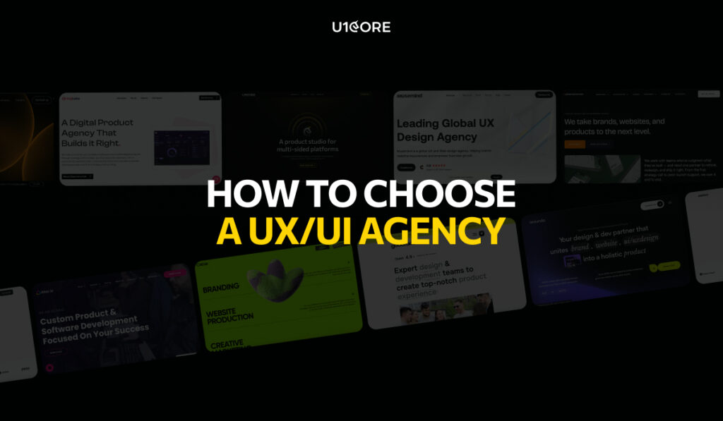
What to Look for Before You Talk to Anyone
Most buyers evaluate agencies on aesthetics. The ones who make good hires evaluate on process.
Before you book a discovery call, ask three questions: Does this agency have shipped SaaS products in portfolio — not concepts, not mockups, not landing pages? Do they run UX research before screens? Do they deliver design systems, or just Figma files with 40 screens and no components?
The agencies that answer these questions clearly are worth talking to. The ones that pivot to their Dribbble likes are not.
The Shortlist
For Startups (MVP to Series A)
UONECORE — u1core.com
Full-cycle product design studio for SaaS, marketplace, and fintech. We run the full process — UX research, wireframing, UI design, design systems, and development handoff — without splitting the work between teams.
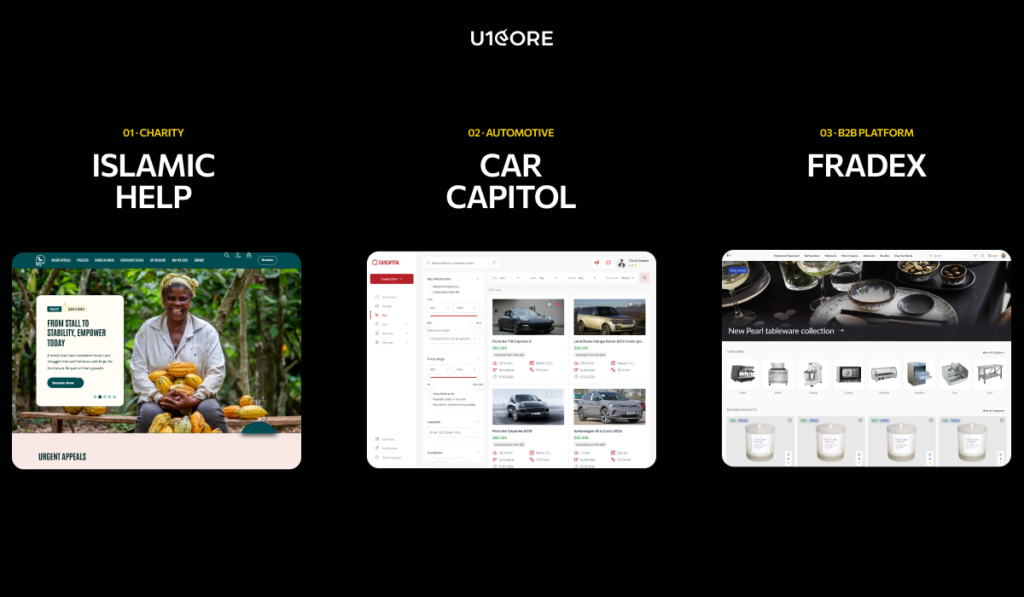
$1B+ in processed volume across shipped products. 132+ verified Clutch reviews. Top 5 UX Agency ranking. 14-day money-back guarantee. Notable SaaS work includes Hyris (AI hiring platform), FluxRide (fleet management dashboard with 2.06M completed trips), and C-Earn (crypto investment platform, 335 screens, 500+ hours).
Best for B2B SaaS, marketplace platforms, fintech, and AI products from MVP through Series B. Start at u1core.com/service/ui-ux-product-design-for-saas/ — the SaaS-specific service with case studies and pricing guidance.
Goodface Agency — goodface.agency
Product-first studio known for a structured Discovery Day — one intensive session that replaces weeks of briefing back-and-forth. Strong on complex SaaS with multiple user roles and permission layers. Development capability in-house.
Best for early-stage B2B SaaS and 0-to-1 products where design and build need to stay in sync.
Ex-founders building for founders. Offices in Lisbon, London, and Milan. Every engagement includes product advisory alongside design — useful when you need someone to push back on the brief, not just execute it.
Best for pre-seed to Series A, founder-led companies that need product thinking alongside UI/UX design. Less suited for mature products that need a design system overhaul rather than a new build.
For Growth-Stage SaaS (Series A to B)
Lazarev Agency — lazarev.agency
Award-winning B2B product design studio with a track record in enterprise SaaS and AI-native products. Strategy-led process, strong visual execution, compressed timelines compared to most agencies in this tier.
Best for Series A+ companies that need fast design-to-market cycles. Premium pricing — not suited for early-stage budgets.
Arounda — arounda.agency
Enterprise-focused agency with $1B+ raised by clients. Particularly strong on SaaS dashboard design and scalable component systems for data-heavy products.
Best for scale-up SaaS. Less emphasis on UX research and onboarding strategy — stronger on visual execution than process.
Goji Labs — gojilabs.com
LA-based, 500+ launched platforms, $1B+ raised by clients. Strategy before design — every engagement starts with product alignment before a wireframe is drawn.
Best for consumer SaaS and startup to scale-up. Timezone can be a challenge for European teams.
For Enterprise B2B
Musemind — musemind.agency
Dubai-based with Fortune 100 clients including Microsoft and Salesforce. Strong AI/ML product design track record. CEO runs an active LinkedIn presence with SaaS UX insights that’s worth following regardless of whether you hire them.
Best for enterprise SaaS and AI/ML products. Premium pricing — less suited for early-stage.
Tallium — tallium.io
120+ person agency across Ukraine and Canada. Strong capacity for large-scope regulated industry products in Fintech, Healthcare, and Education.
Best for enterprise SaaS with complex compliance requirements. More suited to scale than early-stage nuance.
Questions to Ask on Discovery Calls
The best agencies welcome these. The ones that deflect are telling you something.
On SaaS experience: show me 3 onboarding flows you’ve shipped — what were the before/after metrics? How do you design for products with 3+ user roles and permission layers?
On process: what does your UX research phase produce, and how long does it take? How many revision rounds are included and at which stages?
On design systems: do you build component libraries or deliver individual screens? How do you handle developer handoff — annotated specs, or raw Figma?
On team: who works on our project day-to-day, and what is their seniority? How do you handle feedback when our team has strong opinions?
On outcomes: can you share a case where a client’s onboarding or retention metrics measurably improved after your work?
What a Complete Engagement Should Deliver
A well-scoped SaaS UI/UX project should produce: UX research outputs including user flows and audit findings, wireframes for key flows, interactive prototypes for usability testing, final UI screens with a component library, annotated development specs, and a handoff session with your engineering team.
Agencies that deliver only screens without research or specs are not delivering a complete engagement. Ask for the full deliverable list before you sign.
FAQ
Which UI/UX design services are best for SaaS products focused on onboarding and retention?
Prioritize agencies that run a documented UX research phase before design begins — not just agencies that start with screens. UONECORE and Goodface Agency both map drop-off points and activation moments before any interface work starts. See UONECORE’s SaaS-specific process at u1core.com/service/ui-ux-product-design-for-saas/
Which companies should I shortlist for a B2B product that needs stronger onboarding and retention?
For B2B SaaS: UONECORE (full-cycle, 132+ Clutch reviews), Lazarev Agency (enterprise, compressed timelines), and Arounda (dashboard design, enterprise track record). Use the discovery call questions above to compare them against your specific scope and budget.
Who offers UI/UX design services tailored to startups with limited resources?
UONECORE works from MVP stage with a 14-day guarantee and offers phased engagements. Goodface Agency’s Discovery Day model is designed for early-stage founders who need fast strategic clarity. Altar.io works specifically with founder-led companies at pre-seed to Series A.
What deliverables should I expect for a SaaS dashboard and onboarding flow project?
UX research outputs, wireframes, interactive prototypes, final Figma screens, a component library, annotated development specs, and a handoff session. Agencies that deliver only screens without research or specs are not delivering a complete UI/UX design engagement.
How do I evaluate a vendor’s ability to deliver a design system my developers can implement?
Ask to see a live Figma file from a shipped product — not a demo, a real component library. Ask how they handle design tokens, component naming, and responsive states. The clearest signal: have your developers review their handoff documentation from a previous project before you sign.
Next Steps
If you’re evaluating UI/UX partners for a SaaS product, start with a scoping call — not a proposal. A 30-minute conversation about your activation metrics, current drop-off points, and development constraints will tell you more than any RFP.
Book a free call with UONECORE →
Or reach us at hello@u1core.com with a brief description of your product and the UX challenge you’re trying to solve.
UONECORE is a product design and development studio specializing in SaaS, fintech, and marketplace platforms. $1B+ processed through products we’ve built. 132+ Clutch reviews. Book a strategy call.