Research
Most proxy sites bury key facts behind technical jargon, so buyers can’t compare providers quickly. We analyzed competitors and what users check first (speed, coverage, pricing, reliability) and put those answers at the top of every page


ProxyGuard: Secure Proxy Service Website for Individuals and Businesses
A clear, trust-first website for a proxy provider with 102M+ IPs in 200 countries: four proxy types, simple pricing and built-in network tools in one place. 25+ screens and a full UI kit in 60+ hours.
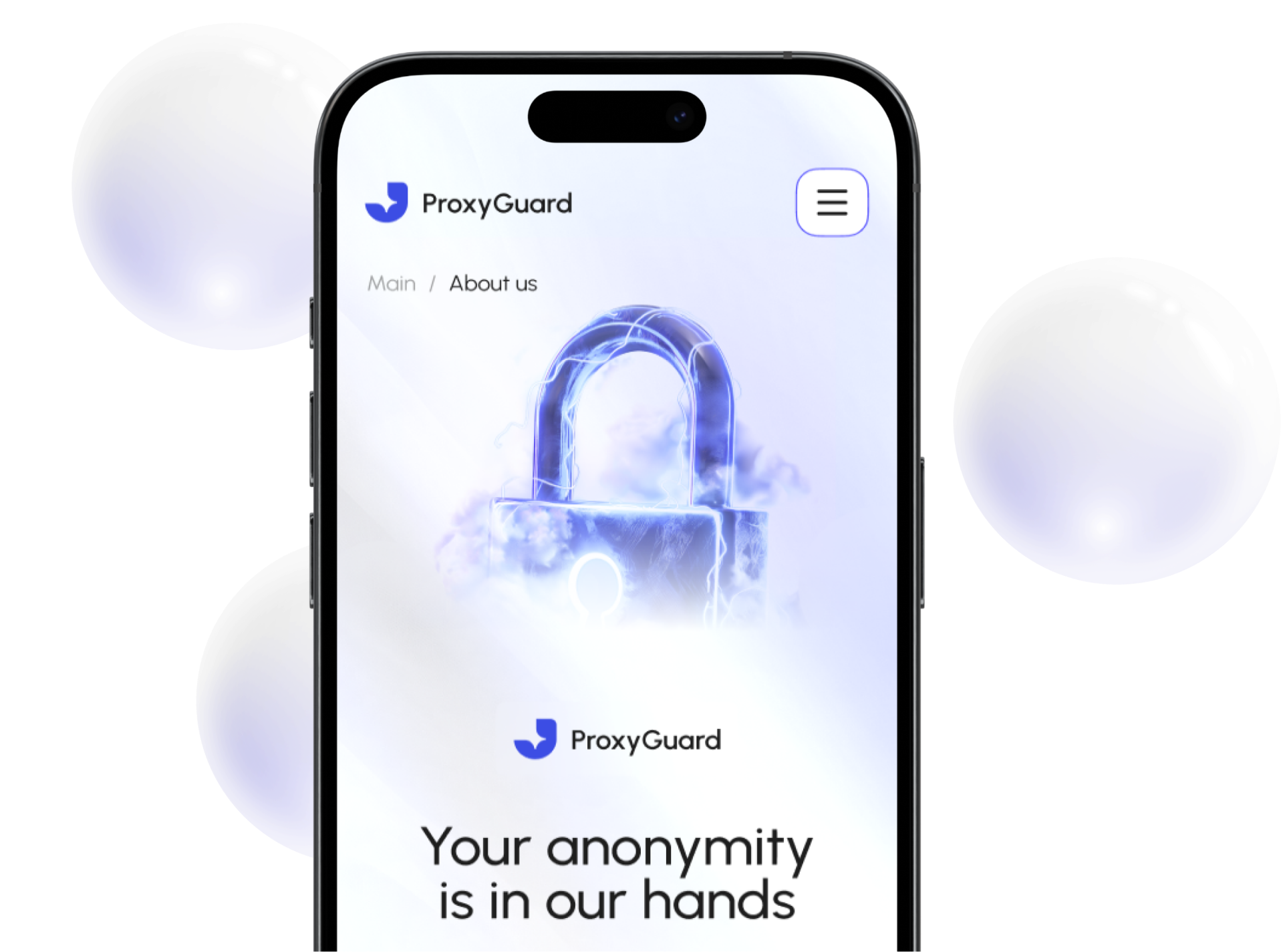
Proxy services look alike and feel technical to most buyers. The task was a website that makes ProxyGuard’s scale and security clear in seconds and leads visitors to a free trial, on desktop and mobile.
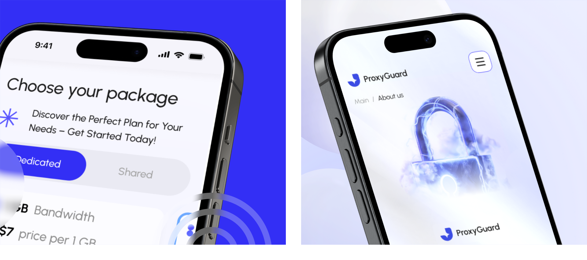
Four proxy types, five network tools and flexible pricing easily turn into a confusing catalog. We structured everything into one clear architecture, so any product or tool is two clicks away and pricing is easy to compare.
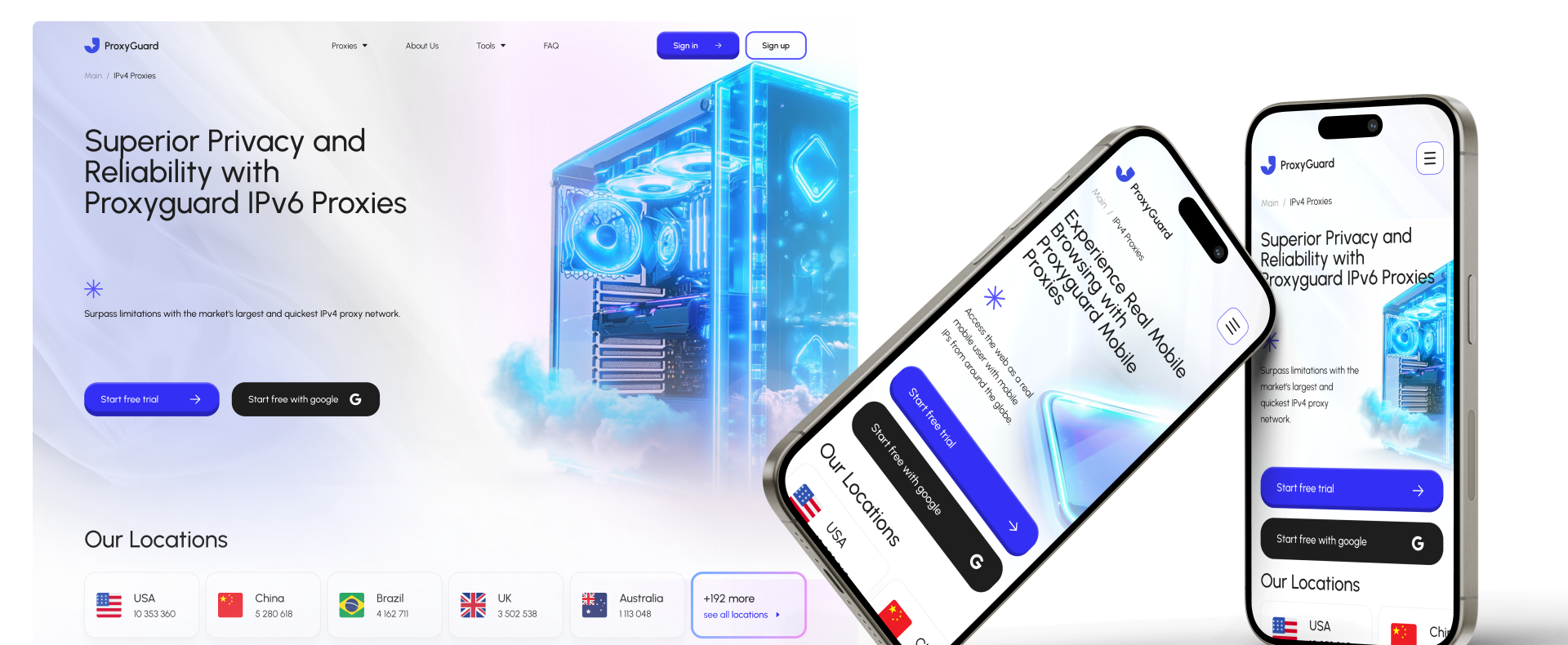
25+ screens, 30+ components and a full UI kit delivered in 60+ hours. A responsive site where users compare proxies, pick a plan and test their connection without leaving the page.
Most proxy sites bury key facts behind technical jargon, so buyers can’t compare providers quickly. We analyzed competitors and what users check first (speed, coverage, pricing, reliability) and put those answers at the top of every page
A proxy brand without a clear message blends into the market. We defined goals, audience, and key offers first, then built the page structure around them.
Too many products slowed the path to sign-up. We mapped the flow from hero to plan selection and cut every step that didn’t help the decision.
Buyers choose a proxy by speed, coverage, and trust. We studied competitors and user pain points, then put those answers upfront: stats, locations, uptime.
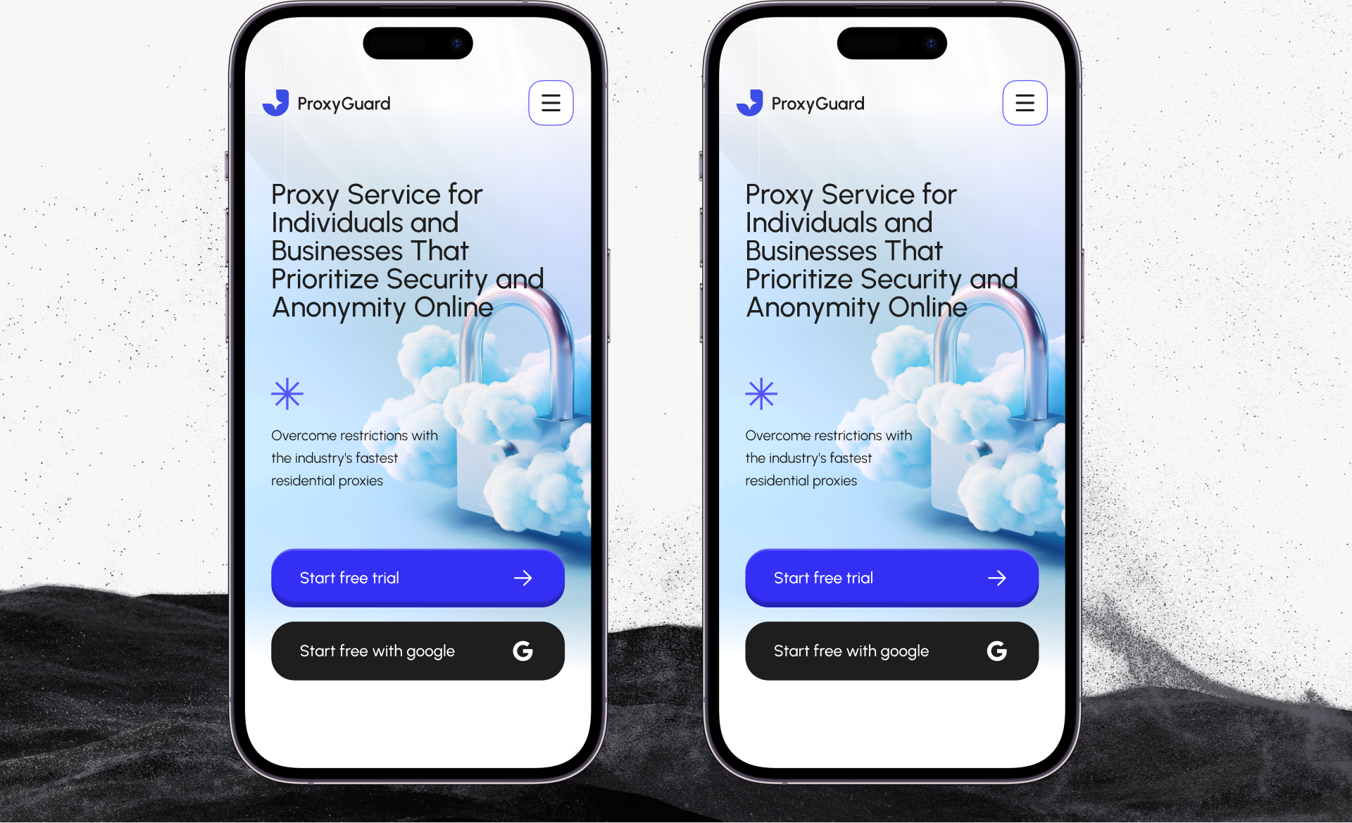
Security products often look cold and heavy. We chose a lighter direction: bright blue, soft gradients, and glass 3D visuals that feel safe and modern.
Too technical scares off individuals; too simple loses businesses. We tested several directions and kept the one that works for both audiences.
Dense data like pricing, locations, and tool results had to stay readable. We built clean layouts with clear hierarchy that adapt to any screen.

Book an introduction call
During this call we do a quick intro and discuss your project and its specific needs.
Book an introduction call
During this call we do a quick intro and discuss your project and its specific needs.

Book a free consultation with us, so we will frame your product vision and strategy.

We’ve received your request and our team is already reviewing it. We’ll get back to you as soon as possible to discuss how we can help you achieve your goals.
Looking forward to collaborating with you!

We’ve sent the download link to your email. Check your inbox (and spam folder just in case) to access the eBook.
We hope you find it valuable for your Web3 journey. If you have any questions or feedback, feel free to reach out!

We want your Web3 website to be great even if you don't hire us.