




- Article
Top UX Agencies Specializing in Fintech KYC Flow Solutions


Web3 has a design problem. Every year dozens of technically sound protocols launch and fail to find users — not because the blockchain didn’t work, but because the interface did.
The projects that crossed into mainstream use — Uniswap, MetaMask, OpenSea, Aave — succeeded as much through interface decisions as through protocol innovation. This guide covers what makes Web3 UX different, what the core challenges are, and how to approach Web3 design and development the right way.
Web3 breaks from Web2 at the trust model, error model, and consequences level.
Ownership is real and irreversible. A mistaken bank transfer can be reversed. A mistaken on-chain transfer cannot. Every action that touches assets needs to be unambiguous before execution and clearly irreversible after.
There is no account in the traditional sense. Web3 identity is a wallet address — a key pair the user controls. No password reset. No account recovery. The learning curve is front-loaded in a way Web2 never was.
Gas fees introduce a pricing layer Web2 never had. Every transaction costs gas — a fee that fluctuates in real time. A user who transacts at the wrong moment may pay 10x what they expected. This is a core design problem, not an afterthought.
Smart contracts replace trust in institutions. Most users can’t read a contract. The design challenge: communicate what a contract does, what permissions it requests, and what risk it carries — in language a non-technical user can act on.
Trust in Web3 has to come from the interface — because there is nothing else.
Make every action explicit. Not “confirm” — but: “You are swapping 1.5 ETH for approximately 4,230 USDC. Slippage: 0.5%. Gas: $3.20.” Every variable stated. Every consequence previewed.
Surface permissions in plain language. “This contract is requesting unlimited permission to spend your USDC — consider approving only the amount you need” has directly prevented billions in losses during exploits.
Build human-readable audit trails. “Swapped 1.5 ETH for 4,230 USDC on Uniswap v3 — June 14, 2026, 14:32 UTC — $3.20 gas.” Not a raw hash.
Communicate risk levels. A stablecoin transfer on a battle-tested protocol carries different risk than liquidity in a new unaudited pool. The interface should reflect that — not bury it in a terms-of-service link.
Web3 onboarding is the hardest UX problem in the industry. The gap between “I heard about this” and “I’m using it” requires understanding wallets, acquiring crypto, navigating gas fees, and making irreversible decisions — before experiencing any value.
Most products put a “Connect Wallet” button and assume the user knows what to do. The result is a conversion cliff that cuts off most potential users before they see the product.
Separate the learning curve from the doing curve. Explain what’s about to happen before asking users to do it. Progressive disclosure works: design the first experience around one action that delivers clear value, layer complexity in later.
Offer multiple entry paths. Users arrive at different stages — some with a funded wallet, some with no wallet, some to complete one specific action. A single onboarding flow that tries to serve all three serves none well.
Test with non-crypto users. Most Web3 products are designed by teams who’ve been in crypto for years. Usability tests with first-timers surface problems no internal review catches.
Which wallets to support matters. MetaMask remains most common for desktop, but Coinbase Wallet, Rainbow, WalletConnect, and Phantom all have significant user bases. Supporting only MetaMask excludes a meaningful portion of users.
Network mismatches — user on Ethereum, product on Polygon — are one of the most common failure points. Catch them proactively. Identify the mismatch, explain it, provide a one-click switch before any transaction is attempted.
Transaction confirmation: show exactly what the user is about to sign in the product UI before the wallet prompt appears. Users should never encounter new information in the wallet popup.
Error handling: every transaction failure needs a designed state with plain-language explanation and clear recovery path. This is unglamorous work — and exactly what separates products users trust from products they avoid.
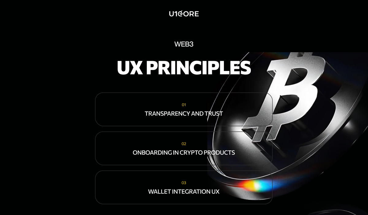
The jargon wall. Gas, slippage, seed phrases, impermanent loss — use plain language by default, technical terms available on request.
Irreversibility without warning. Web2 trains users to expect reversibility. Make irreversibility prominent in confirmation flows — not a checkbox at the bottom of a modal.
Gas fee opacity. Always show gas in USD. Show total transaction cost. Indicate whether current prices are low, normal, or high.
Network confusion. Never let a user attempt a transaction on the wrong network. Catch and resolve mismatches before they cause failures.
Broken loading and empty states. Every state needs design: loading with estimated time, empty with context, error with explanation, pending with status and confirmation estimate.
No inline help. Inline explanations at the exact point of confusion outperform any documentation library. Build help into the interface at critical moments.
Uniswap reduced a complex AMM swap to two token inputs and one button. The price impact warning is one of the cleaner risk communication implementations in DeFi — contextual, clear, not alarming unless warranted.
Lesson: identify your core use case, make it radically simple, ruthlessly separate it from advanced functionality.
OpenSea communicated what mattered — floor price, volume, verified status — without overwhelming users. Its weakness: a verification checkmark that implied more vetting than the platform could consistently deliver. Trust UI is a promise. Design it only for what you can guarantee.
Lesson: at scale, you’ll be held to every implication your interface makes.
Aave explained liquidation risk through one number: the health factor. Green means safe. Red means danger. One color-coded indicator replaced the need to understand collateralization ratios and dynamic interest rates.
Lesson: find the single indicator that summarizes the most important risk and make it the most prominent element.
Figma — dominant for Web3 UI/UX. Build reusable component libraries for wallet connection modals, transaction confirmation patterns, token inputs, and gas displays. Teams with these libraries handle edge cases at a fraction of the cost.
Tenderly — simulate smart contract transactions before mainnet. Understand what can go wrong before designing error states, not after launch.
Rainbow Kit and Web3Modal — most common open-source libraries for wallet connection UX. Pre-built flows for multiple wallets across multiple chains.
Dune Analytics — query on-chain data for real usage insights: which pairs users swap, average transaction sizes, return frequency. Surfaces what off-chain analytics can’t.
Hotjar and FullStory — session recording to identify exactly where users drop off. Combined with on-chain data, gives a complete picture of UX failure points.
Account abstraction is reshaping onboarding. ERC-4337 enables email or social login, gas sponsorship, and transaction bundling. Products using Privy, Dynamic, or Magic are seeing substantially higher conversion. Design challenge: users who onboard through social login don’t know they have a blockchain wallet or how to access assets outside the product.
Mobile-first is baseline. Most Web3 users in growth markets access crypto on mobile. Products designed desktop-first consistently underperform. Bottom sheet navigation, large touch targets, swipe-to-confirm are becoming standard.
Contextual education is replacing documentation. Leading DeFi products embed explanations directly at the point of need — not in a separate help center that most users never visit.
Cross-chain UX is a core problem. Users hold assets across Ethereum, Arbitrum, Base, Solana simultaneously. Products that handle this show unified portfolio views, clear chain indication, and bridging flows that explain time and cost upfront.
Micro-interactions are a trust signal. In a space where users make irreversible decisions with real money, interaction quality directly affects perceived trustworthiness. Rough interfaces lose users the moment an alternative appears.

Web3 design isn’t harder because the concepts are more abstract. It’s harder because the consequences of poor design are more severe. A confusing onboarding in a Web2 app loses you a user. A confusing confirmation screen in a Web3 app can lose a user their assets.
The products that will define Web3 in the next three years are being designed right now — by teams that take UX as seriously as protocol mechanics. The hardest problem in the space has never been making something that works. It’s always been making something that works for everyone.

Need help designing a Web3 product users actually understand? U1CORE has shipped DeFi platforms, NFT marketplaces, and exchange infrastructure across multiple chains. See our Web3 work or get in touch.
U1CORE is a product design and development studio specializing in Web3, marketplace platforms, and custom software development. $720M+ processed through products we’ve built.

Book an introduction call
During this call we do a quick intro and discuss your project and its specific needs.
Book an introduction call
During this call we do a quick intro and discuss your project and its specific needs.

Book a free consultation with us, so we will frame your product vision and strategy.

We’ve received your request and our team is already reviewing it. We’ll get back to you as soon as possible to discuss how we can help you achieve your goals.
Looking forward to collaborating with you!

We’ve sent the download link to your email. Check your inbox (and spam folder just in case) to access the eBook.
We hope you find it valuable for your Web3 journey. If you have any questions or feedback, feel free to reach out!

We want your Web3 website to be great even if you don't hire us.