Are You Ready for Your SaaS or Web3 Launch? Here’s a Checklist for Success

Every founder I’ve talked to before a launch says the same thing: “We’re almost ready.”

Almost. That word does a lot of work.

Because ready to build and ready to launch are two completely different states. And most teams — even good ones — confuse them. They spend eight months on the product and three weeks on everything that happens after someone lands on the page.

Then the launch goes quiet. And nobody really knows why.

So here’s what we actually check before pushing anything live. Not theory — things we’ve learned the hard way, working on SaaS and Web3 products across different markets.
You can’t explain what it does without jargon.

This is the first sign something is off. Not because the product is bad — but because the thinking isn’t clear yet.

If your landing page opens with “a decentralized protocol enabling trustless cross-chain liquidity” — you haven’t figured out who you’re talking to. And if you don’t know that, the launch will feel like shouting into a room and hoping someone turns around.

Test it on someone who doesn’t work in your industry. If they don’t get it in ten seconds, you’re not done yet. Clarity isn’t a copywriting problem. It’s a positioning problem.

You know the audience in theory, not in practice.

“Crypto users” is not an audience. “B2B SaaS companies” is not an audience. An audience is a specific person with a specific problem who is actively looking for something right now.

The narrower you go on launch, the more it feels like the product was built for someone. Because it was.

Two hundred right people will do more for your growth than twenty thousand wrong ones. The algorithm rewards signal. So do investors.

Onboarding promises things the product doesn’t do yet.

This one kills trust quietly. Users arrive expecting one thing, experience another, and leave without saying anything. You just see the number drop.

Ship what works. Be upfront about what’s coming. Users in Web3 especially — they’ve been burned before. Honesty reads as confidence, not weakness.

Design and engineering never looked at the final product together.

This is one of those things that sounds obvious and almost never actually happens.

The designer approved the flow. The developer shipped the build. But nobody sat down and looked at the thing the user actually sees and asked: is this what we meant?

The gap between Figma and production is small. But it’s exactly where things break. A misaligned button state, a loading screen with no copy, an error message that says “something went wrong” and nothing else. Small things that add up to a product that feels unfinished.
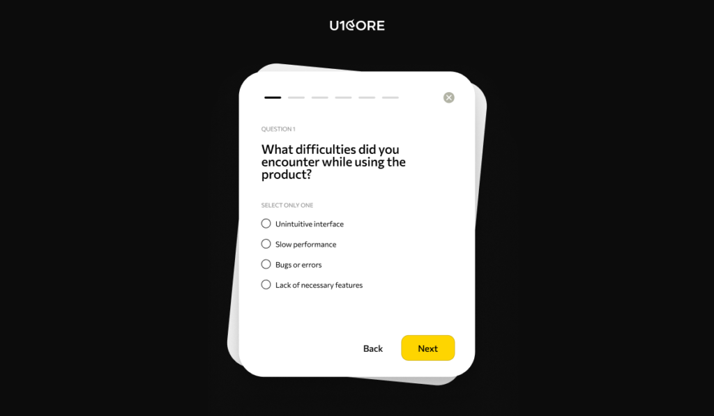
There’s no feedback structure from day one.

Not a survey in month three. A real way to understand what users are doing — and why they stop.

The products that pull ahead aren’t the ones that launched best. They’re the ones that learned fastest. If you’re not collecting structured signal from the first two weeks, you’re navigating without a map.

The brand doesn’t match the ambition.

You can have the best product in the category. But if the landing page looks like it was made in a weekend, if the UI feels disconnected from the marketing, if there’s no visual logic between touchpoints — people make a judgment before they read a word.

In SaaS and Web3, trust is everything. And trust starts with how things look. Not because people are shallow. Because attention is short and signals are fast.

Design isn’t decoration. It’s the first argument you make for why someone should take you seriously.

You don’t have distribution before launch day.

Not a plan for distribution. Actual distribution. A community, a partner, an audience that already trusts you enough to pay attention.

If you’re starting from zero on launch day, you’re making everything harder than it needs to be. Distribution isn’t a marketing function. It’s infrastructure. And you build infrastructure before you need it, not after.

There’s one question I always come back to at the end of this list.

Why now?

Not why this product exists. Why does it need to exist right now, in this moment, for these specific people?
If the answer is clear — you’re probably ready. If it’s not — that’s worth one more week before you press go.

Launches are hard to undo. Take the week.
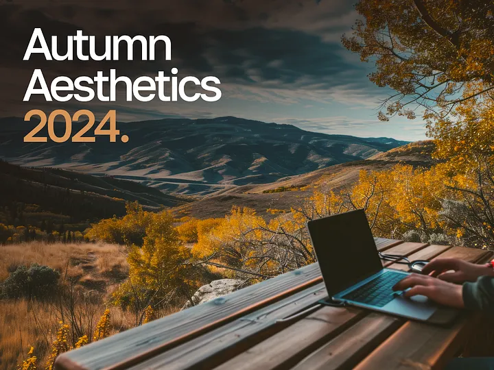
Autumn Aesthetics: Emerging Web Design Trends to Watch in Fall 2024

As the golden leaves fall and the air turns crisp, the web design world also embraces the transformative spirit of autumn. This Fall 2024, we’re witnessing an exciting array of trends inspired by the season’s unique charm.

The Psychology of Autumn in Web Design

In addition to the visual appeal, autumnal themes can also have a profound psychological impact on website visitors. Studies have shown that warm colors, such as those found in autumn, can evoke feelings of convenience, nostalgia, and trust. By incorporating these elements into web design, businesses can create a more welcoming and inviting online presence.

Moreover, the concept of seasonal change can resonate deeply with users. Autumn symbolizes a time of transition, renewal, and introspection. By aligning website design with this seasonal theme, businesses can tap into the emotional resonance of autumn and create a more meaningful connection with their audience.

Here’s a look at how the magic of autumn is influencing the digital design landscape:

  • Nature-Inspired Color Palettes
    Autumn’s color spectrum is a feast for the eyes; this fall, web designs reflect its rich, earthy tones. Imagine deep, velvety burgundies, warm saffrons, and muted moss greens creating a cozy and sophisticated canvas.

Designers are also experimenting with gradient overlays that capture the nuanced play of light as the days grow shorter, adding a dynamic, seasonal touch to their color schemes.

  • Layered Textures and Overlays
    Fall’s layered textures — think of the intricate patterns of frosted leaves or the inviting warmth of a knitted scarf — are making their way into web design. This season, layered textures and overlays are not just about adding depth; they’re about creating an immersive, tactile experience.

Visual elements might appear to gently ripple or shift, mimicking the natural world’s subtle movements and providing a richer, more engaging user experience.

  • Minimalist Layouts
    In a nod to the serene beauty of autumn, minimalist layouts are taking center stage. But this fall, minimalism comes with a twist. Clean lines and spacious layouts are enhanced with autumnal accents — like soft shadowing and gentle gradients — that add a touch of warmth and depth.

The result? A user interface that feels both elegant and inviting, allowing the seasonal elements to shine without overwhelming the senses.

  • Embracing Natural Forms
    Fall’s organic beauty is reflected in web design through the use of flowing, asymmetrical shapes. Designers are steering away from rigid grids and embracing the fluidity of nature, with elements that mimic the gentle curve of a falling leaf or the uneven edge of a pumpkin.

These organic forms bring a sense of natural spontaneity to web layouts, creating a visually appealing and dynamic user experience.

  • Subtle Animations and Micro-Interactions
    To evoke the subtlety of autumn’s charm, designers are integrating delicate animations and micro-interactions. Picture a website where elements gracefully shift color or gently animate as you scroll, echoing the gentle sway of branches or the rustling of leaves.

These understated movements add a layer of sophistication and interactivity, making the digital experience feel as enchanting as a walk through a fall forest.

  • Interactive Visual Elements
    This fall, storytelling through interactive visuals is on the rise. Websites are incorporating interactive features that invite users to engage with autumn-themed elements — like a virtual stroll through a fall landscape or an interactive harvest scene.

These engaging experiences not only captivate users but also create a memorable, immersive connection with the season.

At Oliinykk Design, we’re excited to embrace these autumn-inspired trends in web design projects. Our team of expert designers crafts unique, seasonal experiences that blend nature-inspired colors, layered textures, minimalist layouts, organic shapes, and subtle animations.

Let us help you celebrate the magic of fall with a digital presence that captivates and engages, inviting users to experience autumn in a new way.

Contact us today to bring these trends to life in your next project.