- Article
What We Learned from Building Marketplaces for 3 Completely Different Industries in One Year


If you’re building a SaaS product, design isn’t the last step before launch. It’s the first decision that determines whether users activate, retain, and pay — or sign up once and never return.
This guide covers what UX/UI design for SaaS actually means in practice, why it matters more for SaaS than almost any other product category, and how to approach it if you’re a startup founder working with limited time and budget.
SaaS products live or die on retention. Unlike e-commerce where a bad experience costs you one sale, a bad SaaS experience costs you a customer every month — for the lifetime of the contract.
The numbers are simple. A user who doesn’t understand your product in the first session won’t come back for the second. A user who can’t complete the core action in the first 3 minutes won’t upgrade to paid. A user who hits friction at any point in the flow has 10 alternatives one Google search away.
This is why product design for SaaS is fundamentally different from designing a website or a mobile app. You’re not designing a visit. You’re designing a habit. Every screen either builds that habit or breaks it.
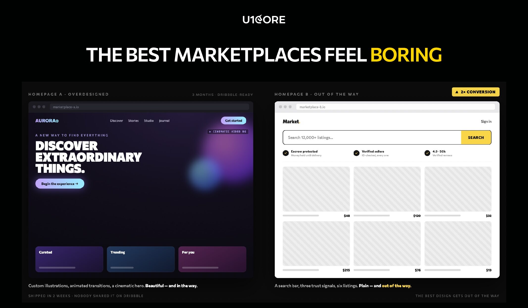
The SaaS products that grow fastest aren’t the ones with the most features. They’re the ones where the UX removes every barrier between signup and the moment the user thinks “I need this.”

Onboarding is not a tutorial. It’s the bridge between “I signed up” and “I got value.”
Most SaaS startups make the same mistake: they ask for too much before showing any value. Name, email, company size, role, team count, use case — all before the user sees the product.
The principle: show value before you ask for information. Let the user experience the core action first. Then collect the data you need — with context for why you need it.
We’ve seen SaaS products cut onboarding from 7 steps to 3 and double their activation rate. Not because 7 steps was too many — but because 4 of those steps had no connection to the user’s first “aha” moment.
The best SaaS onboarding feels like the product is already working for you — not like you’re filling out a government form to access it.
Every feature you show on screen competes for attention with the feature the user actually needs.
SaaS products accumulate features over time. That’s natural. What’s not natural — but necessary — is the discipline to hide complexity from users who don’t need it yet.
Progressive disclosure is the principle: show only what’s relevant to the user’s current task. Advanced features exist — but they appear when the user is ready, not when the product manager wants to show them off.
The SaaS products that feel “simple” aren’t the ones with fewer features. They’re the ones with better information architecture — where every feature lives exactly where you’d expect it.
UX design for SaaS doesn’t end at the Figma file. If the page takes 4 seconds to load, the design doesn’t matter.
Performance is a UX decision. Every loading state, every skeleton screen, every transition — these are design problems, not engineering problems. The UI/UX design team should be designing for perceived performance as much as for visual quality.
A dashboard that loads in 2 seconds with a well-designed skeleton screen feels faster than one that loads in 1.5 seconds with a blank white flash. Perception is reality in SaaS UX.

Every SaaS product design process should start with discovery — not mockups.
Discovery means understanding who your users are, what problem they’re solving, and what they’re currently using instead. It means mapping the competitive landscape — not to copy, but to understand what users already expect.
At U1CORE, every product design engagement starts with a 2-week discovery phase. User interviews. Competitive audit. Flow mapping. Product audit if there’s an existing product. The goal is to make every design decision that follows evidence-based — not assumption-based.
The teams that skip discovery save 2 weeks. Then spend 3 months redesigning what they should have researched.
Prototyping bridges the gap between strategy and screens.
Before committing to full UI design, the core user flows should be prototyped and tested. Not pixel-perfect. Functional enough to answer: does this flow make sense to a user who’s never seen the product?
Interactive prototypes catch structural problems that static mockups hide. A wireframe can look logical on screen. A prototype reveals that the user expected “Save” to be on the left, not the right — and that one mismatch caused 30% of test participants to hesitate.
Prototype early. Test cheap. Fix before the design system is built — not after.
Usability testing is not a luxury. It’s the cheapest insurance against building the wrong thing.
Five users. Thirty minutes each. The insights from even a small test are more valuable than weeks of internal debate about button placement.
What to test: the core action. Can a new user complete the primary task — the thing your SaaS product exists to do — without help? If not, no amount of visual polish makes the product usable.
Test with real users who match your target audience. Internal team members are too close to the product to give valid feedback. They already know where everything is.

Designing for power users first. Your power users will learn anything. Your new users will leave in 60 seconds if confused. Design for the new user. Let power users discover depth over time.
Treating the dashboard as the product. Most SaaS dashboards show 20 metrics on login. The user needs 3. The dashboard should surface what matters now — not everything the database contains.
Ignoring empty states. A new user’s first session is full of empty states — no data, no history, no activity. If those screens show blank tables and “No data available” — the product feels broken before the user starts.
Skipping mobile. Even B2B SaaS gets mobile traffic. If your web design doesn’t work on a phone, you’re losing the CEO who checks your product between meetings.
Adding features instead of fixing flows. When conversion drops, the instinct is to add something new. Usually the fix is removing friction from what already exists. Audit the flow before you expand the feature set.

Not every design agency is built for SaaS. Here’s what to look for:
Do they start with discovery? If the first deliverable is a mood board — they’re not a SaaS design partner. They’re a visual studio. The first deliverable should be a strategy document.
Have they shipped SaaS products? Portfolio pieces are one thing. Products in production with real users are another. Ask to see a product that’s live — not just a Behance case.
Do they think in activation, not aesthetics? A SaaS design partner should ask about your onboarding drop-off rate before they ask about your brand colors.
Can they work with a small team? Most startups have 3-8 people. The agency needs to embed in your workflow — not create a parallel process. If they need a dedicated project manager on your side just to manage them — they’re too heavy.
Do they deliver dev-ready assets?Custom software development teams need organized Figma files with proper components, auto-layout, and specs — not flattened mockups and a PDF.

Before you launch or redesign your SaaS product, run through this:
→ Can a new user reach the core action in under 3 minutes?
→ Does onboarding show value before asking for information?
→ Are empty states designed — or do they show blank tables?
→ Does the dashboard surface what matters now — not everything?
→ Is mobile at least functional — even if desktop is primary?
→ Have you tested the core flow with 5 real users?
→ Does the design system scale — or is every screen custom?
→ Are loading states designed — skeleton screens, transitions, feedback?
→ Can your development team build from the Figma file without guessing?
→ Did you start with discovery — or did you start in Figma?
If more than 3 answers are “no” — the product needs a UX/UI audit before it needs new features.
U1CORE is a product design and development studio specializing in SaaS, fintech, and marketplace platforms. We offer custom product UI/UX design, web design, mobile design, custom software development, app development, branding development, and product audit. $720M+ processed through products we’ve built. Book a strategy call.


During this call we do a quick intro and discuss your project and its specific needs.
During this call we do a quick intro and discuss your project and its specific needs.

Book a free consultation with us, so we will frame your product vision and strategy.

We’ve received your request and our team is already reviewing it. We’ll get back to you as soon as possible to discuss how we can help you achieve your goals.
Looking forward to collaborating with you!

We’ve sent the download link to your email. Check your inbox (and spam folder just in case) to access the eBook.
We hope you find it valuable for your Web3 journey. If you have any questions or feedback, feel free to reach out!