Marketplace Q&A: 10 Questions. Honest Answers.

We’ve built marketplace platforms that process $720M+. The same 10 questions come up every time. Here are the answers we wish someone had written down sooner.


Q1: We have traffic but nobody is transacting — what’s wrong?

Almost always trust. The user landed, looked around, saw a seller they don’t know and a process they don’t understand — and left silently. Running more ads to a platform with a trust gap doesn’t produce more transactions. It produces more data confirming the same problem. Look at your seller profiles — do they show verified identity, completed transactions, and response time, or just a name and a photo? Fix the trust layer first. Then run the ads.
Q2: Our sellers sign up but go inactive after a week — why?

They didn’t get their first transaction. Before that happens, the platform is an experiment. After it happens, it’s a business tool. Show sellers that demand exists before they transact — views, saves, inquiry signals. And audit whether your buyer and seller acquisition is balanced. You can’t design your way out of a liquidity problem. Read what our clients say about results like this on Clutch.

Q3: Users keep transacting off-platform — how do we stop it?

You can’t stop it by locking users in. You stop it by making the on-platform transaction more valuable than the off-platform alternative. Escrow. Dispute resolution. Transaction history. Verified reviews. If your platform doesn’t offer protection, you’re a discovery tool — not a marketplace. And discovery tools don’t capture the transaction.

Q4: Our top 10 sellers generate 80% of GMV — how do we fix that dependency?

You designed for conversion, not distribution. Supplier concentration is almost always a product design problem. The platform made it too easy for power sellers to dominate search results and too hard for new sellers to get their first transaction. Redesign search to surface new sellers alongside established ones. Create a new seller onboarding track that actively drives early transactions. And audit your review system — if it compounds without adjustment, established sellers will always win. See our full portfolio on DesignRush.

Q5: We launched 6 months ago and still feel like a cold-start — what are we missing?

Liquidity, not traffic. Most founders in this situation have users but not enough density in any one category or geography to create a reliable transaction loop. The fix is counter-intuitive: go smaller. Constrain the category. Constrain the geography. Create enough density in a small area to make transactions feel inevitable — then expand.

Q6: Which side do I acquire first — and what happens if I get it wrong?

Acquire supply first in most cases. Buyers come when there’s something to buy. If you get it wrong — you’ll know fast. You’ll have sellers with no buyers, listings with no views, and a churn problem on the supply side within 30 days. There’s no universal answer. There is a right answer for your specific marketplace — and it’s worth a week of thinking before six months of building.

Q7: Our previous agency built something that looked right but broke in production — how do we avoid that?

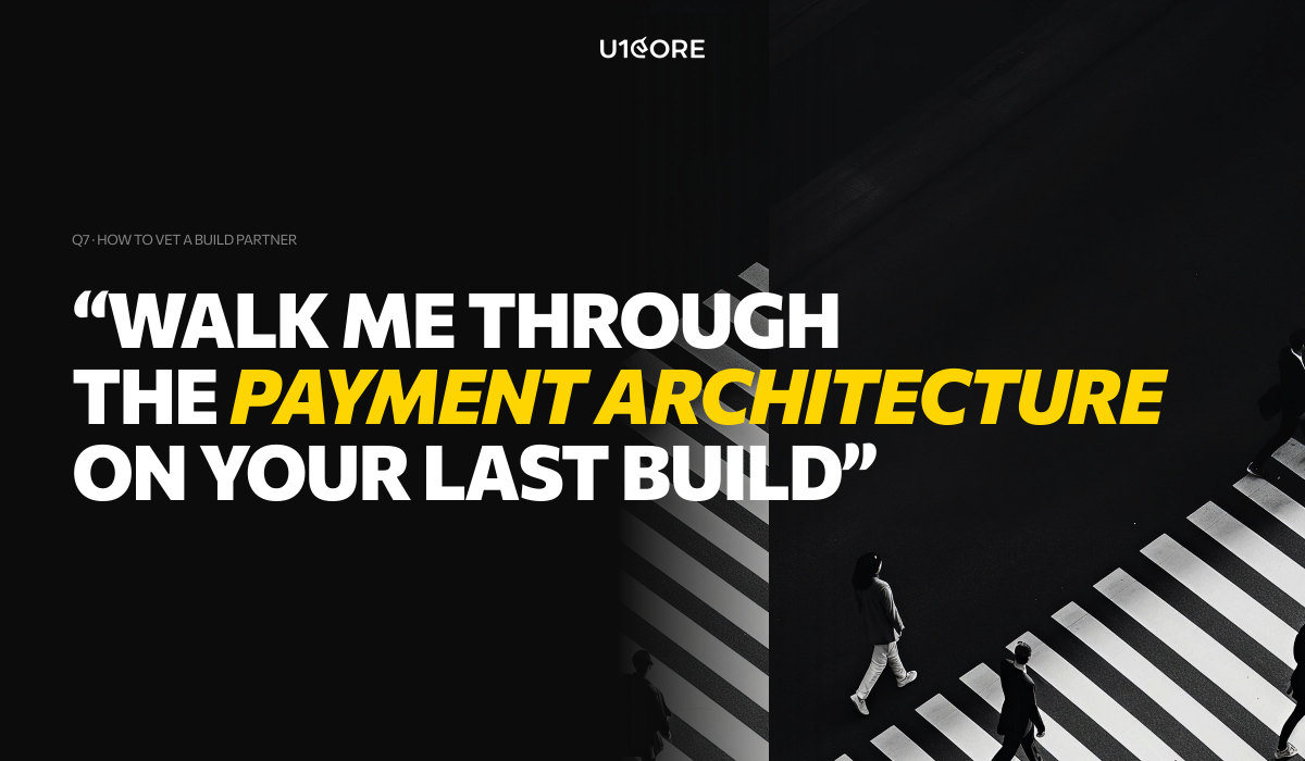
Ask about production specifically — not portfolio. Ask: “Walk me through the payment architecture on your last marketplace build. What edge cases did you design for? What broke anyway?” If the answer is confident and specific — they’ve been through it. If it pivots to the visual design — they haven’t. See what founders say about working with us on Sortlist.
Q8: What absolutely cannot be cut from a marketplace MVP?

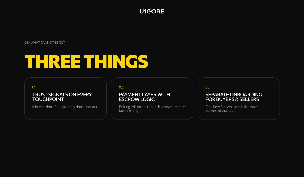
Three things. Trust signals on every transaction touchpoint — if buyers don’t feel safe, they don’t transact. A functional payment layer with basic escrow logic — bolting this on post-launch costs significantly more than building it right the first time. And separate onboarding flows for buyers and sellers — one flow for two completely different users is one of the most common and expensive shortcuts. Everything else can wait. Those three cannot.
Q9: When does a marketplace need a rebuild vs. a redesign?

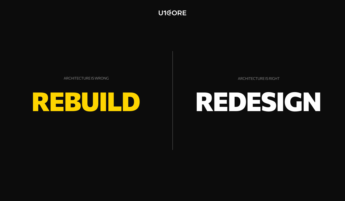
Rebuild when the architecture is wrong. Redesign when the architecture is right but the experience is poor. The signal for rebuild: your payment layer breaks under real volume, your trust system is manual and doesn’t scale, or your onboarding was designed for one user type and you have two. The signal for redesign: users understand the product but drop off at specific points. Most founders think they need a redesign when they actually need a rebuild. Browse our verified agency profile on GoodFirms.
Q10: How do we know if an agency has actually built a marketplace before?

Ask one question: “Tell me about the last cold-start problem you solved.” A team that has built real marketplaces will have a story — which side they acquired first, what didn’t work, what eventually created liquidity. A team that hasn’t will give you a framework. The cold-start problem doesn’t exist in single-sided products. It only reveals itself in marketplaces.

U1CORE designs and builds marketplace platforms — from MVP to scale. $720M+ processed through products we’ve built.
Why Hiring a Generic Dev Agency for Your Marketplace Is a Mistake Most Founders Make Twice

The difference isn’t talent. It’s pattern recognition built from doing this one specific thing repeatedly.

Every week someone sends me a brief.

A two-sided marketplace. Buyers on one side, sellers on the other. A matching problem, a trust problem, a payments problem. And somewhere in the proposal — a shortlist of agencies that have built SaaS tools, mobile apps, and marketing sites for the last five years.

I don’t say this to be dismissive. I say it because I’ve watched too many smart founders spend six months building something that looked right in Figma and broke in production — and discover too late that the team they hired had never actually solved the problems that make marketplaces hard.

The question that reveals everything

There is one question I ask every agency before recommending them for a marketplace build:

“Tell me about the last cold-start problem you solved.”

A generic agency will pause. They might ask what you mean. They might pivot to talking about their design process or their tech stack.

A marketplace studio will have a story. They’ll tell you which side they acquired first and why. They’ll tell you what didn’t work. They’ll tell you what eventually created enough density on one side to pull the other.

The cold-start problem is not a marketing problem. It’s a product design problem. It has to be solved architecturally, in the product, before launch. And you can only know that if you’ve tried to solve it before.

The questions a team asks on day one tell you everything about what you’ll get on launch day.

What generic agencies actually know

Generic agencies are not bad. Many of them are excellent. They build beautiful products, they ship on time, and they understand UX deeply.

What they understand is single-sided products. A SaaS tool has one type of user. A mobile app has one type of user. The entire craft of product design, as most agencies practice it, is built around understanding one user’s needs and serving them well.

A marketplace has two types of users — and their needs are in constant tension.

Buyers want abundant, trustworthy supply. Sellers want abundant, high-quality demand. Every design decision — search ranking, onboarding flow, pricing guidance, review systems, dispute resolution — involves a three-way negotiation between buyer needs, seller needs, and platform health.

This complexity only reveals itself after you’ve built a few marketplaces and watched what breaks.

The problems that only appear in marketplaces

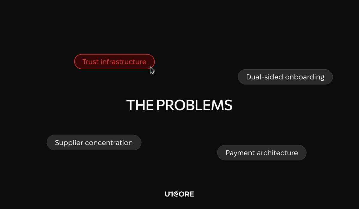
Trust infrastructure. In a marketplace, trust has to be engineered into every transaction from day one. Escrow logic. Identity verification. Dispute resolution that scales. These are not features on a roadmap. They are prerequisites. A generic agency will add them when you ask. A marketplace studio will design them in before the first transaction.

Dual-sided onboarding. Most agencies design onboarding for one user. In a marketplace, you are onboarding two simultaneously. If either side drops off before they see value, the whole platform loses liquidity. The seller who can’t get their first listing live in five minutes will not come back. The buyer who sees three listings in their category will not trust the platform.

Payment architecture. When a generic agency hears “payments,” they think Stripe integration. A marketplace payment layer involves escrow logic, split payouts, variable take rates, refund triggers, and what happens when a seller disappears mid-order. Every one of those scenarios has to be designed before the first transaction. Not after the first complaint.

Supplier concentration. A marketplace where the top ten percent of sellers generate sixty percent of GMV is not a marketplace. It is a dependency. Those sellers know it. This problem has to be designed against from the beginning — not addressed when the first power seller starts negotiating their take rate.

What it costs when the wrong team builds your platform

The mistakes that cost the most are not made in development. They are made in the decisions that precede it — decisions about architecture, about which side to acquire first, about how to structure the payment layer, about what trust infrastructure needs to exist before any real money moves.

A team that has never built a marketplace will make those decisions based on general product principles. Those principles are not wrong. They are just insufficient for the specific problems that multi-sided platforms create.

By the time the insufficiency shows up — in seller churn, in cold-start failure, in a payment layer that breaks under real transaction volume — the cost of fixing it is not a design sprint. It is a rebuild.


What specialization actually looks like

A studio that specializes in marketplaces does not just have marketplace projects in their portfolio. They have a vocabulary.

They talk about liquidity before they talk about design. They talk about take rate optimization before they talk about features. They ask about supplier concentration before they ask about user personas. They have opinions about cold-start strategies that are based on what they have tried and what has failed.

That is what pattern recognition looks like. Not a better process. Not a more experienced team. A set of mistakes already made, already learned from, already designed around.

$720M+ has been processed through platforms we have built at U1CORE. That number is not a marketing claim. It is what happens when you build the right architecture for the right problem.

How to tell the difference before you sign

Ask about the cold-start problem. Listen for a story, not a framework.

Ask about the last payment dispute they designed for. Listen for specifics about escrow logic, not general statements about Stripe.

Ask to see both sides of the onboarding flow from a past project. Not the buyer flow. Both flows. If they only show you one, you know which side got the attention.

The difference is not always visible in a portfolio. It is visible in the conversation.


At U1CORE we design and build multi-sided platforms — marketplaces, exchanges, auction systems, and fundraising platforms. If you are building something in this space and want a team that has been through it before, we would love to hear about it.

The New Rules of Marketplace Building: What the Current Global Situation Changed Forever

The playbook that built Airbnb, Etsy and Amazon doesn’t work anymore. Here’s what replaced it.

Every week someone sends me a deck.

A two-sided marketplace. Network effects. The next big platform in their space. And somewhere in the pitch — a comparison to a company that launched in a completely different world, under completely different conditions, with completely different user behavior.

I don’t say this to be dismissive. I say it because I’ve watched too many smart founders spend a year building something that would have worked in 2019 — and discover in 2026 that the ground shifted while they were building.

The global disruptions of the last five years didn’t just change the environment marketplaces operate in. They changed the foundational assumptions marketplace businesses are built on. Supply chains broke. Cross-border transactions got complicated. User trust eroded. AI commoditized the core value proposition of half the marketplaces that were in someone’s pitch deck three years ago.

Here’s what actually changed — and what it means if you’re building right now.

Trust is no longer a feature. It’s the architecture.

The original marketplace model was simple: bring buyers and sellers together, let reputation accumulate over time, handle disputes when they happen. Trust was a lagging indicator — something that built up through transaction history and reviews.

That model assumed stable participants. Sellers who would still be there next month. Supply that was predictable. Reputation that meant something because the people who built it weren’t going to disappear.

None of those assumptions survived the last five years intact.

Sellers disappeared. Platforms that had operated for years discovered that the trust infrastructure they’d built was dependent on conditions that no longer existed. And users who got burned once — by a seller who vanished, by a transaction that couldn’t be resolved, by a platform that had no answer for what happened when things went wrong — didn’t come back.

The new rule is simple and uncomfortable: trust cannot be something your platform earns over time. It has to be built into the transaction from day one. Escrow that releases on verified delivery. Identity verification that goes beyond an email address. Dispute resolution that scales. These aren’t features on a roadmap. They’re prerequisites.

Global is fragile. Local is defensible.

For a decade, the marketplace narrative was about scale. Go global. Move fast. Own the category everywhere simultaneously.

The last five years proved that global scale without local resilience is a liability.

The marketplaces that survived disruption were the ones with strong local supply. Not because local is always better — but because local held when global broke. Local sellers could deliver when cross-border logistics failed. Local trust networks stayed intact when broader systems didn’t. Local regulatory environments were navigable when international ones became unpredictable overnight.

The marketplaces that struggled were the ones that had optimized for global GMV at the expense of local depth.

The new rule: your marketplace needs to work — really work, with real unit economics — within a single city or region before it earns the right to expand. Not as a pilot. As proof that the underlying model is sound when you strip away the scale that was papering over the problems.

AI commoditized matching. Curation is the new moat.

The original marketplace value proposition was a matching problem. You had supply, you had demand, and your job was to make matching faster and cheaper than the alternatives.

AI makes matching trivially easy for anyone. That’s not a competitive advantage anymore. It’s table stakes.

What AI can’t replicate is trust. Verified quality. A community of participants who chose your platform because it gave them something they can’t get elsewhere. The defensible marketplace businesses of the next decade won’t win on algorithm. They’ll win on the quality of what flows through them and the strength of the relationships they’ve built with the people on both sides.

If your marketplace’s core value proposition is “we surface the right result faster” — that’s no longer a business. It’s a feature that any well-funded competitor can match in a product sprint.

Cold start got harder. Community became the shortcut.

The channels that made marketplace cold starts manageable five years ago — paid social, organic reach, influencer-driven growth — are all more expensive and less effective than they were. The cost of acquiring the first thousand participants on either side of your marketplace has increased significantly across almost every category.

The marketplaces successfully launching today almost universally started with an existing audience. A newsletter. A community. A professional network. A following built around a specific domain. They built the marketplace as a layer on top of relationships that already existed — which meant the cold start problem was already partially solved before a single line of code was written.

This is not a coincidence. It’s a structural shift in what it takes to launch.

The new rule: if you don’t have distribution, you need to build it before you build the platform. Not in parallel. Before.

Regulation became a product decision.

Move fast and figure out regulation later destroyed real businesses. Platforms that had built genuine value for real users discovered overnight liability that changed their unit economics entirely — not because they were doing anything wrong, but because they’d made architectural decisions early that created exposure they hadn’t accounted for.

How you structure the relationship between your platform and your participants — who is an employee versus a contractor, what data you collect, how you handle cross-border transactions — these are product design decisions with legal consequences. They have to be made before you build, because changing them after is expensive in ways that go beyond the engineering cost.

The metric that matters isn’t GMV. It’s switching cost.

GMV told a story about scale. It didn’t tell a story about defensibility.

The real measure of marketplace health is what participants give up when they leave. A marketplace whose sellers make significantly more on the platform than they would through alternatives has something real. A marketplace whose sellers are constantly testing whether they can go direct has a structural problem that growth won’t fix.

Build for switching cost from day one. Not as a retention tactic — as a product philosophy. Every feature, every design decision, every operational choice should make the answer to “why stay?” more obvious than the answer to “why leave?”

The marketplaces that will define the next decade won’t look like the ones that defined the last one.

They’ll start local. They’ll be built on community before they’re built on code. They’ll treat trust as infrastructure, not reputation. They’ll have a clear answer to the switching cost question before they write their first pitch deck.

The old model isn’t wrong. It’s just from a different world.

That world is gone. Build for this one.

Healthcare UX: Design Patterns that Save Lives and Improve Patient Experience

In healthcare, a confusing interface isn’t just a nuisance — it can lead to medical errors. A misread dosage, a missed alert, a form that overwhelmed an exhausted nurse at 3 AM. These aren’t edge cases. They’re documented, recurring failures that cost lives.

According to the WHO’s Digital Health Guidelines, poor digital health design is one of the leading contributors to preventable medical errors globally. UI/UX design services for healthcare products must operate by a fundamentally different standard. This article breaks down the design patterns that matter most — and why getting them right is a matter of patient safety, not just user experience.

What is UX in Healthcare?

UX in healthcare refers to the design of digital interactions between patients, clinicians, and medical systems — covering everything from patient-facing apps to clinical decision support tools, EHR platforms, and medical device interfaces.

Unlike consumer UX, healthcare UX must account for high-stress environments, strict regulatory requirements, and the direct impact of design decisions on patient outcomes. A poorly placed button in a retail app costs a conversion. In a clinical interface, it can cost a life.

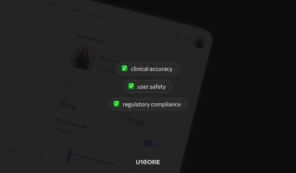
Effective healthcare product design balances three priorities: clinical accuracy, user safety, and regulatory compliance — without sacrificing usability.

Design for High-Stress, Low-Attention Environments

The core assumption of most digital product design — that the user is calm, focused, and unhurried — breaks down completely in healthcare settings.

Clinicians use interfaces mid-procedure and under time pressure. Patients interact with health apps while anxious, in pain, or managing a chronic condition. Medical app UX must be designed for the worst moment, not the best one.

Large touch targets. High-contrast typography. Single-action screens for critical workflows. Error prevention over error recovery — interfaces should make it structurally difficult to enter incorrect information, not just easy to undo it afterward.

The principle is consistent: reduce cognitive demand on users who are already operating near capacity.

Making Critical Information Impossible to Miss

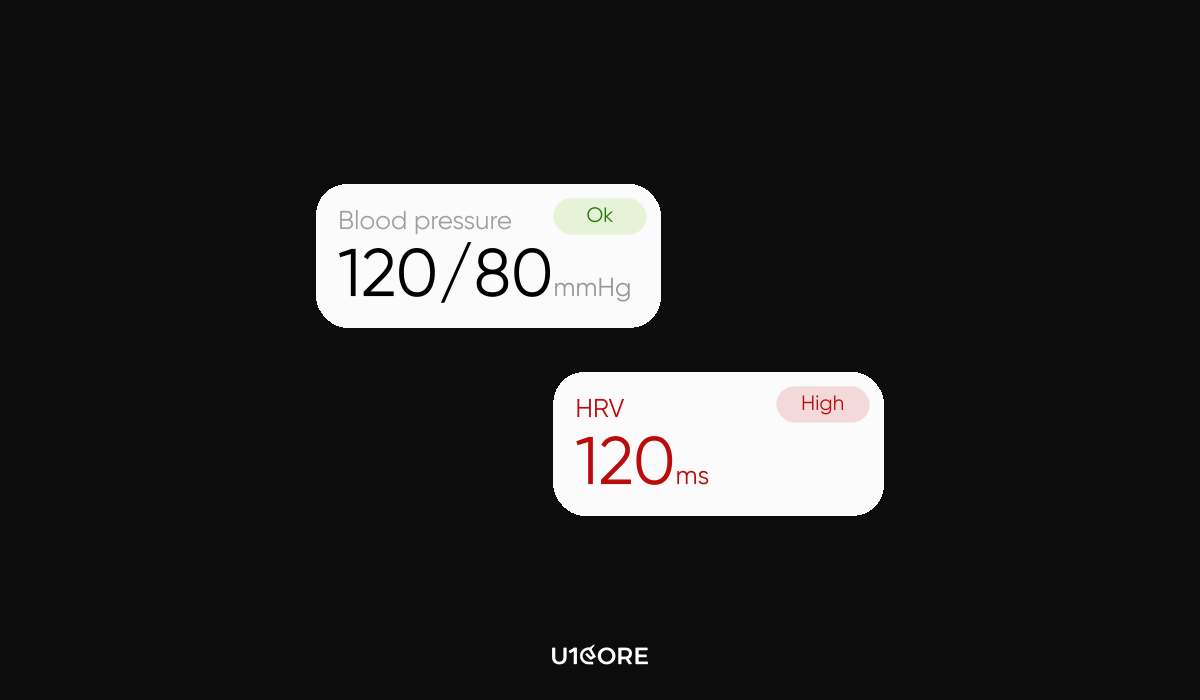
In a patient vitals dashboard, not all information carries equal weight. A heart rate of 42 bpm is not the same as 72 bpm — but in a poorly designed interface, they look identical.

Health tech UI design must communicate severity before the user has to interpret it. Progressive disclosure works: normal values appear quietly, abnormal values escalate through size, position, and visual hierarchy. Severity should never be communicated through color alone — a significant percentage of clinicians have some form of color vision deficiency.

Persistent alerts that remain visible until explicitly acknowledged are essential for time-sensitive clinical data. In consumer design, visual balance signals quality. In clinical environments, imbalance is the signal.

Reducing Cognitive Load at the Point of Action

Emergency physicians make approximately 200 clinical decisions per shift. Every unnecessary UI step, every ambiguous label, every redundant confirmation dialog reduces the capacity available for decisions that actually matter.

At U1CORE, our approach to data visualization for medical professionals prioritizes decision workflows over data completeness. Dashboards are structured around what the user needs to act on — not everything the system knows.

Smart defaults pre-populate fields based on patient context. Progressive forms surface one relevant input at a time. Confirmation dialogs appear only before irreversible actions.

If a clinician has to stop and think about what a button does, the button is wrong.

Complexity in Health-Tech

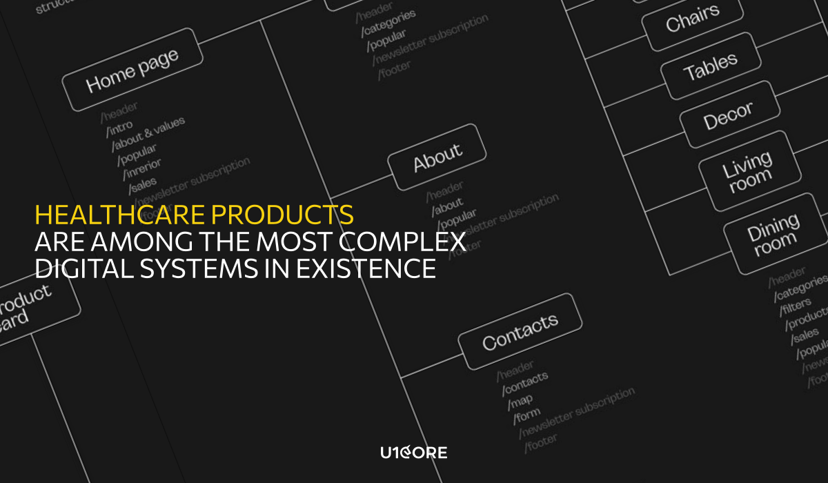
Healthcare products are among the most complex digital systems in existence — integrating real-time data, regulatory requirements, and users with radically different technical literacy.

The answer to this complexity is the same answer that applies to any complex SaaS product: complexity in the system doesn’t require complexity in the interface. The interface’s job is to absorb complexity, not expose it.

For a deeper look at how these principles apply to SaaS, see our article on [UX Design for Complex SaaS: How to Reduce User Churn].

In healthcare, the same logic applies with higher stakes. A clinician navigating a complex interface is a clinician whose attention is on the screen instead of the patient.

Accessibility Requirements for Medical Software

Accessibility in healthcare UX is not a compliance checkbox. It is a clinical requirement.

Healthcare users include patients with low vision, motor impairments, and limited digital literacy. Elderly patients who’ve never owned a smartphone. Clinicians working with gloves on, in variable lighting, sometimes with one hand occupied.

At U1CORE, our healthcare accessibility work meets WCAG 2.1 AA as a minimum, with AAA targets for patient-facing interfaces. Every interactive element is screen reader compatible. Text scales to 200% without layout failure. Patient-facing copy is written at a sixth-grade reading level.

HIPAA-compliant design adds another layer: data displayed on a need-to-know basis, visible audit trails for authorized users, and session management that balances security with clinical workflow continuity.

According to the HIPAA Journal, interface decisions that expose protected health information outside appropriate contexts create both compliance risk and patient safety risk simultaneously.

How to Design a Patient-Centric App

Patient-centric design starts with one principle: the interface should reduce the burden on the patient, not add to it.

Clarity over completeness — the most relevant information appears first, additional detail is accessible but not defaulted. Plain, warm language. Every screen answers the implicit question: what should I do next?

Offline functionality matters more in healthcare than most categories — patients in rural areas or high-acuity moments may not have reliable connectivity. And trust signals — visible security indicators, clear data sharing disclosures, explicit consent flows — are non-negotiable. Patients who don’t trust a health app don’t use it consistently, which undermines the clinical value it was built to deliver.

The Standard Is Different Here

Every industry has design challenges. Healthcare has design consequences.

The patterns in this article — designing for stress, communicating severity, reducing cognitive load, meeting accessibility requirements — are not best practices. In healthcare, they are baseline requirements.

Good healthcare UX reduces errors, builds trust, and drives the adoption through which the product’s clinical value is actually delivered. Design that fails this standard doesn’t just underperform.

It causes harm.

Local Search: Pros and Cons of Working with “Mobile App Developers Near Me”

Every week, someone types “mobile app developers near me” into Google and makes a hiring decision based on what comes up. Here’s what they’re getting right — and what they’re missing.

Why people search locally in the first place

It feels safe. You can meet the team in person, shake hands, walk into an office if something goes wrong. For a non-technical founder handing over a significant budget to build something they can’t fully evaluate — local feels like control.

And that instinct isn’t entirely wrong. But it’s not entirely right either.

The real pros of hiring local

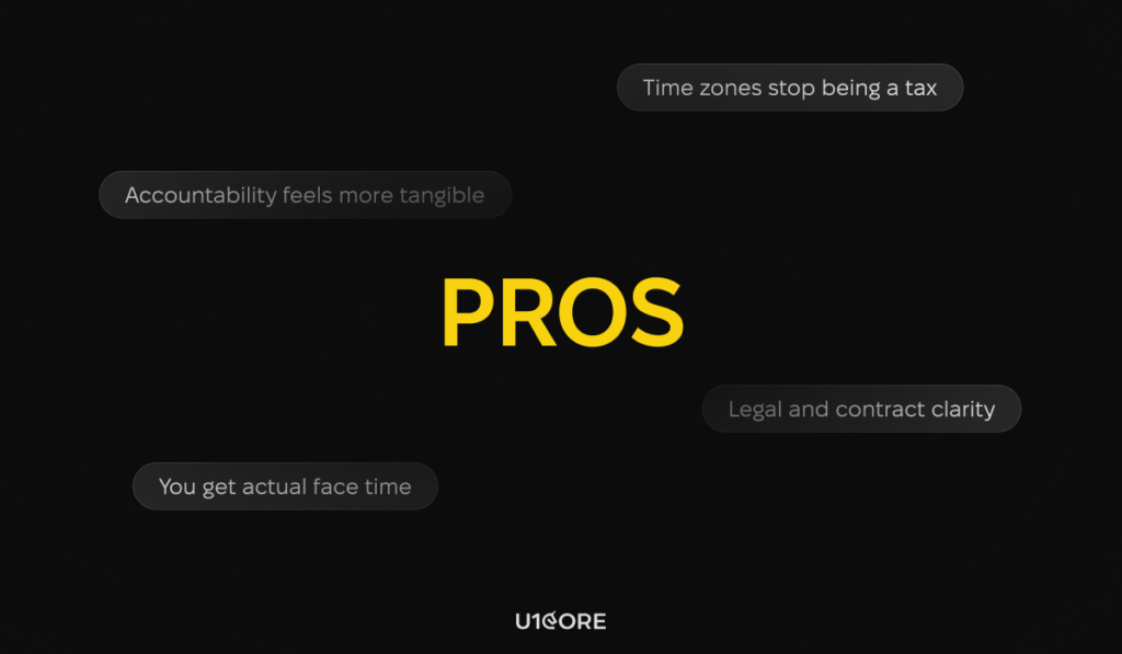
You get actual face time. For complex products, in-person workshops, whiteboarding sessions, and kickoffs make a real difference. Alignment happens faster when everyone’s in the same room. Misunderstandings that take three Slack threads to resolve can be cleared up in five minutes over coffee.

Time zones stop being a tax. No 6am standups. No waiting until afternoon to get a blocker unblocked. When your team works the same hours you do, the feedback loop tightens — and in early-stage development, feedback loops are everything.

Accountability feels more tangible. There’s something psychologically real about working with people who exist in your city. They have a local reputation to protect. They’re not going to disappear after the first invoice.

Legal and contract clarity. Same jurisdiction means less friction if things go sideways. Local contracts, local dispute resolution, no ambiguity around which country’s law applies.

The honest cons

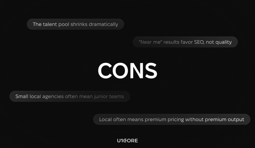
The talent pool shrinks dramatically. “Near me” is a geographic filter applied to a skills problem. The best Flutter developer for your specific product might be in Lisbon or Kyiv or Buenos Aires — not within 30 miles of your office. Limiting your search to a city means you’re optimizing for proximity, not fit.

Local often means premium pricing without premium output. Agencies in major cities charge for their overhead — the office, the sales team, the account manager who sits between you and the actual developers. You’re sometimes paying 40–60% more for the same code you’d get from a well-vetted remote team.

“Near me” results favor SEO, not quality. Google’s local search rewards whoever invested in local SEO, not whoever builds the best products. The agency ranking #1 for “mobile app developer London” got there through content and backlinks — not through client outcomes.

Small local agencies often mean junior teams. Boutique local studios are sometimes one or two senior people and a revolving door of juniors. The senior you meet in the sales call isn’t always the one writing your code.

What actually matters when hiring a dev team

Local vs. remote is the wrong axis. Here’s what to evaluate instead:

Portfolio depth, not office location. Have they built something similar to what you need? Can they show you the product, not just a mockup in a case study? Talk to their past clients directly.

Communication clarity. A remote team that responds in two hours and writes clearly beats a local team that takes two days and communicates vaguely. Timezone overlap matters, but so does how people write when they’re explaining a technical decision to a non-technical founder.

Process transparency. How do they handle scope changes? What happens when something takes longer than estimated? A good team has a clear answer. A risky team gets defensive.

Who actually works on your project. Ask directly: who will be writing the code? What’s their experience level? Will there be a dedicated project manager or will you be coordinating everything yourself?

The hybrid approach most founders ignore

You don’t have to choose between local and remote. Many successful product teams work with a local product manager or CTO-for-hire — someone who sits with you, understands the vision, and manages a distributed development team. You get the face-time and alignment benefits of local without restricting your talent search to a 30-mile radius.

This setup works particularly well for non-technical founders who need someone to translate between business logic and engineering decisions.

So — should you search “near me”?

Search it. Look at what comes up. Then evaluate those agencies exactly the same way you’d evaluate any remote team — by their portfolio, their process, their references, and how clearly they communicate.

If a local agency is genuinely the best fit, great. But don’t let geography be the deciding factor in a decision that will shape your product for the next two years.

The best mobile app developer for your project probably doesn’t show up on page one of Google Maps. They show up when you ask the right people for a referral — or when you stop filtering by location and start filtering by outcomes.

The ROI of Design: How Investing in UX Increases Company Valuation

There’s a meeting that happens in almost every company.

A designer walks into a room with a CFO. The designer says: “We need to invest in UX.” The CFO nods politely and asks: “What’s the return?”

The designer hesitates. Because nobody taught them how to answer that question.

This article is the answer.

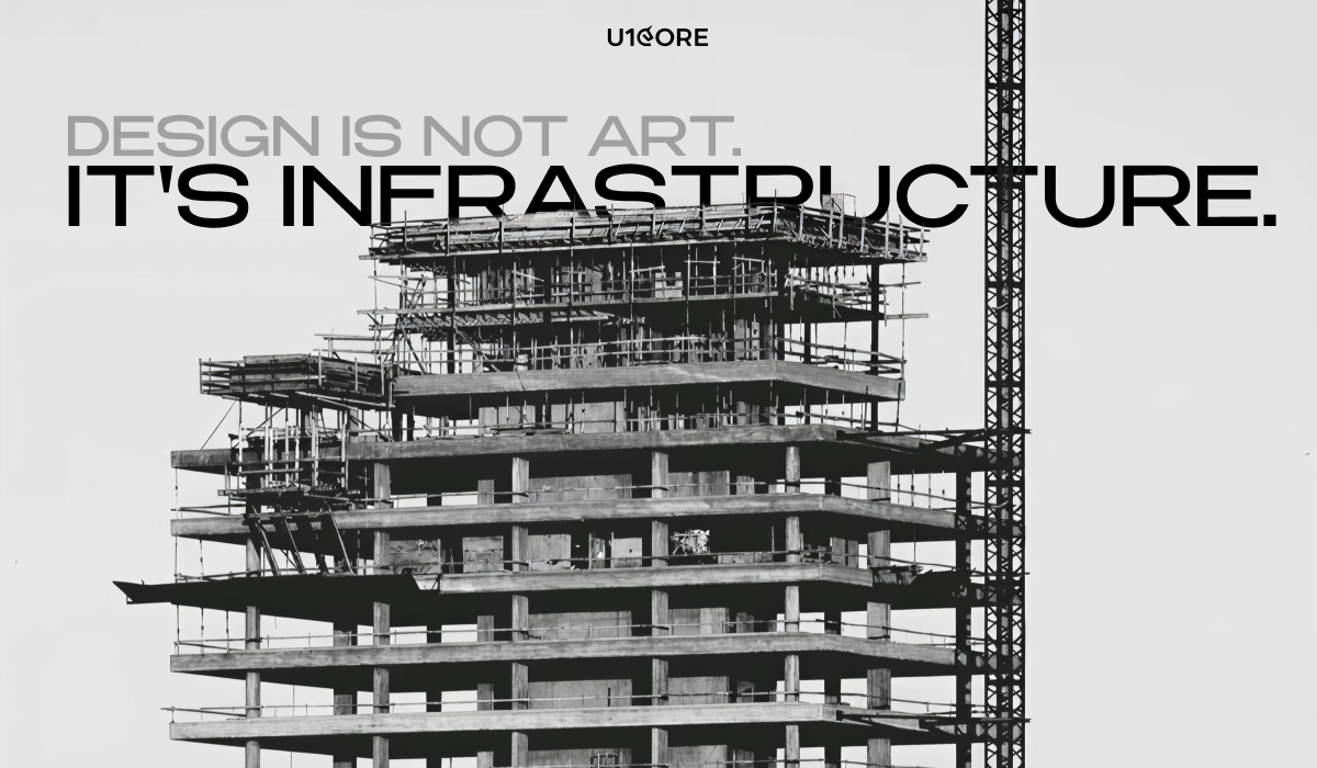
Design is not art. It’s infrastructure.

When a bridge engineer proposes a new bridge, nobody asks “but is it beautiful?” They ask: how many cars per hour? What’s the load capacity? What’s the lifespan?

Good UX works the same way. It’s infrastructure for revenue. And like any infrastructure — when it’s bad, everything slows down. When it’s good, you barely notice it’s there.

The problem is that most companies treat design like decoration. Something you add at the end, when the “real work” is done. And then they wonder why users churn, support tickets pile up, and the product feels like a maze.

The number that should be in every pitch deck

McKinsey tracked 300 companies over 5 years. Companies that took design seriously — not as a department, but as a core business function — outperformed the market by 56% in total returns to shareholders.

Fifty-six percent. That’s not a design win. That’s a compounding financial advantage.

And it makes sense when you trace the chain:

Better design → users reach value faster → they stay longer → they tell their friends → CAC drops → margins grow → valuation goes up.

It’s not magic. It’s math.

Where the money actually leaks

Most founders focus on acquisition. More ads, more content, more sales reps. But the leak is usually downstream.

Conversion. A confusing checkout, a vague CTA, a form with 11 fields — each of these quietly eats revenue. Forrester found that good UX can improve conversion rates by up to 400%. For a product doing $10M ARR, that’s not a design metric. That’s a fundraise.

Retention. PwC found that 32% of users abandon a brand after a single bad experience. One. Bad onboarding, a broken flow, an error with no explanation — and they’re gone. Forever. The math on retention is brutal: a 5% improvement in retention can increase profitability by up to 95% (Bain & Company).

Support costs. Every confused user generates a ticket. Every ticket costs money. IBM calculated that $1 invested in UX returns $100 — much of it from support costs that simply stop happening when the interface actually makes sense.

None of this is abstract. All of it shows up in your P&L.

The investor is already looking at your UX

Here’s something that doesn’t get talked about enough: sophisticated investors have started reading product design as a signal.

Not because they’re designers. Because they’ve learned that design maturity correlates with how fast a company finds product-market fit, how disciplined the team is, and how much hidden technical (and UX) debt will need to be repaid later.

A beautifully designed product isn’t vanity. It’s evidence that the team listens to users, aligns cross-functionally, and ships with intention. That profile attracts capital. Messy UX says the opposite — “we’ll clean this up later” — and later always costs more.

The flywheel nobody draws on a whiteboard

Stripe didn’t build a $50B company because of better payment processing. Dozens of companies process payments.

They built it because developers loved using their API. The documentation was clear. The error messages were helpful. The integration felt like it was designed by someone who had actually integrated an API before.

Developers told other developers. Those developers told their CTOs. CTOs made decisions. Stripe grew without needing a traditional sales team.

That’s design as a growth engine. Not a feature. Not a cost. A flywheel.

Figma, Linear, Notion — same story. The product is the marketing, because the product feels so good that people can’t shut up about it.

So what does the ROI model actually look like?

If you’re building the internal case for design investment, here’s the short version:

  • Conversion improvement × your ARPU × annual traffic
  • Churn reduction × current ARR
  • Support ticket reduction × cost per ticket × MAU
  • Engineering rework saved × average sprint waste × hourly dev cost

Add those up. Divide by design investment. In most cases — even with conservative numbers — you’re looking at 3–10× return within 12–18 months.

The problem isn’t that design ROI doesn’t exist. The problem is that nobody sits down to measure it.

The uncomfortable truth

Most companies don’t under-invest in design because they don’t believe in it.

They under-invest because design debt is invisible until it isn’t. You can ship bad UX for two years and still grow — until retention collapses, NPS tanks, and the product needs a full rebuild that costs ten times what the original design investment would have.

By then, the damage is done. The users who left aren’t coming back. The engineers who built the wrong thing spent a year building the wrong thing.

The companies that win are the ones that treat design the same way they treat engineering: as a strategic investment with a compounding return, not a line item to cut when the quarter gets hard.

Design isn’t a cost. It’s a bet on whether your product will survive long enough to matter.

Place it accordingly.

A Product Designer’s Checklist for Cross-Platform Success

What separates good product designers from great ones isn’t talent — it’s the systems they follow before shipping.

You’ve been there. You design a component, it looks right, it gets built, and then someone opens it on an Android device in the morning commute and the whole thing falls apart. The tap target is too small, the font is rendering weird, and the navigation pattern that felt intuitive on iOS makes no sense on Android.

Cross-platform design failure is rarely dramatic. It’s death by a thousand small decisions that nobody wrote down.

This checklist is for the product designers who are tired of catching these things in QA instead of preventing them in the design phase. It’s opinionated, it’s specific, and it assumes you’ve already shipped something that didn’t quite work the way you planned.

Start with the conversations you’re avoiding

What does “consistent” actually mean for this product? Not philosophically — practically. Does it mean identical UI across platforms? Does it mean same functionality, different patterns? Does it mean brand consistency only, and everything else adapts?

These aren’t rhetorical questions. Write down the answers. Get your team to sign off on them. You will reference this document in arguments three months from now, and you will be glad it exists.

Map the points where your platforms genuinely diverge. Android users have back gestures baked into muscle memory. iOS users expect bottom navigation and swipe-to-dismiss. Web users will try to open links in a new tab, use keyboard shortcuts, and hover over things to preview them before clicking. None of these behaviors exist on mobile. Design for the actual user, not the idealized user who behaves the same way on every surface.

Your design system is either doing this work or it’s not

Go through your tokens. Every single one. Your color tokens need to hold up in both light and dark mode, across platform rendering engines, on cheap Android hardware with oversaturated displays and on OLED iPhones that render black as pure black. Test on real devices. A color that looks fine on your calibrated Studio Display can fail on a Samsung mid-range phone under fluorescent office lighting.

Your type scale needs to be built in relative units. Not because it’s best practice — because iOS and Android handle font rendering differently, and if you’ve hardcoded pixel values, you’ll spend a week chasing one-pixel discrepancies that shouldn’t matter but somehow always do.

Your spacing system needs an explicit mobile component standard. The 8-point grid works everywhere, but how you apply it shifts. A minimum tap target of 44x44pt on iOS and 48x48dp on Android is not a guideline you can negotiate around. It’s the minimum viable touch experience. Go below it and you’re just making things worse for your users and generating accessibility issues at the same time.

Your component library needs to document platform variants explicitly and separately. Not “here’s the button component, it works everywhere.” Here’s the iOS button. Here’s the Android button. Here’s the web button. Here’s what they have in common and here’s where they differ, and here’s the reasoning behind every decision. That documentation is going to save a designer six months from now from making a choice that unwraps everything you built.

Platform-specific UX is not a failure of consistency

Users don’t interact with your design system. They interact with their phone. And their phone has years of learned behavior baked into it.

On iOS, follow the Human Interface Guidelines like they’re requirements, not suggestions. Bottom tabs for primary navigation. Modals that come from the bottom. System font scaling that works with accessibility settings. Swipe-from-left-edge for back navigation that doesn’t conflict with your custom gestures. Apple has trained hundreds of millions of users to expect these patterns. When your app breaks them, users don’t think “this app has a unique navigation philosophy.” They think the app is broken.
On Android, Material Design 3 has more room for expressiveness than most teams use. The dynamic color system alone can make your product feel genuinely native to each device. Android users can tell when they’re using an app that was designed for iOS first and ported second. The tells are subtle — the navigation patterns, the way dialogs are positioned, the back button behavior — but they add up into a product that feels like it doesn’t quite belong on their phone.

On web, you have fundamentally different interaction affordances and you need to use them. Hover states aren’t a nice-to-have. Keyboard navigation is a real use case, not an edge case. Your information density can be higher because the viewport is larger and the user has a pointer device with precision. Responsive doesn’t mean taking your mobile layout and scaling it up. It means rethinking information hierarchy for each breakpoint.

Responsive design is a product decision, not a developer task

Every primary user flow needs to be explicitly designed at five breakpoints: 375px, 768px, 1024px, 1280px, and 1440px. Not comped at 375px and 1440px and assumed to work in between. Designed. With specific decisions documented for each step in between.

Dynamic content needs overflow rules before a single line of code is written. What happens to a username at 40 characters? What happens to a product card when the price has six digits? What happens to a data table on a 375px screen? These questions need answers from the design team, not workarounds from the engineering team.

Every image needs defined behavior at every breakpoint. Not scaling — explicit behavior. Does it crop to a new aspect ratio? Does it reflow to sit above the text instead of beside it? Does it collapse entirely below a certain breakpoint? Undefined responsive behavior is design debt that compounds until it breaks in production in a way that embarrasses everyone.

Accessibility is cross-platform by definition

Every interactive element needs a visible focus state. If your focus states look ugly, that’s a design problem to solve, not a reason to hide them. Invisible focus states break keyboard navigation for everyone who relies on it, and they’re an accessibility failure on every platform simultaneously.

Color cannot be the only way you communicate information. An error state that communicates error through red alone will fail for users with color vision deficiency, fail on certain display types, and fail in high-brightness outdoor environments. Pair color with iconography. Pair it with text. Make the information survive without the color.

Screen reader behavior needs to be tested on the actual tools your users use. VoiceOver on iOS. TalkBack on Android. NVDA on Windows. These tools do not behave identically, and your semantic structure needs to hold up across all of them. Find someone who uses a screen reader daily and watch them use your product. Nothing in your QA checklist will teach you more than that thirty minutes.

Performance is a design decision you’re making right now

Every screen needs a defined loading state that isn’t a spinner. Skeleton screens reduce perceived wait time and maintain layout stability during load. Spinners just make users watch a circle and wonder if something went wrong. This is not a new insight. Teams still ship spinners everywhere.

Every flow needs a defined empty state. First-time user, no data, fresh install. Most products show a blank screen with a small gray label that says “No items yet.” This is a missed opportunity every single time. Empty states are where you set tone, reduce anxiety, and guide the user toward the action that will make the product valuable for them.

Every error state needs to give the user somewhere to go. Not just a message explaining what went wrong. A path forward. This is harder to design than it sounds, which is probably why most error states are still just red text and a dismiss button.

Before you hand off

Have you tested every primary flow on a real iOS device, a real Android device, and at least two browser contexts? Not a simulator. A real device.

Have you documented every component variant that differs across platforms, with the reasoning written down?

Have you defined loading states, empty states, and error states for every screen?

Have you run a contrast check on your color usage in both light and dark mode?

Have you tested with a screen reader?

Have you pressure-tested your layouts with real content — long names, long text, missing images, slow connections?

If the answer to any of these is no, that’s not a checklist failure. That’s a conversation to have with your team about where these things belong in your process so they don’t get caught in QA, or worse, in a user’s hands.

Cross-platform design done well is invisible. Users don’t notice it. They just feel like the product works. That invisibility is the goal. This checklist is how you get there.

How Much Does a Mobile App Actually Cost in 2026?

The honest answer nobody in the industry wants to give you.

You have the idea. You’ve talked to users. You’re ready to build. Then you ask the question every founder dreads:

“How much is this going to cost?”

Agencies quote you a range so wide it’s useless. Freelancers undercut — then surprise you halfway through. Blog posts recycle 2021 numbers like nothing changed. Meanwhile, AI hype has everyone convinced you can ship an app for $5K and a good prompt.

Here’s the reality, from a team that’s shipped mobile products across fintech, healthtech, and B2B SaaS — with budgets ranging from $15K to over $1M.


The number you actually need

Before the breakdown: a grounding estimate.

Simple MVP: $25,000 – $80,000 Mid-complexity product: $80,000 – $250,000 Enterprise-grade app: $500,000+

These aren’t pulled from thin air. They reflect real 2026 market rates, current tooling, and the actual scope most founders underestimate.


Why two “similar” apps can cost 5x differently

Software development isn’t a commodity. The same product idea can cost $40K or $200K depending on five things:

Platform. Native iOS + Android is roughly double the cost of one platform. Flutter and React Native close that gap — you get both platforms for about 1.3–1.5x the cost of one. For most early-stage founders, cross-platform is the right call. Go native only if you need deep hardware integration or non-negotiable performance.

Feature complexity. Authentication is $2–6K. Real-time chat is $8–20K. Video calling is $10–30K. AI/ML features start at $15K and go fast. Each feature is a negotiation between what you need now and what can wait for v2.

Design quality. Template UI vs. custom design system isn’t just aesthetic — it’s a $20–50K swing and a difference your users will feel. First impressions in mobile are brutal and permanent.

Team model. A Western European or North American agency runs $80–250/hr. Eastern Europe or LATAM: $35–80/hr. The math isn’t just hourly rate × hours — a $25/hr agency that takes twice as long and ships half the quality is not cheaper.

Post-launch reality. The build cost is not the total cost. Add 15–20% annually for maintenance, $99/year for Apple’s developer program, infrastructure costs, third-party APIs (Stripe, Twilio, Google Maps), and QA that most quotes quietly omit.


What AI actually changed (and what it didn’t)

Let’s be honest about this, because the hype is loud.

AI coding tools — Copilot, Cursor, Claude — have meaningfully improved developer productivity on routine tasks: boilerplate, testing, documentation. At U1CORE, we’ve seen 20–35% productivity gains on specific task types.

What does this mean for your budget? Roughly 10–20% lower costs on standard app builds in 2026. Not 50%. Not “build it for free.” Any agency promising half-price development via AI is either underscoping your project or cutting corners somewhere you’ll notice later.

Complex architecture, novel integrations, and product design decisions are not cheaper. Senior engineers are still the constraint — AI just makes them faster.


The hidden costs that kill budgets

Even experienced founders get surprised here:

  • QA: Proper testing adds 15–25% to development cost. Skip it and you’ll pay more in bug fixes.
  • Design iterations: Budget for 2–3 revision rounds. Most projects underestimate design by 30–40%.
  • The 20–30% buffer: Well-scoped projects still surface surprises. This isn’t waste — it’s reality insurance.
  • Post-launch iteration: Version 1 is not the final product. Budget 3–6 months of follow-on development before you have something stable.

Before you talk to anyone, do this

The single biggest mistake founders make: going into scoping calls unprepared.

Write down your user types, core flows, rough screen count, must-have vs. nice-to-have features, platform choice, and a budget range. Even a rough range. It signals that you’re a serious founder and gets you tighter, more comparable quotes.

Then ask every potential partner the same uncomfortable question: “What’s caused projects to go over budget in your experience?”

Experienced agencies have honest, specific answers. Everyone else deflects or blames clients.


The bottom line

Mobile app development cost in 2026 isn’t random — it tracks directly to scope, quality, team, and timeline. The founders who get the best return on this investment are the ones who come prepared, set realistic expectations, and don’t optimize purely on price.

The cheapest option is rarely the least expensive in the end. The cost of delays, rewrites, and a bad launch dwarfs any savings on the initial quote.


U1CORE is a product design and development bureau. We help founders scope, design, and ship mobile products — from MVP to scale. If you’re trying to figure out what your specific app would actually cost

Are You Ready for Your SaaS or Web3 Launch? Here’s a Checklist for Success

Every founder I’ve talked to before a launch says the same thing: “We’re almost ready.”

Almost. That word does a lot of work.

Because ready to build and ready to launch are two completely different states. And most teams — even good ones — confuse them. They spend eight months on the product and three weeks on everything that happens after someone lands on the page.

Then the launch goes quiet. And nobody really knows why.

So here’s what we actually check before pushing anything live. Not theory — things we’ve learned the hard way, working on SaaS and Web3 products across different markets.

You can’t explain what it does without jargon.

This is the first sign something is off. Not because the product is bad — but because the thinking isn’t clear yet.

If your landing page opens with “a decentralized protocol enabling trustless cross-chain liquidity” — you haven’t figured out who you’re talking to. And if you don’t know that, the launch will feel like shouting into a room and hoping someone turns around.

Test it on someone who doesn’t work in your industry. If they don’t get it in ten seconds, you’re not done yet. Clarity isn’t a copywriting problem. It’s a positioning problem.

You know the audience in theory, not in practice.

“Crypto users” is not an audience. “B2B SaaS companies” is not an audience. An audience is a specific person with a specific problem who is actively looking for something right now.

The narrower you go on launch, the more it feels like the product was built for someone. Because it was.

Two hundred right people will do more for your growth than twenty thousand wrong ones. The algorithm rewards signal. So do investors.

Onboarding promises things the product doesn’t do yet.

This one kills trust quietly. Users arrive expecting one thing, experience another, and leave without saying anything. You just see the number drop.

Ship what works. Be upfront about what’s coming. Users in Web3 especially — they’ve been burned before. Honesty reads as confidence, not weakness.

Design and engineering never looked at the final product together.

This is one of those things that sounds obvious and almost never actually happens.

The designer approved the flow. The developer shipped the build. But nobody sat down and looked at the thing the user actually sees and asked: is this what we meant?

The gap between Figma and production is small. But it’s exactly where things break. A misaligned button state, a loading screen with no copy, an error message that says “something went wrong” and nothing else. Small things that add up to a product that feels unfinished.

There’s no feedback structure from day one.

Not a survey in month three. A real way to understand what users are doing — and why they stop.

The products that pull ahead aren’t the ones that launched best. They’re the ones that learned fastest. If you’re not collecting structured signal from the first two weeks, you’re navigating without a map.

The brand doesn’t match the ambition.

You can have the best product in the category. But if the landing page looks like it was made in a weekend, if the UI feels disconnected from the marketing, if there’s no visual logic between touchpoints — people make a judgment before they read a word.

In SaaS and Web3, trust is everything. And trust starts with how things look. Not because people are shallow. Because attention is short and signals are fast.

Design isn’t decoration. It’s the first argument you make for why someone should take you seriously.

You don’t have distribution before launch day.

Not a plan for distribution. Actual distribution. A community, a partner, an audience that already trusts you enough to pay attention.

If you’re starting from zero on launch day, you’re making everything harder than it needs to be. Distribution isn’t a marketing function. It’s infrastructure. And you build infrastructure before you need it, not after.

There’s one question I always come back to at the end of this list.

Why now?

Not why this product exists. Why does it need to exist right now, in this moment, for these specific people?

If the answer is clear — you’re probably ready. If it’s not — that’s worth one more week before you press go.

Launches are hard to undo. Take the week.

Micro-Interactions: Small Details, Big Impact in UX Design

We often focus on the big elements when it comes to UX design — slick layouts, smooth navigation, and standout features. But at Oliinykk Design we understand that it’s the small, often invisible details that truly make or break a user’s experience. These small moments, called micro-interactions, are the subtle animations, hover effects, and feedback responses that guide and engage users in a meaningful way.

Micro-interactions may seem tiny, but they hold tremendous power. They give users feedback, guide their actions, and create a sense of flow that makes digital experiences feel intuitive and enjoyable. Let’s explore how these small details can leave a lasting impression and elevate your design.

What are Micro-Interactions?

Micro-interactions are brief, contained moments in a digital interface that perform a single, specific task while enhancing the user’s experience. They can be found in nearly every corner of a digital product — from turning off an alarm on your phone to liking a post on social media. Micro-interactions can be visual (e.g., animations) or tactile (e.g., vibrations), and they often serve to provide feedback, direct user attention, or improve navigation.

Examples of Micro-Interactions:

  • A button changes color when hovered over, indicating it’s clickable.
  • A success animation when a user completes a task, like a checkmark appearing after form submission.
  • A notification badge showing the number of unread messages.
  • A subtle vibration when pressing a key on a virtual keyboard.
  • A loading spinner to indicate the content is being processed.

While these moments might seem inconsequential, they are the micro-elements that shape a user’s overall perception of the product. When designed thoughtfully, micro-interactions can subtly nudge users towards specific actions, reinforce brand values, and create a more enjoyable, accessible experience.

Why Micro-Interactions Matter

1. Clear Feedback & Guiding Users

Micro-interactions offer instant feedback, helping users understand the result of their actions. This eliminates uncertainty and guides them smoothly through tasks.

For example, when you click a button that changes color, you know the system is responding. When a form field turns red after an error, it’s a clear signal to fix something. These small cues make users feel in control and keep them on the right path without frustrating them.

2. Building a Strong Brand Identity

These tiny interactions also add personality to your product. They can reflect your brand’s tone whether playful, sleek, or professional — without users even realizing it. The right animation, hover effect, or feedback response can make your product feel cohesive and reinforce your brand’s identity.

For example, a playful brand might use bouncy animations, while a high-tech brand might opt for sleek, minimal transitions. These details make your website more memorable, and users will associate them with your brand.

3. Improving Accessibility and Usability

Micro-interactions also make digital products more accessible and easier to use. For users with visual impairments, audio or haptic feedback can help them navigate the product. For those who need a little extra guidance, animations can show them the way. Micro-interactions ensure that all users, regardless of ability, have a smooth, intuitive experience.

Designing Effective Micro-Interactions

The key to great micro-interactions lies in balance, and Oliinykk Design knows how to strike that balance. They should be subtle enough not to distract users but noticeable enough to enhance their experience. Here’s how to get it right:

  • Keep it simple:

Micro-interactions should be quick and to the point. Avoid over-the-top animations that could slow down the experience.

  • Make them purposeful:

Every micro-interaction should have a clear function — whether it’s guiding users, providing feedback, or showing progress.

  • Stay on brand:

Design interactions that reflect your brand’s personality. Whether it’s fun, sleek, or professional, the details should match your brand’s tone.

  • Consider accessibility:

Ensure that micro-interactions are easy to perceive for all users. This could mean offering alternative feedback, such as sound or vibration.

Conclusion

At Oliinykk Design, we know that the smallest details often have the largest impact on UX design. Micro-interactions may seem like minor components, but they play a critical role in shaping user experiences, guiding behavior, reinforcing brand identity, and improving accessibility. When designed with intention and purpose, these tiny interactions can elevate your product from functional to unforgettable.

As we continue to evolve in a digital-first world, designers must pay close attention to these subtle elements, recognizing that the success of a product often lies in the small details. Our experience shows that micro-interactions, while small, have an undeniable influence on the user experience — proof that in design, sometimes less is truly more.