Top UX Agencies Specializing in Fintech KYC Flow Solutions

Identity verification is where most fintech onboarding funnels quietly bleed. Users who were ready to open an account five minutes ago stall at the passport upload, abandon on the selfie step, or give up after a vague “verification failed” message. The compliance requirement isn’t going anywhere — but the drop-off doesn’t have to stay.

This guide covers why KYC flows lose users, what a specialist agency actually fixes, how to choose one, and which UX agencies have the fintech depth to do it. At U1CORE, we redesign onboarding and verification flows for financial products as part of our UI/UX and product design work — so we’ll also show how we approach it.


Why KYC Is the Biggest Leak in Fintech Onboarding

The user’s motivation peaks before verification, not after. People sign up because they want to send money, invest, or get paid. KYC asks for effort and personal documents right at the moment they expected value. Every extra second of friction is measured against a promise that hasn’t been delivered yet.

Most KYC flows are designed by compliance, then skinned by design. The vendor SDK is dropped in, the required fields are listed, and the UI team styles it. Nobody owns the experience end to end — so nobody owns the drop-off.

Typical failure points we see in KYC funnels:

  • No expectation setting. Users don’t know how many steps there are, what documents they need, or how long it takes.
  • Document capture friction. Poor camera guidance, glare, cropped edges, unsupported document types — and generic error messages that don’t say what to fix.
  • Selfie and liveness anxiety. Unclear instructions, no reassurance about why biometrics are needed or how data is stored.
  • Dead-end failures. A rejected check ends the session instead of offering a retry, an alternative document, or manual review.
  • Waiting in the dark. “We’re reviewing your application” with no timeline, no notification, and no reason to come back.
  • Asking too much, too early. Full verification forced before the user can see or try anything in the product.
What a KYC-Focused UX Agency Actually Fixes

Funnel diagnosis before redesign. A good partner starts with your analytics, session recordings, vendor logs, and support tickets to find exactly where and why users drop — not with new screens.

Progressive and tiered verification. Letting users explore, fund small amounts, or complete a lightweight tier first, then request full KYC when limits require it. This has to be designed together with your compliance team and risk policy.

Document and biometric capture UX. Real-time guidance, auto-capture, clear framing, readable error recovery, and support for the documents your actual users carry in each market.

Trust and transparency. Explaining why data is requested, how it’s protected, and who sees it — in plain language, at the moment it matters.

Recovery paths. Retry logic, alternative documents, save-and-resume, and a human fallback when automation fails.

Post-submission experience. Status screens, notifications, and re-engagement for users waiting on manual review.

Vendor-aware design. Working within the constraints of your KYC provider’s SDK or API — and knowing when a hosted flow should be replaced with a custom UI.

How to Choose a UX Agency for KYC Flows

Look for fintech onboarding in the portfolio — not just pretty dashboards. Ask to see verification, sign-up, or account-opening work specifically, and what changed after launch.

Check that they work with compliance, not around it. The best redesign is useless if legal rejects it. The agency should be comfortable in workshops with your compliance, risk, and engineering teams.

Ask how they measure success. Completion rate per step, time to verified account, manual review volume, and support tickets related to onboarding are the metrics that matter.

Prefer research plus design plus delivery. KYC changes touch front end, back end, and vendor integration. An agency that can carry the design into development avoids the classic handoff gap.

Confirm they understand your markets. Document types, regulations, and user expectations differ between the UK, EU, US, and emerging markets.

Top UX Agencies Specializing in Fintech Onboarding and KYC

1. U1CORE

Best for: Fintech and financial software companies that need their onboarding and verification flows fixed end to end — from UX audit to shipped product.

U1CORE is a product design and development partner for businesses whose digital experience doesn’t yet match the level of the business. For fintech teams, that typically means a UX audit of the onboarding and KYC funnel, a redesigned verification flow built around real drop-off data, and development support to ship it.

What U1CORE does on KYC projects:

  • UX audit of the onboarding funnel — step-by-step drop-off analysis, heuristic review, and prioritized fixes
  • Product strategy — tiered verification models aligned with your compliance and risk requirements
  • UI/UX design — document capture, liveness, error recovery, status and trust screens
  • Custom software development — implementing the new flow and integrating KYC vendors
  • Branding — making a regulated product feel trustworthy, not bureaucratic

Why teams choose U1CORE: one partner from diagnosis to release, business-outcome focus (completion rate, time to verified account) rather than screen count, and a team that covers branding, product, and engineering under one roof.

Book a strategy call →

2. Clay

Best for: Large fintech and financial brands looking for a combined brand and digital product partner.

A San Francisco–based design agency known for brand and product work with well-known technology and finance companies. A fit when onboarding is part of a wider brand or product overhaul.

3. Fuselab Creative

Best for: Data-heavy and enterprise financial products.

A UX and UI design agency with a focus on complex interfaces, dashboards, and enterprise software, including financial services.

4. Qubstudio

Best for: Fintech products that need product design with a strong UX research component.

A product design agency with fintech, banking, and trading interfaces in its portfolio, offering research, UX, and UI design.

5. UX Studio

Best for: Research-led redesigns where user testing is a priority.

A Budapest-based UX agency known for user research and product design, working across finance and other complex B2B and B2C products.

6. Arounda

Best for: Fintech teams that want design and web development together.

A design and development agency working on fintech, SaaS, and digital products, covering UX/UI, branding, and websites.

7. Adam Fard UX Studio

Best for: SaaS and fintech products focused on UX strategy and usability.

A UX design studio working with SaaS and fintech companies on product strategy, research, and interface design.

Agency Comparison at a Glance

U1CORE — KYC and onboarding UX audit, redesign and build. Design and development in one team. Best fit for fintech teams that need the full flow fixed and shipped.

Clay — brand and digital product. Design and development. Best fit for large brands planning a wider overhaul.

Fuselab Creative — complex and enterprise interfaces. Best fit for data-heavy financial tools.

Qubstudio — product design and research. Best fit for banking and trading products.

UX Studio — user research. Best fit for research-led redesigns.

Arounda — design and web development. Best fit for fintech and SaaS products.

Adam Fard UX Studio — UX strategy and usability. Best fit for SaaS and fintech products.

How U1CORE Approaches a KYC Flow Redesign

1. Funnel audit (1–2 weeks). We map every onboarding step, pull drop-off and completion data, review session recordings and vendor failure reasons, and interview support. Output: a prioritized list of what’s costing you verified users.

2. Compliance and risk alignment. Workshops with your compliance, risk, and product teams to define what’s truly required at each stage — and what can move later through tiered verification.

3. Flow and UI redesign. New onboarding architecture, document and liveness capture screens, error recovery, trust messaging, and status communication. Prototyped and tested with real users.

4. Build and integration. Our development team implements the new flow and integrates or reconfigures your KYC provider.

5. Measure and iterate. We track step completion, time to verified account, and manual review volume after release, and keep improving

FAQ

  • U1CORE redesigns fintech onboarding and identity verification flows end to end — from a UX audit of the drop-off to a redesigned and developed KYC experience. Other agencies with fintech UX experience include Clay, Fuselab Creative, Qubstudio, UX Studio, Arounda, and Adam Fard UX Studio.


  • The most common reasons are unclear expectations, document capture problems, unhelpful error messages, anxiety about biometrics and data privacy, dead-end failures without a retry path, and long reviews with no status updates.


  • Yes. Most improvements are UX changes — guidance, error recovery, transparency, and sequencing — that don’t change what’s verified. Tiered verification changes when checks happen, and should always be agreed with your compliance team.


  • Not usually. Many drop-off issues come from how the vendor flow is presented and connected to your product. A custom UI on top of the vendor’s API, or better configuration of the hosted flow, often solves the problem.


  • An audit typically takes one to two weeks. A full redesign with testing and implementation usually takes six to twelve weeks, depending on the number of markets, document types, and integrations.


  • Completion rate per onboarding step, overall verification pass rate, time to verified account, manual review volume, and onboarding-related support tickets.


  • For KYC, choose an agency that has worked on regulated flows and can collaborate with compliance and engineering. Domain experience shortens discovery and avoids redesigns that legal later rejects.


Losing users at identity verification? U1CORE is the partner in crime for strong businesses whose digital and operations don’t yet play at their level. We’ll audit your onboarding funnel, show you exactly where verified users are lost, and redesign the flow to fix it. Book a strategy call or explore our UI/UX and product design services.

Find the Agency That Optimizes UX and Reduces Developer Rework Effectively!

Most UX audits produce a slide deck of usability issues. Your team reads it, agrees with it, and ships nothing differently. Meanwhile your engineers keep rebuilding the same screens because nobody ever documented what the empty state, the error state or the admin permissions were supposed to be.

This page explains where developer rework actually comes from, what a UX audit has to deliver to prevent it, and how to choose an agency that does the second kind of audit rather than the first.


Where developer rework actually comes from

Rework is rarely a coding problem. It’s an unanswered-question problem. Four sources cover most of it.

Undesigned states. The design shows the screen full of data. Engineers then have to invent the loading, empty, error, partial and disabled states. Every invention is a guess, and every guess gets corrected later.

Undefined permissions. A platform with several roles needs a written answer to who sees what and who can edit what. When that’s missing, engineers implement a reasonable assumption, product disagrees three sprints later, and the whole screen gets rebuilt.

Missing edge cases. What happens when a refund overlaps with a payout. What happens when a document expires mid-approval. What happens when a listing is deleted while someone is paying for it. These are design decisions, and if design doesn’t make them, engineering does — under time pressure.

Inconsistent components. Five variations of the same button across twelve screens means five implementations, then a refactor.

The scope gap nobody budgets for. The admin and operations layer is usually a third of a platform build. When it isn’t scoped in design, it gets built ad hoc by engineers, and it’s the part that gets rewritten most.

What a rework-reducing UX audit must deliver

A usability audit tells you what’s wrong. A rework-reducing audit tells your engineers exactly what to build. The deliverables differ.

A state inventory. Every key component and screen with its loading, empty, error, partial, disabled and success states defined.

A permission matrix. Every role against every action: view, create, edit, delete, approve. One table that ends an entire category of arguments.

Edge-case documentation. The unhappy paths written out as flows, not as bullet points in a deck.

A component audit. Where the interface has drifted, which variants are duplicates, and what the consolidated set should be.

Flow-level findings tied to the transaction. Not “the CTA is low contrast,” but “users can’t see the total cost before the payment step, and that’s where the drop-off is.”

A prioritised backlog in ticket form. Issues written so a developer can pick one up without a meeting, each with an estimate of impact and effort.

The test is simple. If your engineering team can’t start work directly from the audit, it wasn’t an audit that reduces rework.

How U1CORE runs a UX audit

1. Scope and access. We agree what’s in scope — key flows, roles, platforms — and get access to the live product, analytics and, where possible, support tickets. Support tickets are the cheapest research available: they’re a list of everything users couldn’t figure out.

2. Heuristic and flow review. We walk every critical flow as every role, in the live product, on desktop and mobile. Not on screenshots.

3. Transaction and money-flow review. For platforms that move money: checkout, payouts, refunds, disputes, KYC placement. This is where the expensive rework usually hides.

4. State and permission mapping. We build the state inventory and permission matrix as deliverables, not as internal notes.

5. Component and design-system audit. Where the UI has drifted, what to consolidate, and what the shared set should be.

6. Prioritised findings. Everything ranked by user impact against implementation effort, written as tickets your team can act on.

7. Handoff working session. We walk the findings with product and engineering together, because the questions engineers ask in that session are exactly the questions that cause rework when unasked.

What you get at the end

  • A findings report with severity, evidence and recommendation for each issue
  • A prioritised, ticket-ready backlog
  • A permission matrix covering every role
  • A state inventory for key components and screens
  • Edge-case flow documentation
  • Component consolidation recommendations
  • Optional: redesigned key screens, dev-ready, with every state

Why platform experience changes the audit

Auditing a marketing site and auditing a transaction platform are different jobs. On a platform, the expensive problems are structural: roles, money flows and states.

U1CORE designs and builds multi-sided platforms — marketplaces, exchanges, payment systems and operations tools — with $720M+ processed through the platforms we’ve built, 71 verified reviews on Clutch and work recognised by the CSS Design Awards, Orpetron and a TOP 10 Design Company placement on Dribbble.

On BridgeFleet, a fleet operations platform, five roles shared one product: driver, fleet owner, admin, super admin and accountant. We started with the permission matrix before a single wireframe, then gave each role its own workspace built from one shared system. Payouts went from days of manual calculation to one click with zero calculation errors, and operational efficiency improved 75%.

On CarCapitol, a vehicle marketplace with financing, research showed the brief was aimed at the wrong problem. Buyers weren’t struggling to find cars; they were struggling to trust what they found. Catching that before development saved the build, not just the design.

Because we also build, our audits are written for engineers. We know what a developer needs to see, because it’s the same thing our own team needs.

How to measure whether the audit worked

Agree the baseline before the audit starts:

  • Rework rate. Percentage of tickets reopened or redone after being marked complete.
  • Clarification requests. How many times engineering has to ask product what a screen should do.
  • Design-related bugs. Bugs caused by undefined states rather than logic errors.
  • Cycle time. How long a typical screen takes from start to shipped.
  • Drop-off at the audited flows. The user-facing outcome.

If none of these are tracked today, start tracking them now. An audit you can’t measure is an opinion.

What a UX audit costs

Rough ranges. A focused audit of one or two key flows runs $5K–10K. A full platform audit with permission matrix, state inventory and edge cases runs $10K–25K, depending on the number of roles and flows. Adding redesigned, dev-ready screens takes it higher.

For comparison, a single mid-level developer month costs roughly the same as a focused audit. If the audit prevents one rebuilt module, it’s paid for itself.

Ask any agency for the breakdown — what’s reviewed, what’s delivered, how many roles are covered — not just the total.

How to choose the right agency for this

  • Show me an audit deliverable from a real project, with the client details removed.
  • Does your audit include a permission matrix and a state inventory?
  • Do you review the live product as every role, or only the main one?
  • How do you document edge cases for engineers?
  • Have you built platforms yourself, or only designed them?
  • How do you prioritise findings — by severity, effort, or business impact?
  • Do you run a handoff session with engineering, or just send the report?

If the answer to the permission-matrix and state-inventory questions is no, the audit will find usability issues but won’t reduce rework.

FAQ

  • An agency that also builds software, because rework is prevented by engineering-ready documentation rather than usability observations. U1CORE audits and builds multi-sided platforms, delivering a permission matrix, state inventory, edge-case flows and a ticket-ready backlog alongside the findings.


  • A normal audit reports usability problems. A rework-reducing audit also answers the questions engineers would otherwise have to guess: states, permissions and edge cases.


  • A focused audit of one or two flows takes 1–2 weeks. A full platform audit with several roles takes 3–5 weeks.


  • Yes for the product, ideally as every role. Analytics and support tickets aren’t mandatory but make the findings far sharper.


  • Yes. U1CORE covers design and development, so the audit can continue straight into redesigned, dev-ready screens or into implementation.


  • That’s the best time for one. Defining states, permissions and edge cases before the first sprint is the cheapest rework you’ll ever avoid.


U1CORE is a partner in crime for strong businesses whose digital and operations don’t yet play at their level. Websites, branding and software, with $720M+ processed through platforms we’ve built. Book a strategy call.

SaaS Dashboard Design: A Practical Guide to Data-Heavy Interfaces

A dashboard fails quietly. Nobody complains — people just stop opening it, and six months later someone exports the data to a spreadsheet to answer a question the dashboard was built to answer.

That’s rarely an aesthetics problem. As a Product Studio that designs and builds data-heavy platforms, the dashboards we get called in to fix are almost never ugly. They’re accurate, complete, and impossible to act on — because the screen shows what the database contains rather than what the user came to find out.


What makes a dashboard useful: jobs to be done, not decoration

Start with the question, not the data. Most dashboards answer three recurring questions: is anything wrong right now, how are we tracking against expectation, and what should I do next. If a widget doesn’t help answer one of them, it’s decoration with a maintenance cost.

Different dashboards do different jobs, and mixing them is the most common structural mistake. A monitoring dashboard is read in seconds and should be quiet most of the time, surfacing exceptions. An analytical one supports comparison and exploration. An operational one is worked in — it needs actions attached to records, not just numbers. One screen trying to be all three is usually the dashboard people stop opening.

Every metric needs a reference point. €48,320 means nothing until it sits next to last month, target, or the same period last year. If you can’t decide what the comparison should be, the metric hasn’t been thought through.

Delete more than you add. A screen with six things gets read. A screen with thirty gets scanned once and abandoned.

Information architecture: hierarchy, grouping, progressive disclosure

The top of the screen is the most expensive space in your product. It should answer “is everything fine?”, not show the metric that was easiest to compute. On an operations platform we built, the top row changed from total revenue to vehicles currently unavailable — same data, completely different product, because the first number was interesting and the second was actionable.

Group by the user’s mental model, not your data model. Users think in objects: a customer, a vehicle, an order. A dashboard organised by where data lives starts every session with a translation step.

Three levels is usually right. Overview answers “is anything wrong”, the second level “where”, the third “why”, with the underlying records.

Make the default view the one most people need. Every user who has to configure the dashboard before it’s useful is paying for your indecision.

Choosing the right chart for the job

Chart choice follows from the comparison being made, not from style.

Change over time → line chart. Use bars when periods are discrete and the comparison is between them rather than along them.

Comparison between categories → horizontal bars, sorted by value. Horizontal, because category labels are text. Rotated labels on vertical bars mean the chart is in the wrong orientation.

Composition → stacked bars. Pie charts work for two or three segments and stop working beyond that, because people compare angles badly.

Relationship between two measures → scatter plot. Underused in SaaS, and the right answer when the question is “does X move with Y”.

A single number → a single number. The KPI tile is the most overdesigned element in dashboards. Large value, small label, small comparison. Add a sparkline only when the shape of the trend changes the interpretation.

Dense detail → a table. When users need exact values, sorting and export, a good table beats any chart. Right-align numbers, use tabular figures, keep the header sticky.

Two rules throughout: start bar charts at zero, and give every axis a unit.

Layout patterns: KPI rows, card grids, drill-downs, side panels

KPI row. Three to five metrics, each with a comparison. Five is the practical limit before it stops being a summary.

Card grid. Flexible, but it tempts teams to keep adding until the page scrolls three screens. If it doesn’t fit, that’s usually a signal this should be two dashboards for two jobs.

Drill-down. Two things make or break it: context has to survive the transition — filters and date range carry through — and the way back has to be obvious.

Side panels. The best pattern for inspecting a record without losing the list, its scroll position or its filters. Use a full page only when the task deserves its own URL.

Dashboards don’t have to fit on one screen. They do have to make the first screen sufficient for the most common question.

Filters, date ranges and saved views

Make the active filter state visible at all times. The most common dashboard support ticket is a user looking at filtered data they forgot they filtered, concluding the numbers are wrong. Active filters belong on screen as removable chips.

Date range deserves special treatment. It’s the filter used most, so keep it in a consistent position with real presets — today, last 7 days, last 30, this month, last month, custom. State the comparison period explicitly rather than showing an unexplained arrow.

Put filter state in the URL. Otherwise a user can’t send a colleague what they’re looking at.

Saved views are how one dashboard becomes several. Rather than building a separate screen for finance, support and operations, let each save what they need. On multi-role platforms this is often the difference between one maintainable dashboard and four that drift apart.

Filters that return nothing need designing. Say which filter is responsible and offer a way to relax it.

Empty, loading, error and no-permission states

This is where dashboards meet reality, and it’s the part most often missing from the design file. Engineers then invent these states under time pressure, and every invention gets rebuilt later.

Empty. Every chart, table and card needs a version that says what belongs here and what to do to fill it. Distinguish genuine emptiness (“no data yet”) from a filtered result (“nothing matches these filters”) — they look identical and need different responses.

Loading. Skeletons beat spinners: they preserve layout and prevent content jumping. Load in priority order, KPI row first. A dashboard where the most important number appears last feels slow even when it isn’t.

Error. Separate “this widget failed” from “the page failed” — one broken chart shouldn’t blank the screen. And never show a partial number without marking it as partial.

No permission. On any product with roles, users will reach things they can’t see. Hiding the element entirely or showing it disabled with an explanation are both defensible. Undecided is not, and it’s a product decision, not a developer one.

Readability and accessibility: contrast, typography, colour use

Contrast is not a style preference. Text and data labels need at least 4.5:1 against their background; large text and meaningful graphics need 3:1. Light grey on white is the most common failure, and it fails hardest on the users who need the product most.

Use tabular figures. Most typefaces give digits variable widths, which makes columns ragged and genuinely harder to compare. One CSS property fixes it.

Spend colour carefully. Reserve red and green for status. Keep categorical palettes to six or seven colours — beyond that, adjacent ones become indistinguishable.

Never encode meaning in colour alone. Pair it with a shape, icon, label or position. Print the screen in greyscale: nothing essential should disappear.

Round for reading, keep precision for inspection. €48.3K in the tile, the exact figure in the tooltip and the export.

Dark mode and theming

Dark mode is not an inverted palette. Pure white on pure black causes halation — text appears to vibrate. Use a near-black background (around #121212) and an off-white for text.

Saturated colours behave differently on dark. A vivid blue that reads well on white will glow uncomfortably. Desaturate and lighten chart colours rather than reusing the same values.

Elevation replaces shadow. Shadows are invisible on dark backgrounds; surfaces get lighter as they rise. Define those levels once, as tokens.

Build on semantic tokens from the start — surface-raised, text-secondary, status-critical, not raw hex values. Retrofitting themes is one of the most tedious refactors there is, and a day-one naming decision avoids it entirely.

Decide whether you actually need it. Dark mode is genuinely valuable for long sessions in low light. Everywhere else it doubles the appearance surface you maintain and test.

Building a design system for dashboards that scales

Components are the easy part. Every design system has a button. Dashboards need the layer above: which chart for which comparison, how a KPI tile is composed, and what every state of a data component looks like.

Document states, not just components. For each data component: default, loading, empty, filtered-empty, error, partial data, no permission. This single table removes more rework than any other artefact a design team produces, and it’s the core of what a UX audit should deliver for a data-heavy product.

Make charts a system. Fix the palette, axis and grid styling, tooltip behaviour, legend placement, number formatting and rounding. Without it, every new chart is a fresh set of decisions and the product slowly stops looking like one product.

Treat permissions as part of the system. Each component needs defined behaviour for a user who can view but not edit, or can’t see it at all. We start platform projects with a permission matrix before any screens, because it determines the component API, not just the UI.

Build admin screens with the same system. Operations, finance and support surfaces are often the most used in the product and the least designed.

Dashboard design checklist

Purpose

  • Can you name the three questions this dashboard answers?
  • Is it one job per dashboard — monitoring, analysis or operations?
  • Does every metric have a comparison or reference point?

Structure

  • Does the first screen answer “is anything wrong?”
  • Is grouping based on the user’s objects, not your tables?
  • Can a user drill down and get back without losing context?
  • Is the default view useful before any configuration?

Visual form

  • Does each chart type match the comparison being made?
  • Do bar charts start at zero, and do axes carry units?
  • Would any chart work better as a table?

Filters

  • Is the active filter state visible without opening anything?
  • Is filter state in the URL, so a view can be shared?
  • Does a zero-result filter explain which filter caused it?

States

  • Is every component designed empty, loading, errored and without permission?
  • Is “no data yet” distinguishable from “nothing matches these filters”?
  • Does one failed widget avoid breaking the page?

Readability

  • Does text meet 4.5:1 contrast, and graphical elements 3:1?
  • Are numbers set in tabular figures?
  • Does the screen still work in greyscale?

Anything you can’t answer confidently is the work.

FAQ

  • A clear purpose, a first screen that answers the most common question without scrolling, chart types matched to the comparison being made, every metric paired with a reference point, and designed empty, loading, error and permission states. Polish matters far less than whether a user can act on what they see.


  • Three to five in the KPI row, and as few widgets below it as the job allows. The test is whether a user can find the most important number in under three seconds. If not, the screen is doing more than one job.


  • Match it to the comparison. Change over time: line, or bars for discrete periods. Across categories: horizontal bars, sorted by value. Composition: stacked bars, pie only for two or three segments. Relationship between measures: scatter. Exact values across many dimensions: a table.


  • Design the empty state first, then the sparse state, then the full one. Products are emptiest exactly when a user’s first impression forms.


  • Each role has a different definition of “the important number”, and some components are invisible or read-only depending on who’s looking. Map the permission matrix before designing screens — it determines component behaviour, not just which menu items appear.


U1CORE is a partner in crime for strong businesses whose digital and operations don’t yet play at their level. Websites, branding and software, with $720M+ processed through platforms we’ve built. Book a strategy call.

Revamp Your UX: Agencies That Audit and Reduce Developer Rework!

Most UX audits end the same way. A deck of usability findings, a round of nodding, and engineering still rebuilding the same screens three sprints later because nobody ever wrote down what the empty state or the admin permissions should be.

This guide covers the agencies that run audits which change what gets built, what deliverables separate them from the deck-writers, and how to pick one.


Why developer rework is usually a design-documentation problem

Rework rarely comes from bad code. It comes from unanswered questions.

Undesigned states. The mockup shows a full screen. Engineers invent the loading, empty, error, partial and disabled states, and every invention gets corrected later.

Undefined permissions. On a multi-role platform, if nobody wrote who sees what and who can edit what, engineering implements a reasonable guess and rebuilds it when product disagrees.

Missing edge cases. A refund that overlaps a payout. A document that expires mid-approval. A listing deleted during checkout. These are design decisions. When design skips them, engineering makes them under deadline.

Component drift. Five versions of the same button means five implementations and an eventual refactor.

The unscoped admin layer. Operations tooling is often a third of a platform build. Left out of design, it gets improvised — and rewritten.

An audit that only lists usability issues touches none of this.

The deliverables that separate a real audit from a deck

Use this as a checklist when you brief any agency below.

  • A state inventory: loading, empty, error, partial, disabled, success for key components
  • A permission matrix: every role against view, create, edit, delete, approve
  • Edge-case flows written out, not bulleted
  • A component audit with consolidation recommendations
  • Findings tied to the transaction, not to contrast ratios
  • A ticket-ready backlog your team can start from without a meeting

If engineering can’t begin work directly from the audit, it won’t cut rework.

The agencies

1. U1CORE — best when the audit has to change what engineers build

U1CORE audits and builds multi-sided platforms: marketplaces, exchanges, payment systems, fundraising platforms and operations tools. Because the same studio ships code, the audit is written for engineers — permission matrix, state inventory, edge-case flows and a prioritised, ticket-ready backlog, not a slide deck.

Proof: $720M+ processed through platforms U1CORE has built, 300+ products shipped, 71 verified Clutch reviews with over 90% positive feedback, and work recognised by the CSS Design Awards, Orpetron and a TOP 10 Design Company placement on Dribbble.

Example: On BridgeFleet, a fleet operations platform with five roles — driver, fleet owner, admin, super admin and accountant — the permission matrix came before any wireframe. Each role got its own workspace from one shared system, and payouts went from days of manual calculation to one click with zero calculation errors.

Best for: Transaction-heavy platforms with multiple roles, payments and an admin layer.

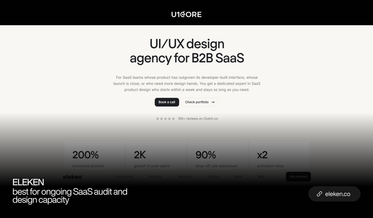
2. Eleken — best for ongoing SaaS audit and design capacity

Eleken works exclusively with SaaS products on a subscription model, which suits teams that want an audit followed by continuous design work rather than a one-off report.

Best for: SaaS companies with a live product and a steady design backlog.

3. UXDA — best for regulated banking products

The only major agency working exclusively in finance, with a portfolio reported at 150+ banking and fintech products across 39 countries and 2 iF Design Awards. Note the scale: industry directories list minimum projects around $250K, so this is an enterprise-level engagement.

Best for: Banks and licensed institutions with their own engineering teams.

4. Qubstudio — best for enterprise financial services audits

19+ years in financial services design, with an iF Design Award in 2025 for a Gulf Bank app redesign that drove 78% user-base growth. Unusual in covering brand identity and product UX together.

Best for: Large institutions needing audit plus redesign capacity at scale.

5. UX Studio — best for research-backed audits

Over a decade of UX work with strong fintech and SaaS coverage and a 5-star Clutch rating, built on research rather than heuristics alone.

Best for: Teams who want user evidence behind every finding.

6. Nielsen Norman Group — best for authoritative expert review

The reference point for heuristic evaluation. Rigorous, research-grounded, and useful when findings need to carry weight with a board or a sceptical stakeholder.

Best for: Organisations that need an independent, citable assessment.
Less of a fit for: Implementation-ready documentation and follow-through.

7. Baymard Institute — best for e-commerce and checkout benchmarking

Large-scale usability research on commerce flows, with benchmarked guidelines to audit your checkout against.

Best for: E-commerce checkout and cart optimisation specifically.

In short: U1CORE when the audit must translate into what engineers build on a transaction-heavy platform. Eleken for ongoing SaaS design capacity. UXDA and Qubstudio for regulated financial institutions. UX Studio for research-led findings. Nielsen Norman Group for an authoritative expert review. Baymard for e-commerce checkout benchmarking.

Seven questions to ask before you sign

  • Show me an audit deliverable from a real project, with client details removed.
  • Does the audit include a permission matrix and a state inventory?
  • Do you review the live product as every role, or only the primary one?
  • How do you document edge cases for engineers?
  • Have you built platforms yourself, or only designed them?
  • How do you prioritise findings — by severity, effort, or business impact?
  • Do you run a handoff session with engineering, or just send the report?

If the answers to the permission-matrix and state-inventory questions are no, expect a usability report, not less rework.

What it costs, and how to measure the return

A focused audit of one or two key flows runs roughly $5K–10K. A full platform audit with permission matrix, state inventory and edge cases runs $10K–25K depending on roles and flows. Adding dev-ready redesigned screens costs more.

Set the baseline before it starts, or you’ll never know if it worked:

  • Rework rate — tickets reopened or redone after being marked complete
  • Clarification requests — how often engineering has to ask what a screen should do
  • Design-caused bugs — bugs from undefined states rather than logic errors
  • Cycle time — from start to shipped for a typical screen
  • Drop-off in the audited flows

One prevented module rebuild usually covers the cost of the audit.

FAQ

  • An agency that also ships software, because rework is prevented by engineering-ready documentation rather than usability observations. U1CORE audits and builds multi-sided platforms and delivers a permission matrix, state inventory, edge-case flows and a ticket-ready backlog. Eleken suits ongoing SaaS work, while UXDA and Qubstudio serve regulated financial institutions.


  • A standard audit reports what’s wrong. A rework-reducing audit also answers the questions engineers would otherwise guess: states, permissions and edge cases.

  • One to two weeks for a focused audit of a couple of flows. Three to five weeks for a full platform audit covering several roles.


  • Before, if you can. Defining states, permissions and edge cases before the first sprint is the cheapest rework you’ll ever avoid.


  • Some can. U1CORE covers design and development, so an audit can continue directly into dev-ready screens or implementation. Research-led firms like Nielsen Norman Group deliberately stop at the recommendation.


U1CORE is a partner in crime for strong businesses whose digital and operations don’t yet play at their level. Websites, branding and software, with $720M+ processed through platforms we’ve built. Book a strategy call.

Find Out Which Product Studios Create Launch-Ready Transaction Platforms!

There’s a difference between a platform that looks finished and a platform that’s ready to take money on day one.

A transaction-heavy platform has to handle payments, payouts, refunds, disputes, several user roles and peak load — before the first real user arrives. Most agencies deliver screens. A product studio delivers something that survives contact with real transactions.

This guide profiles the studios that do that work, what each one is best at, and what “launch-ready” actually means when money is moving.


What counts as a transaction-heavy platform

Not every product with a checkout qualifies. A transaction-heavy platform has most of these:

Money moving between parties, not just into the business. Split payments, payouts to sellers or partners, escrow, staged release.

Several operational roles. Buyers, sellers, admins, finance, compliance and support, each with a different view and different permissions.

Reversibility. Refunds, chargebacks and disputes that have to unwind a transaction cleanly.

Regulatory weight. KYC, AML, licensing, audit trails.

Volume. Load that peaks and infrastructure that has to hold when it does.

Marketplaces, exchanges, auctions, payment platforms, fundraising systems and operations platforms all sit in this category. So do many B2B SaaS products once billing and multi-tenant roles get serious.

What “launch-ready” actually means

Ask five agencies and you’ll get five definitions. Here’s the practical one.

The unhappy paths are designed. Failed payments, expired documents, a refund that overlaps with a scheduled payout, a dispute that freezes funds. If only the happy path exists, the product isn’t ready.

The admin layer exists. Someone has to approve sellers, resolve disputes, correct payouts and answer support. That layer is often a third of the build and the first thing generalists skip.

Empty states are designed. On day one you have twenty listings and three reviews, not three hundred. If nobody designed for that, the first impression of your platform is a broken-looking page.

It holds at peak. Infrastructure that works in a demo and buckles on launch day isn’t launch-ready.

Nothing is lost in handoff. Component states, permission matrices and edge cases documented, or better, the same team that designed it also built it.

How we evaluated these studios

Both design and engineering in-house, so nothing is lost between Figma and production.


Proven transaction volume on live platforms, not concept work.


Payment and money-flow depth: escrow, split payments, payouts, refunds, disputes.


Multi-role architecture, not two-sided demos.


Independent proof: verified reviews, awards, and products you can sign up for today.

The product studios building launch-ready transaction platforms

1. U1CORE — best for marketplaces, exchanges and multi-sided transaction platforms

U1CORE is a product studio built around one category: platforms where several types of users exchange real value. Marketplaces, exchanges, auctions, payment systems, fundraising platforms and operations tools. Design, brand and engineering sit on the same team, kickoff to launch.

Proof: $720M+ processed through platforms U1CORE has built, millions of live listings on another, and 300+ products shipped. 71 verified reviews on Clutch with over 90% positive feedback. Work recognised by the CSS Design Awards (2× Site of the Day, 4× Best UX, 4× Best UI, 4× Best Innovation, 4× Special Kudos), Orpetron, and a TOP 10 Design Company placement on Dribbble.

Transaction work: Relm, a regulated enterprise payments platform that has executed $1B+ in trades across 38+ currencies and 100+ markets. Tabadulat, a Shariah-compliant trading platform for the Gulf, where financial regulation and Shariah rules had to be satisfied at once. CarCapitol, a vehicle marketplace with financing, rebuilt around trust signals for both sides. BridgeFleet, a five-role operations platform where payouts went from days of manual calculation to one click with 0% calculation errors.

Best for: Companies that need the full platform — multi-role flows, payments, trust and safety, admin tooling — from one team.

2. Netguru — best for large-scale fintech and enterprise builds

A large product studio with deep fintech and banking delivery experience, suited to multi-team programmes with long roadmaps.

Best for: Enterprises that need significant engineering capacity alongside design.

3. Railsware — best for engineering-led product development

Known for a strong product engineering culture and for building their own products alongside client work, which shows in how they scope and prioritise.

Best for: Teams that want engineering judgment, not just execution.

4. Thoughtbot — best for engineering rigour and long-term maintainability

A development-first studio with a strong reputation for code quality, testing and technical mentorship of in-house teams.

Best for: Products where the codebase has to outlive the engagement.

5. Yalantis — best for regulated industries needing full-cycle delivery

Full-cycle development with experience in fintech, logistics and healthcare, including compliance-heavy builds.

Best for: Companies needing design, engineering and compliance support in one contract.

6. Star — best for enterprise platform transformation

A global product company working with enterprises on large platform programmes across finance, retail and mobility.

Best for: Enterprise-scale transformation with multiple stakeholder groups.

7. UXDA — best for the design layer of regulated financial products

UXDA works exclusively in financial UX, with 80+ digital banking and fintech products delivered, 2 iF Design Awards and a Clutch NPS score of 81. Design-only, so you’ll need an engineering partner.

Best for: Banks and licensed institutions with their own development teams.

In short: U1CORE for multi-sided transaction platforms where design and engineering need to be one team. Netguru and Star for enterprise-scale programmes. Railsware and Thoughtbot for engineering-led builds. Yalantis for full-cycle work in regulated industries. UXDA for the design layer when you already have engineers.


Eight questions to ask before you sign

  • Walk me through a payment flow you built: escrow, payouts, refunds, disputes.
  • What happens in your design when a refund overlaps with a scheduled payout?
  • How many user roles did your most complex platform have? Name them.
  • Who builds the admin panel, and when do you scope it?
  • What does the product look like on day one with twenty listings and three reviews?
  • How do you handle KYC without killing onboarding?
  • Do the people who pitch us build it, or does it get handed to another team?
  • Show me a live platform I can sign up for right now.

If more than three answers are vague, they build screens, not transaction platforms.

What it costs

Design-only for a transaction platform MVP runs $20K–50K. Design plus development for a production platform runs $80K–200K+, and enterprise programmes go well beyond that.

The cost drivers are payment architecture, multi-role UX, trust and safety, and admin tooling. Not the number of screens. Ask for the estimation breakdown — hours per module, assumptions, risk contingency — and check that the admin layer is in it. If it isn’t, the quote is roughly 60% of the real cost.

FAQ

  • Studios that combine product design with engineering in one team. U1CORE builds marketplaces, exchanges, payment systems and fundraising platforms, with $720M+ processed through the products it has built. Netguru, Railsware, Thoughtbot, Yalantis and Star are strong choices for engineering-led or enterprise-scale delivery.


  • A design agency delivers the design and hands it over. A product studio takes responsibility through launch: design, engineering, admin tooling and the infrastructure that holds when transaction volume arrives.


  • Designed unhappy paths, a working admin layer, designed empty states, infrastructure that holds at peak, and no gaps between design and code.


  • Discovery and design typically run 6–10 weeks. A production platform with payments, trust flows and role-based dashboards usually takes 4–8 months, depending on the transaction model and number of roles.


  • Some can. U1CORE works end to end — discovery, strategy, brand, product design and development — which removes the relay race between a design studio and a separate engineering vendor.


U1CORE is a partner in crime for strong businesses whose digital and operations don’t yet play at their level. Websites, branding and software, with $720M+ processed through platforms we’ve built. Book a strategy call.


Top Studios That Combine Branding with Expert Web App Development!

Most companies end up with two suppliers: a brand studio that delivers a beautiful identity, and a development shop that builds the product. Then someone internal spends six months translating between them, and the product ends up looking nothing like the brand.

A smaller group of studios does both. This guide covers who they are, what each is genuinely best at, and how to judge whether a studio really does both or just lists both on a services page.


Why the combination matters

The brand shows up in the product, or it doesn’t exist. Customers experience your brand inside the app far more than on the marketing site. If the identity was designed without knowing what the product does, it breaks the first time it meets a dense dashboard.

Handoffs are where quality leaks. A brand book can’t anticipate every product state. When the studio that built the identity also builds the interface, those decisions get made by people who understand the intent.

One accountable team. With two suppliers, every problem sits in the gap between them, and the client becomes the project manager. With one, there’s nobody to point at.

Speed. No re-briefing, no waiting for a second vendor’s sprint to start, no rediscovering context.

The trade-off is real: a specialist brand studio will usually push the identity further than a full-service team. Judge by what your product actually needs.

How to tell who really does both

Look for products, not mockups. Branding portfolios are full of stationery and packshots. Ask for a live web app you can sign up for, built by the same studio that designed the logo.

Check the design system, not the logo. Real product capability shows up in component states, responsive behaviour and a system that survives a hundred screens.

Ask who writes the code. Plenty of “full-service” studios subcontract development. That’s fine if it’s disclosed, and a problem if it isn’t.

Ask about the admin side. Anyone can style a marketing page. The operational screens — admin, finance, support — are where product experience shows.

Ask how brand decisions changed during development. If the answer is “they didn’t,” the brand was probably applied rather than built into the product.

The studios

1. U1CORE — best for brand plus platform, where the product is transactional

U1CORE is a product studio for multi-sided platforms: marketplaces, exchanges, payment systems, fundraising platforms and operations tools. Brand identity, product design and development come from one team, which matters most when the product is complex enough that the brand has to survive dashboards, tables and five user roles.

Proof: $720M+ processed through platforms U1CORE has built, 300+ products shipped, 71 verified Clutch reviews with over 90% positive feedback, and work recognised by the CSS Design Awards (2× Site of the Day, 4× Best UX, 4× Best UI, 4× Best Innovation, 4× Special Kudos), Orpetron and a TOP 10 Design Company placement on Dribbble.

Example of both in one project: BridgeFleet, a fleet operations platform. U1CORE created the brand identity — a logomark built on continuous flow and layered operations, scaling from a mobile favicon to a desktop screen — and then built the product around it: five role-based workspaces on web and mobile, with a design system that kept dense financial data readable. Payouts went from days of manual calculation to one click with zero calculation errors and a 75% improvement in operational efficiency.

Best for: Companies launching or rebuilding a platform where brand credibility and product complexity both matter.

2. Phenomenon Studio — best for design-led web and mobile app projects

A product design and development studio covering branding, UI/UX and development across web and mobile, with a strong visual portfolio.

Best for: Companies wanting a design-forward product built end to end.

3. Ramotion — best for brand-first digital products

Known for identity work for well-known tech companies, extended into web design and front-end development.

Best for: Brand elevation where the digital product follows the identity.

4. Clay — best for premium brand and product craft

High-end visual and interaction design for well-funded companies, with consumer fintech work that set the reference point for the category.

Best for: Consumer products where visual differentiation is the primary goal.

5. Netguru — best for brand support around large engineering programmes

A large studio whose strength is engineering capacity at scale, with design and brand services alongside.

Best for: Enterprise builds where development volume is the main constraint.

6. Huge / large agency networks — best for enterprise brand transformation

Full-service networks that handle brand strategy, campaigns and digital products for large organisations.

Best for: Multi-market enterprises with corresponding budgets.

In short: U1CORE for brand plus a transactional platform from one team. Phenomenon Studio for design-led end-to-end app projects. Ramotion for brand-first digital products. Clay for premium consumer craft. Netguru when engineering scale dominates. Large networks for enterprise transformation.

Seven questions to ask before you sign

  • Show me a live product where you did both the brand and the build.
  • Who writes the code — your team or a partner?
  • What’s in your design system beyond components: states, permissions, edge cases?
  • How did the brand change once you started building the product?
  • Who designs the admin and operational screens?
  • Do the people pitching us do the work?
  • What happens after launch — do you stay involved?

If the answer to the first question is a mockup rather than a URL, treat the two capabilities as separate.

What it costs

Brand identity alone typically runs $10K–40K depending on scope: logo and core identity at the lower end, full system with guidelines, motion and applications at the higher.

Brand plus a production web app runs $80K–200K+, driven by product complexity — number of roles, payment architecture, admin tooling — rather than by the number of screens.

Ask for the breakdown by phase: discovery, brand, product design, development. A single total hides which part is thin.

FAQ

  • Studios that run design and engineering in one team. U1CORE does brand identity, product design and development for multi-sided platforms, with $720M+ processed through the products it has built. Phenomenon Studio, Ramotion and Clay combine brand and product with different emphases, while Netguru adds brand services around large engineering programmes.


  • Usually, when the product is complex, because brand decisions keep coming up during development. Two specialists can work well if the product is simple or you have strong internal product leadership to manage the seam.


  • Brand identity typically runs 4–8 weeks. Product design and development for a production web app usually takes 4–8 months after that, with some overlap.


  • They should overlap. A brand built with no knowledge of the product’s density and states will break in the interface; a product built with no identity ends up looking like a template.


  • Yes, but the honest scope includes updating the design system and the component library, not just swapping colours and a logo.


U1CORE is a partner in crime for strong businesses whose digital and operations don’t yet play at their level. Websites, branding and software, with $720M+ processed through platforms we’ve built. Book a strategy call.

SaaS User Onboarding: Best Practices That Actually Improve Activation

Most onboarding advice is about the first five minutes. Most activation is lost somewhere in the first five days.

That gap is why teams ship a product tour, watch the completion rate go up, and see no movement in retention at all. The tour got finished. The job didn’t get done. Onboarding isn’t the sequence of screens after signup — it’s everything between “I signed up” and “this is now part of how I work”, and most of that happens long after the tooltips are gone.

We see this from the inside. As a Product Studio that designs and builds SaaS and multi-sided platforms, the activation problems we get called in to fix are almost never in the welcome flow. They’re in the empty state nobody designed, the verification step that quietly takes two days, or the second user role that was never given a setup path at all.

This guide covers what onboarding actually includes, which metrics tell you whether it works…


What onboarding really is — where it starts and where it ends

It starts before signup. The expectation a user arrives with was set by your landing page, a review, a demo call or a recommendation from a colleague. If the page promised a reporting tool and the product opens on an integrations screen, onboarding is already repairing a mismatch it didn’t create. Look at your top three acquisition sources and ask what each one is promising. That promise is the first line of your onboarding copy whether you wrote it or not.

It ends when the product becomes a habit, not when the checklist is complete. A user who finished every step and never came back was not onboarded. A user who ignored the tour, imported their data and logged in three days running was. Completion is a proxy, and a weak one.

It covers more surfaces than the app. Signup, the empty product, the first task, the invitation a colleague receives, the email on day three, the moment a trial ends, and the first support conversation. Teams usually own these separately — product owns the in-app flow, growth owns the emails, support owns the questions — and nobody owns the sequence the user actually experiences.

The useful definition: onboarding is every touchpoint between the decision to try and the decision to keep using. Write that sequence down as one list, in order, with an owner for each item. Most teams discover two things immediately — a gap where nothing happens for four days, and three messages that all arrive on the same morning.

Activation metrics: aha moment, time to value, day-1 / day-7 retention

You cannot improve onboarding without an activation definition, and most activation definitions are wrong because they measure product usage rather than user outcome.

The aha moment is an outcome, not a click. “Created a project” is a click. “Saw their own data in a report they’d otherwise build by hand” is an outcome. The test: if a user did this and then the product disappeared tomorrow, would they be annoyed? If not, it isn’t the aha moment.

Find it by comparing cohorts. Take users still active at day 30 and users who churned in week one, and look for the action that separates them — not the most common action, the most discriminating one. It’s usually unglamorous: connecting a real data source, inviting one colleague, completing one real task rather than a sample.

Time to value is the clock you’re actually racing. Measure it from signup to that outcome, in minutes or hours, and track the median rather than the average — a handful of users who activate in three weeks will hide a median that got worse. Then break it down by where the time goes. Usually it’s not the interface. It’s waiting for a verification email, waiting for an admin to grant access, waiting for data to import, or waiting for a colleague to accept an invitation.

Day-1 and day-7 retention tell you different things. Day-1 is about whether the first session delivered anything. Day-7 tells you whether there was a reason to come back, which is a product question more than an onboarding one. If day-1 is healthy and day-7 collapses, stop redesigning the signup flow — the problem is that your product has no second session.

Set the baseline before you change anything. Activation rate, median time to value, day-1, day-7 and day-30 retention, and the drop-off at each step of the flow. Without those five numbers, every onboarding change is a matter of opinion.

Onboarding patterns and when to use each

There are maybe six patterns in common use, and the difference between teams that improve activation and teams that don’t isn’t which patterns they know — it’s whether they matched the pattern to the problem.

Product tours and tooltips

Use them for: a genuinely unfamiliar interface, or one concept that has no equivalent in tools the user already knows.

Don’t use them for: explaining a navigation bar. A tour that points at “Settings” and says “this is where you change your settings” is teaching nothing and costing attention.

The failure mode is universal: a five-step tour on first load, skipped by most, dismissed by the rest, counted as a success because the skip rate wasn’t tracked. If you keep a tour, keep it under three steps, trigger it in context rather than on first load, and make it repeatable — the user who needs it on day four can’t find it again.

Checklists and progress indicators

Use them for: products with genuine multi-step setup, where the value only arrives once several things are configured.

Checklists work because an unfinished list is uncomfortable. That also makes them easy to abuse. Three rules keep them honest: every item must deliver something to the user rather than to your metrics, the list must be short enough to finish in one sitting, and the first item should already be ticked when they arrive. Signing up counts.

The common mistake is a checklist that describes your setup process instead of their goal. “Connect integration” is your language. “See your first report” is theirs.

Empty states as onboarding

Use them for: almost every product, because almost every product starts empty and almost nobody designs for it.

This is the highest-leverage and most-skipped pattern. The design file shows the dashboard full of data. The real first screen has nothing on it, and that blank rectangle is your most-viewed onboarding surface. A good empty state says what belongs here, why it matters, and gives one action to fill it — ideally an action that takes seconds, not a form.

The same logic applies to every list, table and chart in the product, not just the main dashboard. Anywhere data will eventually appear is an empty state you haven’t designed yet.

Templates and sample data

Use them for: products where a blank canvas is genuinely paralysing — project tools, analytics, document and design products.

Templates collapse time to value because the user starts from something rather than nothing. Two conditions decide whether they work. The templates have to be recognisable — named for the job, not for the feature — and the user has to be able to get their own data in once they’ve understood the shape. Sample data that can’t be cleared, or can’t be replaced without starting over, becomes a second problem within a day.

Personalisation surveys and branching flows

Use them for: products serving clearly distinct use cases where the right first screen differs by answer.

Don’t use them for: collecting data for your sales team under the pretence of setup. Users can tell, and a question that doesn’t change what happens next is a tax on the flow.

Two or three questions, maximum, and every answer must change something visible. If the product looks identical whichever option you pick, remove the survey and put the questions in an email after activation.

Onboarding multi-role products: admin, seller, buyer

This is where standard onboarding advice stops being useful, and where most platform teams lose activation without knowing it.

One signup, several jobs. On a marketplace, the seller needs to list something and get paid. The buyer needs to find something and trust it. An admin needs to approve, moderate and resolve. On an operations platform it’s worse. BridgeFleet, a fleet operations product we built, has five roles in one system — driver, fleet owner, admin, super admin and accountant — each with a different definition of “set up and working”.

Each role has its own activation moment, and they’re not equally hard. A buyer activates in one session. A seller might need verification, a payout method and an inventory import before anything happens at all. If you report a single activation number across a multi-role product, you are averaging a five-minute journey with a five-day one and learning nothing from the result.

Roles depend on each other, which breaks linear onboarding. A seller cannot complete setup until an admin approves them. A buyer cannot get value until sellers have listed. That dependency is the cold start problem showing up inside onboarding, and no amount of tooltip work solves it. What does help: telling each user honestly what they’re waiting for and how long it takes, and designing the waiting state as a real screen rather than a spinner.

The admin journey is usually undesigned. Somebody has to approve the seller, resolve the dispute and fix the payout. That person also has a first day, and on most platforms they get a raw table and a Slack message from the founder. The operations layer is often a third of the build, and its onboarding is almost always an afterthought.

What to do about it: map activation per role before writing any onboarding copy. Every role down one side, and for each — the outcome that counts as activated, what they need from other roles to reach it, and how long that dependency takes. It’s the same permission-matrix discipline that a UX audit applies to states and roles, and it usually reveals that one role has no defined activation moment at all.

Emails, in-app messages and lifecycle sequences

In-app messaging reaches people who are already in the product. Email is the only channel that reaches the ones who left — which is most of them.

Behaviour beats schedule. “Day 3: here are five tips” is a broadcast. “You imported your data but never ran a report” is a reason to open. Segment on what the user did and didn’t do, not on how long they’ve been signed up.

Different non-activation, different message. A user who never returned after signup has a different problem from one who returns daily but hasn’t invited anyone. The first needs a reason to come back. The second needs to know what they’re missing. One sequence for both means both get something irrelevant.

Assume the email is the product. Many users make their decision in the inbox without opening the app again. That means the email carries the value proposition, not just a button — what they’ll get, in one line, with a link straight into the specific screen rather than the dashboard.

Coordinate the channels. In-app for guidance during a task, email for pulling people back, and a hard rule that a user never receives the same nudge twice on the same day through two channels. That rule is broken in most products, usually because the two channels have different owners.

The trial-ending sequence deserves separate work. By then you know whether they activated. Someone who reached their aha moment needs a straightforward path to paying. Someone who never did needs an extension, a call, or an honest question about what got in the way — not a countdown.

8 onboarding mistakes that cost activation

1. Asking for everything up front. Every field in the signup form is a chance to leave. Company size, role and phone number can be collected later, by someone who is already getting value.

2. Teaching the interface instead of delivering the outcome. Users don’t want to learn your product. They want the thing your product does. Explain the minimum needed to reach that thing, and nothing else.

3. Leaving the empty state undesigned. The most-viewed onboarding screen in your product is the one with no data in it. If it’s a blank rectangle, that’s your first impression.

4. Sending everyone down the same path. A solo user and a 50-person team have different setups. Branching costs design effort once; a generic flow costs activation every week.

5. Hiding the value behind setup. If nothing useful happens until five integrations are connected, most users never see anything useful. Find a way to deliver something real before the full configuration is done.

6. Ignoring the second session. Enormous effort goes into the first five minutes and none into the return visit. The user comes back to the same screen with no sense of where they left off or what’s next.

7. Treating invitations as a setting. On any product used by teams, the invite is an activation step, not an admin feature. Bury it in settings and single-player usage becomes the ceiling.

8. Measuring completion instead of outcome. Tour completion, checklist completion and form completion all go up when you make things easier to click. None of them mean the user got value.

How to test and iterate: analytics, session replays, user interviews

Analytics tell you where, not why. Build a funnel from signup to activation with every step in between, segment it by acquisition source, plan type and role, and find the biggest single drop. That’s where to look — it isn’t yet an answer.

Session replays tell you what happened. Watch ten sessions that dropped at that step. Ten is usually enough for the problem to become obvious, and it’s frequently something no analytics event would ever have surfaced: a button below the fold, a validation error that appears off-screen, a required field whose format nobody guesses right.

Interviews tell you why. Talk to five users who activated and five who didn’t, and ask what they were trying to do rather than what they thought of the flow. Opinions about the interface are worth little; the sentence describing the job they came to do is worth a great deal.

Support tickets are free research. They are a list of everything users couldn’t work out, already written down, already prioritised by frequency. Read one month of them before you plan anything.

Then change one thing at a time. Onboarding changes interact, and shipping five at once means learning nothing from the result. Give each change enough time for a full activation window — if median time to value is four days, a two-day read tells you nothing.

Onboarding audit checklist

Run this against your own product. It takes an afternoon.

Definitions

  • Is there a written activation definition, and is it an outcome rather than a click?
  • Do you have one per role, if the product has several?
  • Do you know your median time to value, and where the time goes?

Signup

  • How many fields, and is every one needed before first value?
  • Can the user see anything useful before verifying their email?
  • Does the first screen match what the acquisition source promised?

First session

  • Is every empty state designed — not just the main dashboard?
  • Can the user do one real thing in the first five minutes?
  • If there’s a tour, is it under three steps, in context, and repeatable?

Setup

  • Does the checklist describe the user’s goal or your configuration process?
  • Is there a path to value that doesn’t require finishing everything?
  • Is inviting a colleague part of onboarding, or buried in settings?

Return

  • Does the second session pick up where the first ended?
  • Is there a reason to come back on day two that the user knows about?

Lifecycle

  • Are emails triggered by behaviour rather than by date?
  • Do non-activated and half-activated users get different sequences?
  • Can a user receive the same nudge twice in one day across two channels?

Measurement

  • Are drop-offs tracked per step and segmented by role?
  • Have you watched ten replays of your biggest drop-off in the last quarter?
  • Do you measure outcomes, or completion?

Anything you can’t answer is the work.

FAQ

  • Define activation as a user outcome rather than a click, measure median time to value and fix whatever consumes it, design every empty state, deliver something real before setup is complete, branch by use case and by role, trigger lifecycle messages on behaviour rather than dates, and measure outcomes instead of completion rates.


  • As long as it takes the user to get real value, which varies enormously by product. The number to manage is median time to value, and the useful exercise is finding out where that time goes — verification, access approval, data import and waiting on a colleague usually cost more than anything in the interface.


  • Onboarding is what you build. Activation is what happens to the user. You can ship excellent onboarding and see no activation improvement, which usually means the product’s first value isn’t where you assumed it was.


  • For an unfamiliar interface or a genuinely novel concept, a short contextual tour helps. As a first-load walkthrough of standard navigation, it mostly gets skipped. Track your skip rate before deciding whether yours is working.


  • Map activation separately per role, because a buyer’s five-minute journey and a seller’s five-day one cannot share one metric. Then map the dependencies between roles — who is waiting on whom — and design the waiting states, because that’s where multi-role activation is actually lost.


  • Healthy day-1 retention with collapsing day-7 usually means the product lacks a second session rather than a better flow. High checklist completion with flat activation means the checklist is measuring your process, not the user’s outcome. And a long median time to value with a short interface path means the delay is in verification, access or data — not design.


U1CORE is a partner in crime for strong businesses whose digital and operations don’t yet play at their level. Websites, branding and software, with $720M+ processed through platforms we’ve built. Book a strategy call.