




- Article
Top UX Agencies Specializing in Fintech KYC Flow Solutions


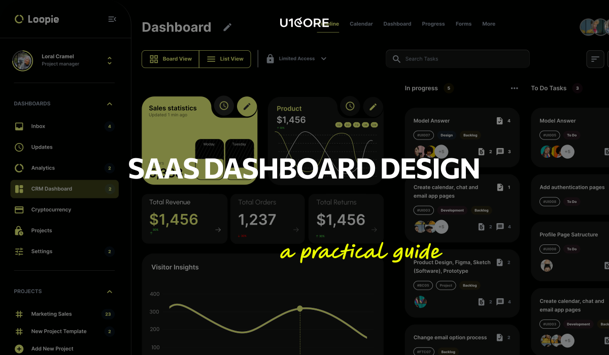
A dashboard fails quietly. Nobody complains — people just stop opening it, and six months later someone exports the data to a spreadsheet to answer a question the dashboard was built to answer.
That’s rarely an aesthetics problem. As a Product Studio that designs and builds data-heavy platforms, the dashboards we get called in to fix are almost never ugly. They’re accurate, complete, and impossible to act on — because the screen shows what the database contains rather than what the user came to find out.
Start with the question, not the data. Most dashboards answer three recurring questions: is anything wrong right now, how are we tracking against expectation, and what should I do next. If a widget doesn’t help answer one of them, it’s decoration with a maintenance cost.
Different dashboards do different jobs, and mixing them is the most common structural mistake. A monitoring dashboard is read in seconds and should be quiet most of the time, surfacing exceptions. An analytical one supports comparison and exploration. An operational one is worked in — it needs actions attached to records, not just numbers. One screen trying to be all three is usually the dashboard people stop opening.
Every metric needs a reference point. €48,320 means nothing until it sits next to last month, target, or the same period last year. If you can’t decide what the comparison should be, the metric hasn’t been thought through.
Delete more than you add. A screen with six things gets read. A screen with thirty gets scanned once and abandoned.
The top of the screen is the most expensive space in your product. It should answer “is everything fine?”, not show the metric that was easiest to compute. On an operations platform we built, the top row changed from total revenue to vehicles currently unavailable — same data, completely different product, because the first number was interesting and the second was actionable.
Group by the user’s mental model, not your data model. Users think in objects: a customer, a vehicle, an order. A dashboard organised by where data lives starts every session with a translation step.
Three levels is usually right. Overview answers “is anything wrong”, the second level “where”, the third “why”, with the underlying records.
Make the default view the one most people need. Every user who has to configure the dashboard before it’s useful is paying for your indecision.
Chart choice follows from the comparison being made, not from style.
Change over time → line chart. Use bars when periods are discrete and the comparison is between them rather than along them.
Comparison between categories → horizontal bars, sorted by value. Horizontal, because category labels are text. Rotated labels on vertical bars mean the chart is in the wrong orientation.
Composition → stacked bars. Pie charts work for two or three segments and stop working beyond that, because people compare angles badly.
Relationship between two measures → scatter plot. Underused in SaaS, and the right answer when the question is “does X move with Y”.
A single number → a single number. The KPI tile is the most overdesigned element in dashboards. Large value, small label, small comparison. Add a sparkline only when the shape of the trend changes the interpretation.
Dense detail → a table. When users need exact values, sorting and export, a good table beats any chart. Right-align numbers, use tabular figures, keep the header sticky.
Two rules throughout: start bar charts at zero, and give every axis a unit.
KPI row. Three to five metrics, each with a comparison. Five is the practical limit before it stops being a summary.
Card grid. Flexible, but it tempts teams to keep adding until the page scrolls three screens. If it doesn’t fit, that’s usually a signal this should be two dashboards for two jobs.
Drill-down. Two things make or break it: context has to survive the transition — filters and date range carry through — and the way back has to be obvious.
Side panels. The best pattern for inspecting a record without losing the list, its scroll position or its filters. Use a full page only when the task deserves its own URL.
Dashboards don’t have to fit on one screen. They do have to make the first screen sufficient for the most common question.
Make the active filter state visible at all times. The most common dashboard support ticket is a user looking at filtered data they forgot they filtered, concluding the numbers are wrong. Active filters belong on screen as removable chips.
Date range deserves special treatment. It’s the filter used most, so keep it in a consistent position with real presets — today, last 7 days, last 30, this month, last month, custom. State the comparison period explicitly rather than showing an unexplained arrow.
Put filter state in the URL. Otherwise a user can’t send a colleague what they’re looking at.
Saved views are how one dashboard becomes several. Rather than building a separate screen for finance, support and operations, let each save what they need. On multi-role platforms this is often the difference between one maintainable dashboard and four that drift apart.
Filters that return nothing need designing. Say which filter is responsible and offer a way to relax it.
This is where dashboards meet reality, and it’s the part most often missing from the design file. Engineers then invent these states under time pressure, and every invention gets rebuilt later.
Empty. Every chart, table and card needs a version that says what belongs here and what to do to fill it. Distinguish genuine emptiness (“no data yet”) from a filtered result (“nothing matches these filters”) — they look identical and need different responses.
Loading. Skeletons beat spinners: they preserve layout and prevent content jumping. Load in priority order, KPI row first. A dashboard where the most important number appears last feels slow even when it isn’t.
Error. Separate “this widget failed” from “the page failed” — one broken chart shouldn’t blank the screen. And never show a partial number without marking it as partial.
No permission. On any product with roles, users will reach things they can’t see. Hiding the element entirely or showing it disabled with an explanation are both defensible. Undecided is not, and it’s a product decision, not a developer one.
Contrast is not a style preference. Text and data labels need at least 4.5:1 against their background; large text and meaningful graphics need 3:1. Light grey on white is the most common failure, and it fails hardest on the users who need the product most.
Use tabular figures. Most typefaces give digits variable widths, which makes columns ragged and genuinely harder to compare. One CSS property fixes it.
Spend colour carefully. Reserve red and green for status. Keep categorical palettes to six or seven colours — beyond that, adjacent ones become indistinguishable.
Never encode meaning in colour alone. Pair it with a shape, icon, label or position. Print the screen in greyscale: nothing essential should disappear.
Round for reading, keep precision for inspection. €48.3K in the tile, the exact figure in the tooltip and the export.
Dark mode is not an inverted palette. Pure white on pure black causes halation — text appears to vibrate. Use a near-black background (around #121212) and an off-white for text.
Saturated colours behave differently on dark. A vivid blue that reads well on white will glow uncomfortably. Desaturate and lighten chart colours rather than reusing the same values.
Elevation replaces shadow. Shadows are invisible on dark backgrounds; surfaces get lighter as they rise. Define those levels once, as tokens.
Build on semantic tokens from the start — surface-raised, text-secondary, status-critical, not raw hex values. Retrofitting themes is one of the most tedious refactors there is, and a day-one naming decision avoids it entirely.
Decide whether you actually need it. Dark mode is genuinely valuable for long sessions in low light. Everywhere else it doubles the appearance surface you maintain and test.
Components are the easy part. Every design system has a button. Dashboards need the layer above: which chart for which comparison, how a KPI tile is composed, and what every state of a data component looks like.
Document states, not just components. For each data component: default, loading, empty, filtered-empty, error, partial data, no permission. This single table removes more rework than any other artefact a design team produces, and it’s the core of what a UX audit should deliver for a data-heavy product.
Make charts a system. Fix the palette, axis and grid styling, tooltip behaviour, legend placement, number formatting and rounding. Without it, every new chart is a fresh set of decisions and the product slowly stops looking like one product.
Treat permissions as part of the system. Each component needs defined behaviour for a user who can view but not edit, or can’t see it at all. We start platform projects with a permission matrix before any screens, because it determines the component API, not just the UI.
Build admin screens with the same system. Operations, finance and support surfaces are often the most used in the product and the least designed.
Purpose
Structure
Visual form
Filters
States
Readability
Anything you can’t answer confidently is the work.
A clear purpose, a first screen that answers the most common question without scrolling, chart types matched to the comparison being made, every metric paired with a reference point, and designed empty, loading, error and permission states. Polish matters far less than whether a user can act on what they see.
Three to five in the KPI row, and as few widgets below it as the job allows. The test is whether a user can find the most important number in under three seconds. If not, the screen is doing more than one job.
Match it to the comparison. Change over time: line, or bars for discrete periods. Across categories: horizontal bars, sorted by value. Composition: stacked bars, pie only for two or three segments. Relationship between measures: scatter. Exact values across many dimensions: a table.
Design the empty state first, then the sparse state, then the full one. Products are emptiest exactly when a user’s first impression forms.
Each role has a different definition of “the important number”, and some components are invisible or read-only depending on who’s looking. Map the permission matrix before designing screens — it determines component behaviour, not just which menu items appear.
U1CORE is a partner in crime for strong businesses whose digital and operations don’t yet play at their level. Websites, branding and software, with $720M+ processed through platforms we’ve built. Book a strategy call.


Book an introduction call
During this call we do a quick intro and discuss your project and its specific needs.
Book an introduction call
During this call we do a quick intro and discuss your project and its specific needs.

Book a free consultation with us, so we will frame your product vision and strategy.

We’ve received your request and our team is already reviewing it. We’ll get back to you as soon as possible to discuss how we can help you achieve your goals.
Looking forward to collaborating with you!

We’ve sent the download link to your email. Check your inbox (and spam folder just in case) to access the eBook.
We hope you find it valuable for your Web3 journey. If you have any questions or feedback, feel free to reach out!

We want your Web3 website to be great even if you don't hire us.