


- Article
Top UX Agencies Specializing in Fintech KYC Flow Solutions


Most SaaS landing pages fail before the visitor reads the second paragraph. Not because the product is wrong. Because the page doesn’t answer three questions every visitor asks in the first ten seconds: what does this do, who is it for, and why should I trust you.
This guide covers how to structure a high-converting SaaS landing page — from hero section to pricing to CTA. At U1CORE, landing page design is one of our most requested services for growth-stage SaaS companies. Here’s what actually moves conversion.
A SaaS homepage serves multiple audiences: existing users, potential customers, investors, job candidates. A landing page serves one audience with one message and one goal.
A landing page built for a specific acquisition channel converts at two to five times the rate of a generic homepage because the message matches the visitor’s context. Every significant acquisition channel deserves its own landing page.
The hero section is the only part of the page every visitor sees. If it fails to communicate what the product does and why it matters in under ten seconds, the rest of the page doesn’t get read.
A high-converting SaaS hero has four elements.
Headline: a specific, outcome-oriented statement. Not a tagline. A clear answer to “what is this.” The best SaaS headlines follow a simple structure: Verb, outcome, audience. “Close more deals without updating your CRM.” “Build and ship features twice as fast.”
Subheadline: one or two sentences that expand the headline with the specific mechanism or audience. Together, headline and subheadline answer: what does this do, who is it for, what’s different.
Primary CTA: one action, clearly labeled. “Start free trial” is better than “Get started” because it tells the visitor what they’re starting. Avoid generic labels — Sign up, Learn more, Submit — that could belong to any product.
Hero visual: a product screenshot or short product video. Not a stock photo. Visitors want to see what they’re buying. A realistic product screenshot reduces the “is this real” question and increases time on page.
Stripe’s hero shows a code snippet and a payment interface simultaneously — answering “what does this do” and “how does it work” in a single visual. Linear’s hero shows the actual product interface at high resolution, communicating product quality before a word is read.
Social proof reduces the purchase anxiety every SaaS visitor carries. The most effective forms, in order of credibility:
Named testimonials with photos and company logos. A quote from “Sarah M., VP of Operations, Acme Corp” with a headshot and company logo is more credible than a generic five-star review. Specificity signals authenticity.
Customer logos. A row of recognizable company logos communicates that the product has been adopted by credible organizations.
Usage statistics. “50,000 teams use this product” or “4.8 from 2,000+ reviews on G2” are credible because they’re specific and verifiable. Vague claims are less credible.
Case study snippets. A one-paragraph outcome story is more persuasive than a generic testimonial because it describes a specific result.
Place social proof immediately below the hero — not buried at the bottom of the page.
The pricing section is the highest-intent moment on a SaaS landing page. A visitor who scrolls to pricing is actively evaluating. A high-converting pricing section has three properties.
It shows the actual price. “Starting at $49/month” is more credible than “pricing available on request.” Hiding price creates friction at the highest-intent moment.
It has a clear recommended plan. Label one plan as “Most popular.” Visitors who are unsure which plan to choose are more likely to convert when the page removes the decision.
It addresses the objection at the decision point. “Free to cancel anytime” and “14-day free trial, no credit card required” belong in the pricing section — not in the FAQ at the bottom.
A long SaaS landing page needs multiple CTA placements. The minimum structure: hero section, after the features section, adjacent to the pricing table, and footer. Each placement uses the same primary action with varied supporting copy.
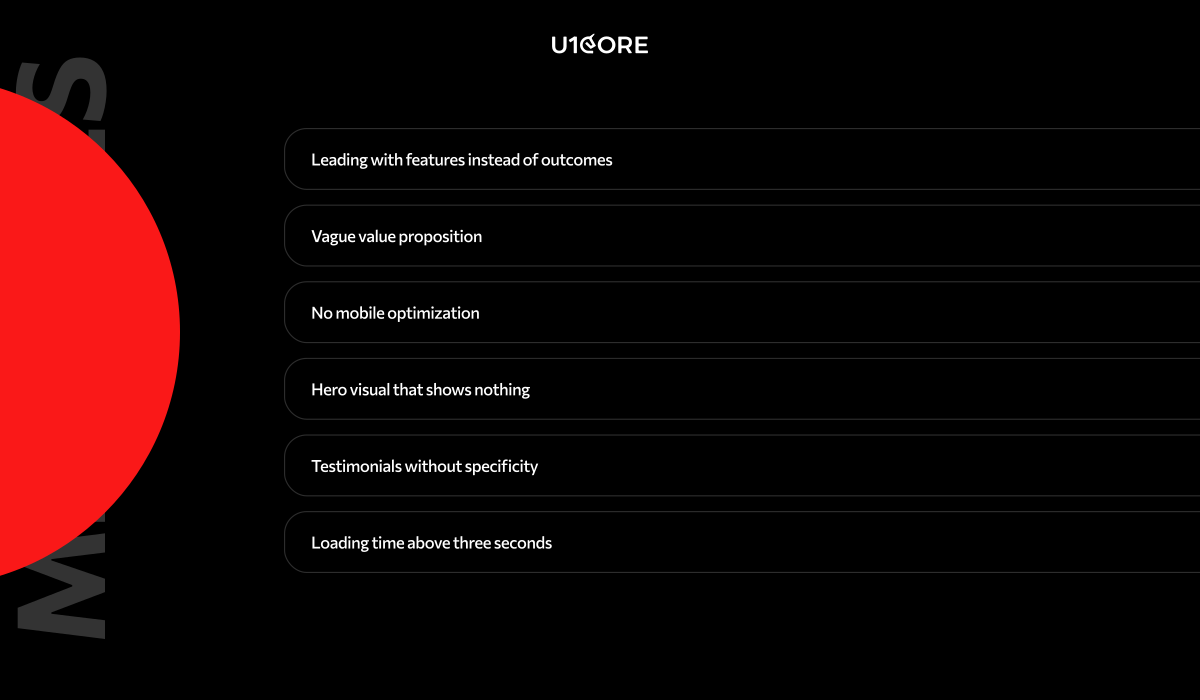
Leading with features instead of outcomes. “Automated reporting, custom dashboards, and API integrations” describes what the product has, not what it does. Reframe: “See the data that drives your decisions — automatically, in real time.”
Vague value proposition. “The platform for modern teams” could describe a thousand products. Be specific about who the product is for and what it specifically solves.
No mobile optimization. A significant share of initial SaaS research happens on mobile. A desktop-only design loses mobile visitors immediately.
Hero visual that shows nothing. A gradient background or stock photo communicates nothing. If visitors can’t see what they’re buying, they leave.
Testimonials without specificity. “Great product, highly recommend!” from “John D.” is not social proof. Real testimonials name a specific outcome, from a named person with a real role, company, and photo.
Loading time above three seconds. Every additional second of load time reduces conversion. Unoptimized images and render-blocking scripts are the most common causes.
Webflow is the strongest choice for design-quality landing pages that marketing teams need to update independently. It produces clean code, strong Core Web Vitals performance, and a visual editing interface that non-developers can use after initial setup. Our Webflow development service covers end-to-end delivery on this stack.
Framer has emerged as a strong alternative for design-led teams. It supports advanced animations that Webflow handles less elegantly, and its AI-assisted design features accelerate initial builds.
Unbounce and Instapage are purpose-built for conversion-optimized landing pages with built-in A/B testing. They produce pages faster. The trade-off is design flexibility.
Next.js or Astro for custom development is appropriate when the landing page needs to integrate tightly with the product’s authentication system or when performance requirements exceed what no-code tools deliver.
For most early and growth-stage SaaS products, Webflow is the best default.
A landing page is a starting point for ongoing conversion optimization, not a finished deliverable.
Start with qualitative data. Before running A/B tests, understand why visitors are not converting. Session recordings from Hotjar or Microsoft Clarity, user interviews with recent trial signups, and exit surveys tell you more than aggregate metrics alone.
Identify the highest-impact test. The element with the most traffic and the most visible drop-off is the first test candidate. For most SaaS landing pages, that is the hero headline and primary CTA.
Test one element at a time. Testing two elements simultaneously makes it impossible to know which change drove the result.
Measure conversion, not engagement. Time on page and scroll depth are engagement metrics. Trial signups and demo requests are conversion metrics. Optimize for what you actually want.
Give tests sufficient time. Most meaningful conversion tests need at least two weeks and sufficient traffic to reach statistical significance.
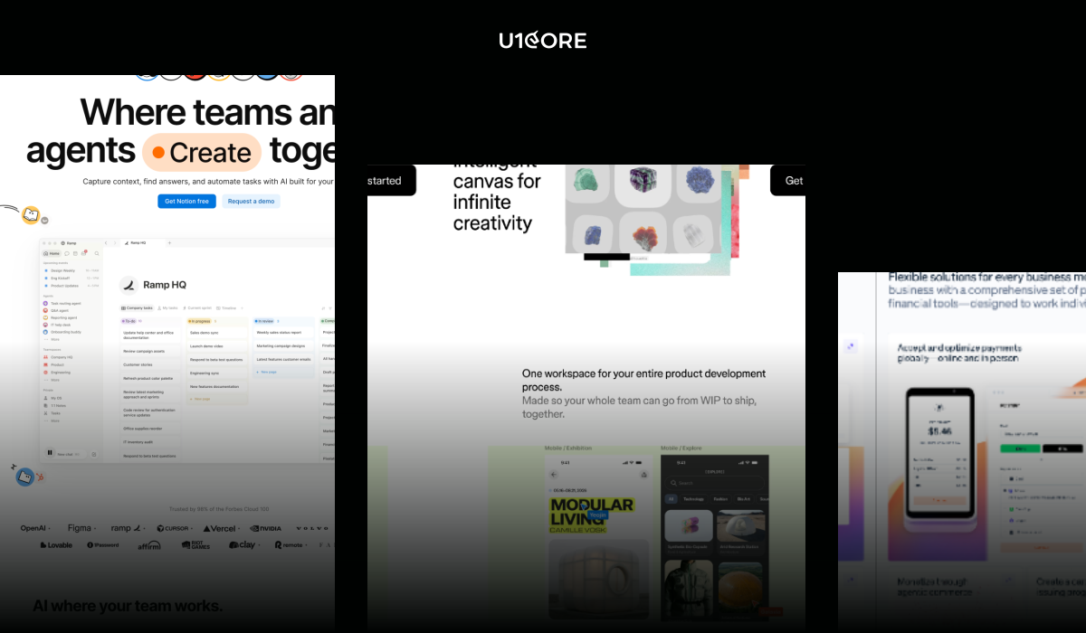
Linear shows the actual product interface at high resolution in the hero. The value proposition is specific. No stock photography. Social proof consists of named testimonials from engineering leaders. The page loads in under two seconds.
Notion segments immediately in the hero — showing different use cases for different audiences — and uses user-generated content as social proof. The result speaks to multiple buyer types without losing specificity for any of them.
Stripe uses the hero to speak simultaneously to two audiences: developers (code snippet showing API integration) and business owners (payment success interface). Technical sophistication and business legitimacy, communicated at the same time.
Figma uses video in the hero — a short demonstration of real-time collaboration that differentiates the product from alternatives. The video communicates the core differentiator faster than any written description could.
The common thread across all four: specific value propositions, real product visuals, specific social proof from named sources, fast loading, and a single conversion goal per page.
Need help designing a SaaS landing page that converts? U1CORE has shipped landing pages and SaaS UI/UX design for growth-stage companies across marketplace, fintech, and Web3. Get in touch to discuss your project.
U1CORE is a product design and development studio specializing in SaaS, marketplace platforms, and custom software development. $720M+ processed through products we’ve built.

Book an introduction call
During this call we do a quick intro and discuss your project and its specific needs.
Book an introduction call
During this call we do a quick intro and discuss your project and its specific needs.

Book a free consultation with us, so we will frame your product vision and strategy.

We’ve received your request and our team is already reviewing it. We’ll get back to you as soon as possible to discuss how we can help you achieve your goals.
Looking forward to collaborating with you!

We’ve sent the download link to your email. Check your inbox (and spam folder just in case) to access the eBook.
We hope you find it valuable for your Web3 journey. If you have any questions or feedback, feel free to reach out!

We want your Web3 website to be great even if you don't hire us.