




- Article
Top UX Agencies Specializing in Fintech KYC Flow Solutions


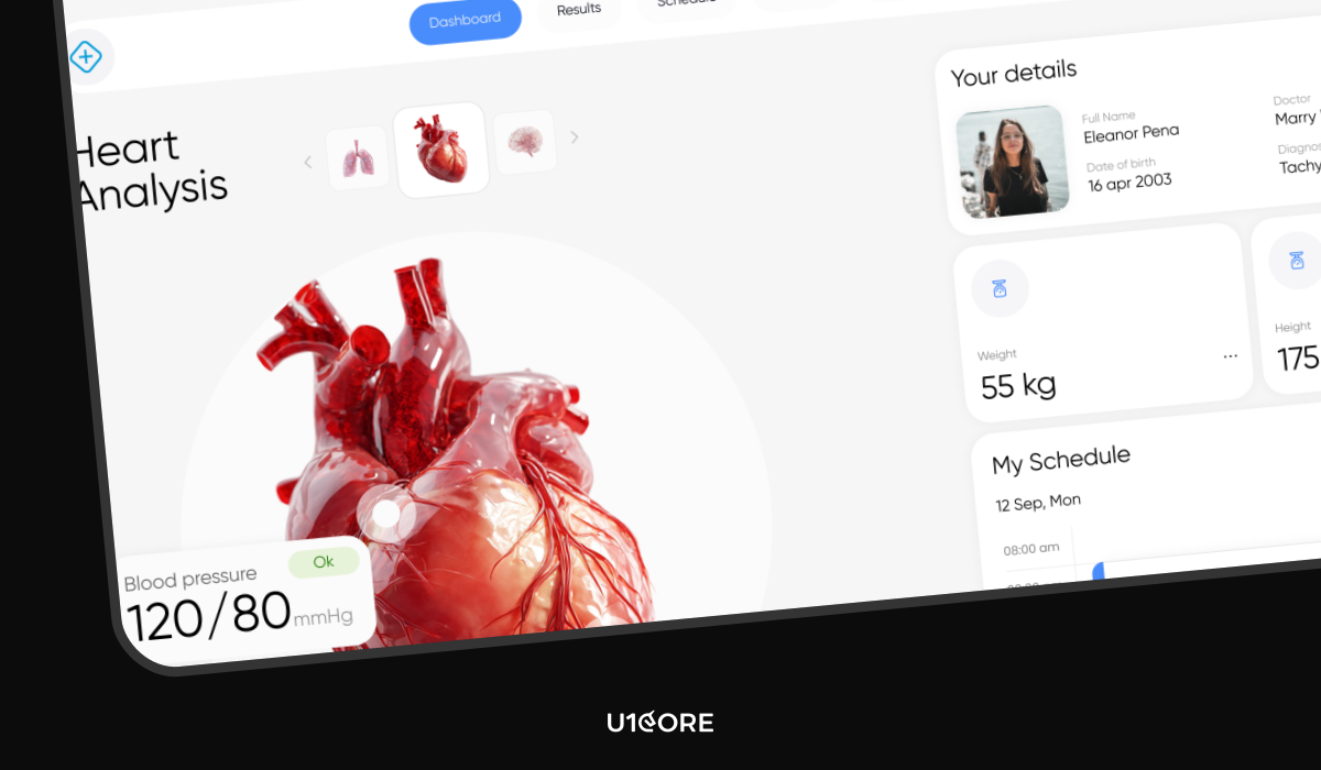
In healthcare, a confusing interface isn’t just a nuisance — it can lead to medical errors. A misread dosage, a missed alert, a form that overwhelmed an exhausted nurse at 3 AM. These aren’t edge cases. They’re documented, recurring failures that cost lives.
According to the WHO’s Digital Health Guidelines, poor digital health design is one of the leading contributors to preventable medical errors globally. UI/UX design services for healthcare products must operate by a fundamentally different standard. This article breaks down the design patterns that matter most — and why getting them right is a matter of patient safety, not just user experience.
UX in healthcare refers to the design of digital interactions between patients, clinicians, and medical systems — covering everything from patient-facing apps to clinical decision support tools, EHR platforms, and medical device interfaces.
Unlike consumer UX, healthcare UX must account for high-stress environments, strict regulatory requirements, and the direct impact of design decisions on patient outcomes. A poorly placed button in a retail app costs a conversion. In a clinical interface, it can cost a life.
Effective healthcare product design balances three priorities: clinical accuracy, user safety, and regulatory compliance — without sacrificing usability.

The core assumption of most digital product design — that the user is calm, focused, and unhurried — breaks down completely in healthcare settings.
Clinicians use interfaces mid-procedure and under time pressure. Patients interact with health apps while anxious, in pain, or managing a chronic condition. Medical app UX must be designed for the worst moment, not the best one.
Large touch targets. High-contrast typography. Single-action screens for critical workflows. Error prevention over error recovery — interfaces should make it structurally difficult to enter incorrect information, not just easy to undo it afterward.
The principle is consistent: reduce cognitive demand on users who are already operating near capacity.
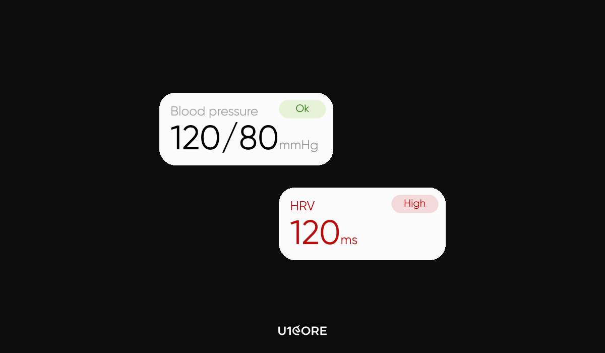
In a patient vitals dashboard, not all information carries equal weight. A heart rate of 42 bpm is not the same as 72 bpm — but in a poorly designed interface, they look identical.
Health tech UI design must communicate severity before the user has to interpret it. Progressive disclosure works: normal values appear quietly, abnormal values escalate through size, position, and visual hierarchy. Severity should never be communicated through color alone — a significant percentage of clinicians have some form of color vision deficiency.
Persistent alerts that remain visible until explicitly acknowledged are essential for time-sensitive clinical data. In consumer design, visual balance signals quality. In clinical environments, imbalance is the signal.

Emergency physicians make approximately 200 clinical decisions per shift. Every unnecessary UI step, every ambiguous label, every redundant confirmation dialog reduces the capacity available for decisions that actually matter.
At U1CORE, our approach to data visualization for medical professionals prioritizes decision workflows over data completeness. Dashboards are structured around what the user needs to act on — not everything the system knows.
Smart defaults pre-populate fields based on patient context. Progressive forms surface one relevant input at a time. Confirmation dialogs appear only before irreversible actions.
If a clinician has to stop and think about what a button does, the button is wrong.
Healthcare products are among the most complex digital systems in existence — integrating real-time data, regulatory requirements, and users with radically different technical literacy.
The answer to this complexity is the same answer that applies to any complex SaaS product: complexity in the system doesn’t require complexity in the interface. The interface’s job is to absorb complexity, not expose it.
For a deeper look at how these principles apply to SaaS, see our article on [UX Design for Complex SaaS: How to Reduce User Churn].
In healthcare, the same logic applies with higher stakes. A clinician navigating a complex interface is a clinician whose attention is on the screen instead of the patient.

Accessibility in healthcare UX is not a compliance checkbox. It is a clinical requirement.
Healthcare users include patients with low vision, motor impairments, and limited digital literacy. Elderly patients who’ve never owned a smartphone. Clinicians working with gloves on, in variable lighting, sometimes with one hand occupied.
At U1CORE, our healthcare accessibility work meets WCAG 2.1 AA as a minimum, with AAA targets for patient-facing interfaces. Every interactive element is screen reader compatible. Text scales to 200% without layout failure. Patient-facing copy is written at a sixth-grade reading level.
HIPAA-compliant design adds another layer: data displayed on a need-to-know basis, visible audit trails for authorized users, and session management that balances security with clinical workflow continuity.
According to the HIPAA Journal, interface decisions that expose protected health information outside appropriate contexts create both compliance risk and patient safety risk simultaneously.

Patient-centric design starts with one principle: the interface should reduce the burden on the patient, not add to it.
Clarity over completeness — the most relevant information appears first, additional detail is accessible but not defaulted. Plain, warm language. Every screen answers the implicit question: what should I do next?
Offline functionality matters more in healthcare than most categories — patients in rural areas or high-acuity moments may not have reliable connectivity. And trust signals — visible security indicators, clear data sharing disclosures, explicit consent flows — are non-negotiable. Patients who don’t trust a health app don’t use it consistently, which undermines the clinical value it was built to deliver.
Every industry has design challenges. Healthcare has design consequences.
The patterns in this article — designing for stress, communicating severity, reducing cognitive load, meeting accessibility requirements — are not best practices. In healthcare, they are baseline requirements.
Good healthcare UX reduces errors, builds trust, and drives the adoption through which the product’s clinical value is actually delivered. Design that fails this standard doesn’t just underperform.
It causes harm.

Book an introduction call
During this call we do a quick intro and discuss your project and its specific needs.
Book an introduction call
During this call we do a quick intro and discuss your project and its specific needs.

Book a free consultation with us, so we will frame your product vision and strategy.

We’ve received your request and our team is already reviewing it. We’ll get back to you as soon as possible to discuss how we can help you achieve your goals.
Looking forward to collaborating with you!

We’ve sent the download link to your email. Check your inbox (and spam folder just in case) to access the eBook.
We hope you find it valuable for your Web3 journey. If you have any questions or feedback, feel free to reach out!

We want your Web3 website to be great even if you don't hire us.