


- Article
How to Choose a Design Partner for a Marketplace Platform


How a Rebellious Design Trend Is Giving Edge to AI and Web3 Products
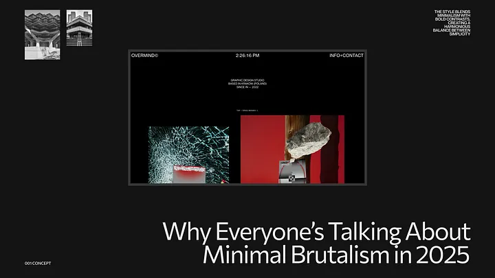
Minimal brutalism is everywhere in 2025 — from startups and creative agencies to personal portfolios and SaaS dashboards. It’s bold, unapologetic, and somehow… still clean.
If you’ve ever seen a site with massive fonts, harsh grid lines, unexpected color choices, and almost too simple of a layout — that’s minimal brutalism at work. It’s not just a trend — it’s a rebellion. And like any good rebellion, it’s rooted in something deeper.
Minimal brutalism is the collision of two worlds:
Together, they form an aesthetic that says: “We don’t need decoration. We need design that does its job.”
It’s about showing the grid. Letting buttons feel like buttons. Breaking visual hierarchy intentionally — but never randomly.
1. Post-AI Visual Fatigue
As generative AI floods the internet with polished, perfect, and soulless designs, minimal brutalism cuts through with honesty and imperfection. It feels real in a sea of fake.
2. Short Attention, High Impact
Bold type, harsh contrast, and deliberate spacing demand attention. These layouts aren’t pretty — they’re effective. That’s what today’s overstimulated user needs.
3. Gen Z’s Influence
This generation grew up with chaos. They don’t need harmony — they need personality. Minimal brutalism speaks their language: “We’re not here to please. We’re here to say something.”
4. A Natural Fit for AI and Web3 Products
Minimal brutalism’s raw, transparent aesthetic aligns perfectly with the principles of AI and Web3 — where openness, decentralization, and functional clarity are valued. For AI products, it strips away the artificial polish and showcases core capabilities. For Web3 interfaces, it visually mirrors the transparent, trustless architecture underneath. It’s not about making tech look sexy — it’s about making it feel real, tangible, and user-controlled. In these emerging fields, minimal brutalism doesn’t distract — it grounds.
Use it if:
Avoid it if:
Minimal brutalism is not for everyone — and that’s the point.
Minimal brutalism isn’t just about how it looks — it’s about what it says:
“Design doesn’t have to be safe to be effective.”
In a world where design is becoming algorithmic, predictable, and polished to perfection, minimal brutalism reminds us of the power of human-made, opinionated, and imperfect work.
If you want your product to feel like something real — maybe it’s time to break the grid.

During this call we do a quick intro and discuss your project and its specific needs.
During this call we do a quick intro and discuss your project and its specific needs.

Book a free consultation with us, so we will frame your product vision and strategy.

We’ve received your request and our team is already reviewing it. We’ll get back to you as soon as possible to discuss how we can help you achieve your goals.
Looking forward to collaborating with you!

We’ve sent the download link to your email. Check your inbox (and spam folder just in case) to access the eBook.
We hope you find it valuable for your Web3 journey. If you have any questions or feedback, feel free to reach out!