



- Article
Top UX Agencies Specializing in Fintech KYC Flow Solutions


Subtitle:
How simplicity builds trust, adoption, and scalability in high-functionality software.
Introduction
SaaS products are becoming increasingly sophisticated. From AI-powered analytics to multi-step automation workflows, complexity in functionality is inevitable. But complexity in interface? That’s a choice.
At U1CORE, we’ve worked with dozens of SaaS companies — each with unique features, user bases, and business logic. And we’ve seen a consistent pattern: the more complex the product, the more vital it is to simplify its UI.
1. Complexity Behind, Clarity in Front
You may have 40 micro-features in the backend, but your user only needs one clear way to get their task done. When users see buttons, forms, or dashboards overloaded with options, anxiety creeps in. Cognitive overload = user drop-off.
The solution? Hide complexity, reveal intent.
Use progressive disclosure. Guide users with step-by-step UX flows. Prioritize clarity over coverage.
2. Clean Interfaces Build Trust
Cluttered UIs often signal poor structure or rushed development. In contrast, minimal, clean designs evoke confidence and professionalism.
Ask yourself:
The best SaaS UIs feel invisible — because they just work.
3. Think in User Stories, Not Feature Lists
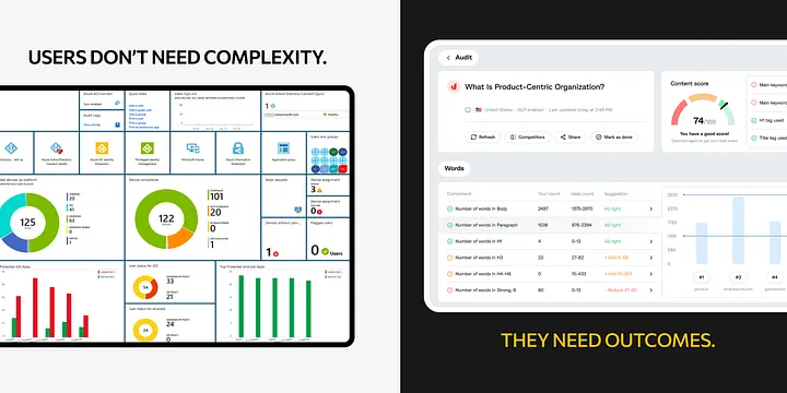
Too often, SaaS platforms are built around internal logic: “this is how our system works.” But users don’t care about that. They care about outcomes.
Design for stories:
Map your UX around real-life goals, not internal modules.
4. Mobile-First ≠ Feature-Restricted
SaaS is no longer desktop-only. Founders check metrics on their phones. Marketers approve changes between meetings. That doesn’t mean you need to shrink the whole dashboard — but it does mean designing mobile as a first-class citizen.
A clean interface naturally adapts better to mobile screens.
5. Scaling? Simple Systems Win
Here’s the hard truth: if your UI is hard to understand for a new user today, it’ll be 10x worse once you scale.
Every layer of UI debt slows down onboarding, increases support tickets, and complicates future feature releases.
Investing in simplicity now pays off in agility later.
Conclusion
A sophisticated SaaS product deserves a sophisticated UI strategy — but not a visually complicated one.
At U1CORE, our mission is to help SaaS founders and teams simplify without dumbing down.
Because clarity isn’t basic — it’s a competitive advantage.

Book an introduction call
During this call we do a quick intro and discuss your project and its specific needs.
Book an introduction call
During this call we do a quick intro and discuss your project and its specific needs.

Book a free consultation with us, so we will frame your product vision and strategy.

We’ve received your request and our team is already reviewing it. We’ll get back to you as soon as possible to discuss how we can help you achieve your goals.
Looking forward to collaborating with you!

We’ve sent the download link to your email. Check your inbox (and spam folder just in case) to access the eBook.
We hope you find it valuable for your Web3 journey. If you have any questions or feedback, feel free to reach out!

We want your Web3 website to be great even if you don't hire us.