



- Article
How to Choose a Design Partner for a Marketplace Platform


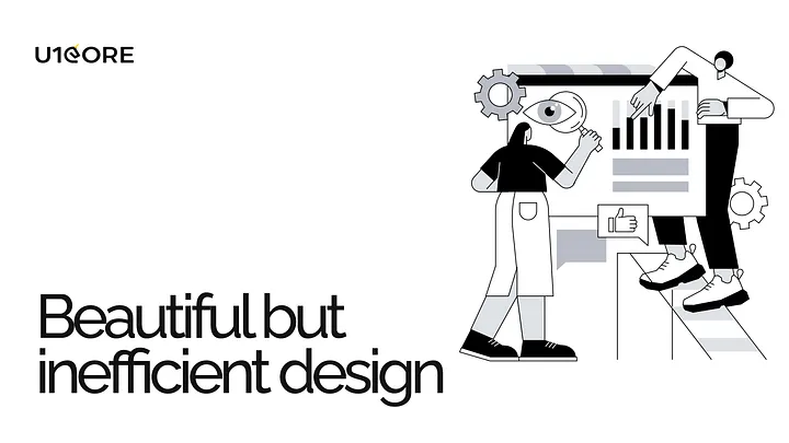
It’s easy to fall in love with a visually stunning design. A sleek color palette, elegant typography, and striking imagery can captivate anyone’s attention. But here’s the truth: beauty alone isn’t enough to convert users. If your design isn’t meeting its business goals, the issue likely lies beyond aesthetics. Let’s explore why even the most beautiful designs can fail and how applying psychology-backed principles can turn things around.
A design that prioritizes appearance over functionality risks frustrating users rather than engaging them. It’s not just about looking good — it’s about guiding users seamlessly toward actions that fulfill their needs and align with your business objectives. When conversions aren’t happening, it’s often due to a disconnect between the user experience (UX) and the visual design (UI).
Think of it like this: a luxurious sports car might look incredible, but if the controls are confusing or it’s uncomfortable to drive, how many people will buy it?
To make your design not only beautiful but also effective, you need to incorporate the following psychological principles:
The Principle: The more choices a user has, the longer it takes for them to make a decision.
The Problem: Overloading users with options (e.g., too many buttons, links, or CTAs) leads to analysis paralysis, causing them to leave your site without taking any action.
The Fix: Simplify your design by prioritizing key actions. For example, a well-designed e-commerce site like Amazon ensures users are guided through a straightforward checkout process without unnecessary distractions.
The Principle: Users tend to perceive aesthetically pleasing designs as easier to use.
The Problem: While beauty creates a positive first impression, it can mislead designers into thinking usability isn’t as critical.
The Fix: Combine beauty with functionality. Test your designs thoroughly to ensure they’re intuitive, not just attractive. For example, Apple’s product pages are visually stunning but also guide users effortlessly through product details and purchase options.
The Principle: The time it takes to click a target is a function of the distance to the target and its size.
The Problem: Small buttons or poorly placed interactive elements make it harder for users to complete actions.
The Fix: Make important buttons large and easy to click, especially on mobile devices. For instance, primary CTAs (like “Buy Now” or “Sign Up”) should be prominent and positioned where users naturally look.
The Principle: The human brain has limited capacity for processing information.
The Problem: Cluttered interfaces or too much text can overwhelm users, leading them to abandon your site.
The Fix: Embrace white space and focus on clear, concise content. Break information into digestible chunks and use visuals strategically to guide the user’s journey.
Take the website U1CORE, which specializes in UX/UI and web design. Every design decision is rooted in functionality and user behavior. By incorporating principles like Hick’s Law and Fitts’s Law, the layouts not only look stunning but also drive conversions by offering seamless navigation and clear CTAs. This balance of form and function is key to success.
If you want your design to convert effectively, remember these key steps:
A visually appealing design is a powerful tool, but it’s not the endgame. By weaving in the psychology of user behavior and aligning your design with clear business objectives, you can transform your “pretty” website into a conversion powerhouse.
What’s your biggest challenge when balancing aesthetics and usability in design? Let us know in the comments or visit U1CORE to explore how we can help optimize your digital presence.

During this call we do a quick intro and discuss your project and its specific needs.
During this call we do a quick intro and discuss your project and its specific needs.

Book a free consultation with us, so we will frame your product vision and strategy.

We’ve received your request and our team is already reviewing it. We’ll get back to you as soon as possible to discuss how we can help you achieve your goals.
Looking forward to collaborating with you!

We’ve sent the download link to your email. Check your inbox (and spam folder just in case) to access the eBook.
We hope you find it valuable for your Web3 journey. If you have any questions or feedback, feel free to reach out!