Tomorrow

  • Branding Design
Tomorrow

Tomorrow River is a Breckenridge-focused real estate investment company — built around a contemporary professional identity with a nostalgic, authentic alpine feel.

A full brand identity project for Tomorrow River — a real estate investment company in Breckenridge, Colorado. From positioning and visual language to logo system and brand guidelines.

Title

Task

The task was to build a complete brand identity for Tomorrow River — a real estate investment company focused on the Breckenridge market. This meant defining the core brand elements: positioning, target audience, values — and translating them into a unified visual system that could work across all brand touchpoints.

Title

Challenge

The core challenge was balance. Tomorrow River needed to feel contemporary and professional — the kind of brand that serious investors trust — while also capturing the nostalgic, authentic atmosphere of Breckenridge’s alpine environment. A generic real estate identity wouldn’t work. The brand had to carry a sense of place, without feeling regional or niche.

Results

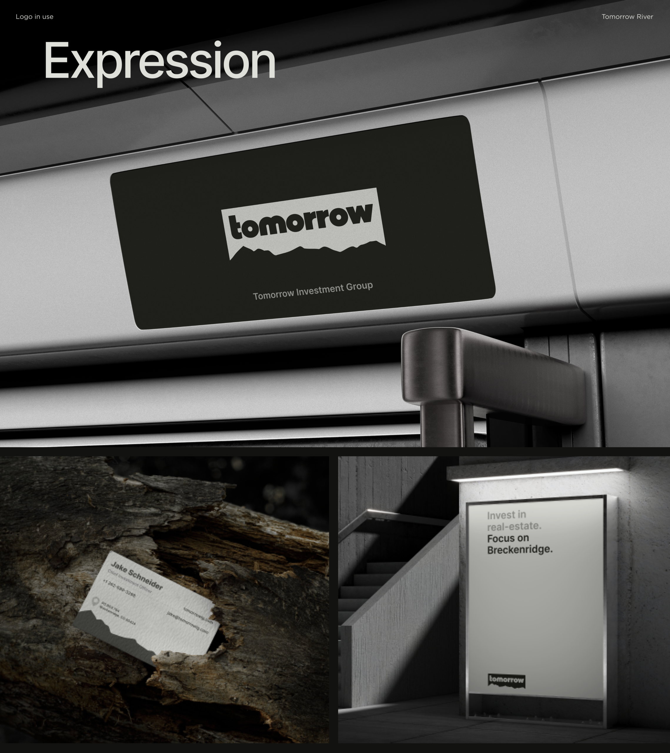
The result is a cohesive visual identity that holds across every application — from logo and typography to color palette and brand collateral. The system communicates trust and professionalism while staying grounded in the character of Breckenridge. This wasn’t just a logo project. It was a full visual language built to grow with the company.

Screens:
20+
Hours:
100
Team members:
10+

Project Timeline

  • Research

    The research phase focused on understanding the Breckenridge real estate market, its buyers, and the visual language competitors were using. We identified a gap: most regional real estate brands lean either too corporate or too rustic. Tomorrow River had an opportunity to occupy a more refined middle ground — premium, place-rooted, and forward-looking.
  • Briefing

    The brief called for a brand that felt both timeless and modern — one that could represent a serious investment company while evoking the character of Breckenridge. Key requirements: a strong logo system, a flexible color palette, and a typographic identity that could scale from digital to print.

  • Moodboard

    The moodboard drew from alpine architecture, premium outdoor brands, and contemporary real estate identities. The palette evolved around deep, earthy tones — reflecting the landscape — with clean, geometric forms that signal precision and modernity. The reference point was a brand that feels like it belongs in Breckenridge, not just near it.

  • Logo Design

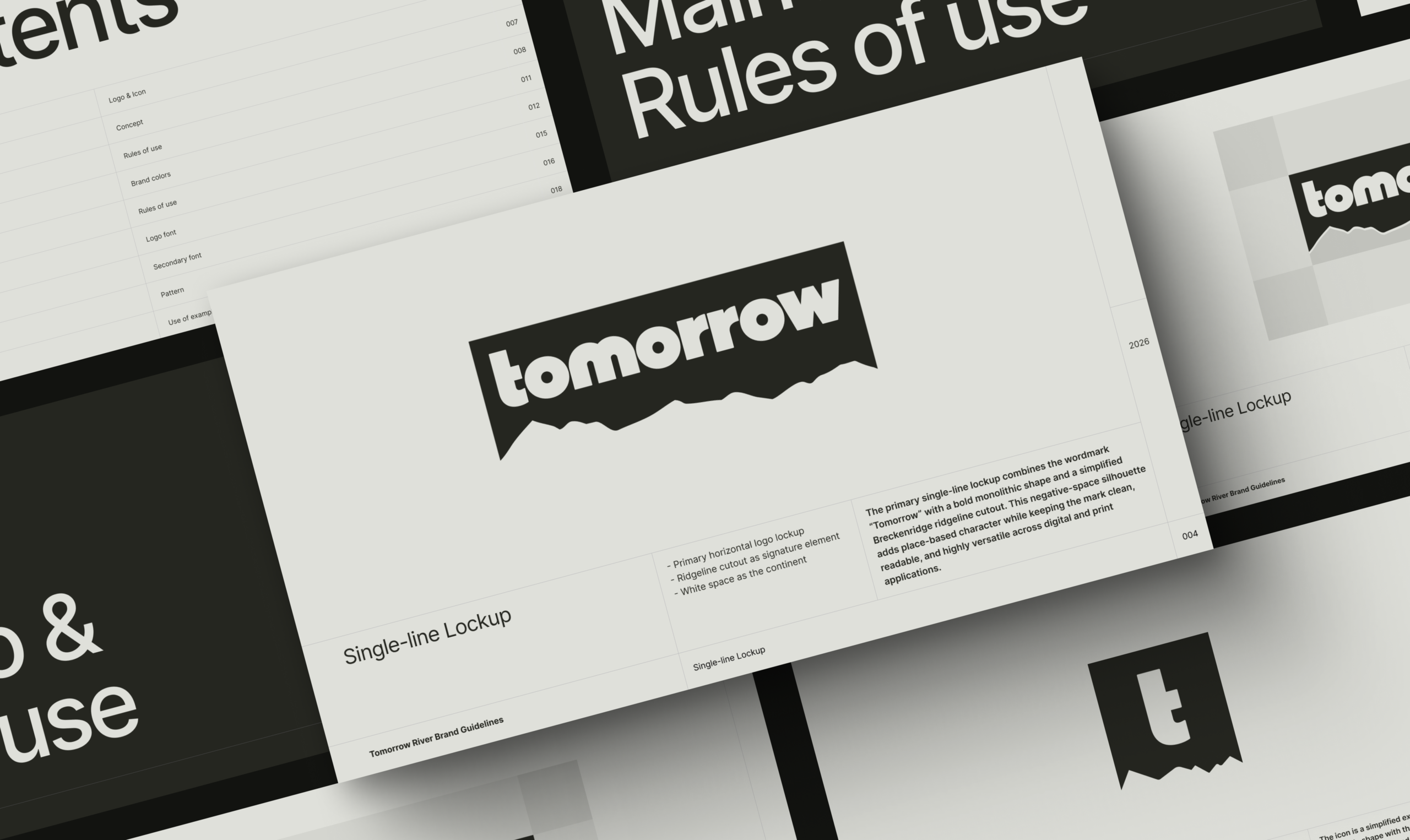
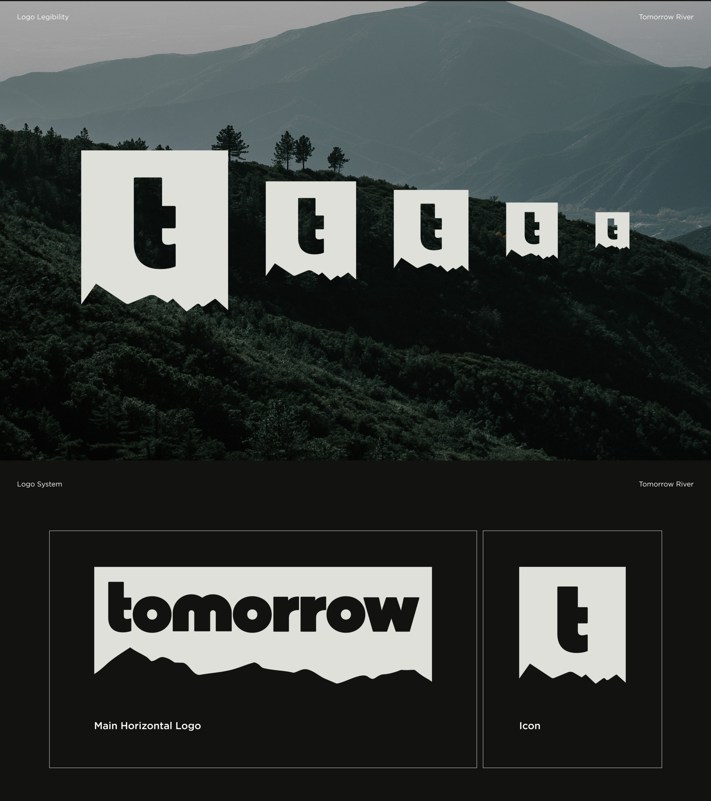
    The logo system was built around a mark that balances heritage with forward momentum — a nod to the Tomorrow in the name without being literal. Multiple lockups were developed for different contexts: horizontal, stacked, and icon-only. Each version maintains clarity and weight at any scale.

  • Design Concepts

    Design concepts explored two visual directions: one leaning into the alpine heritage of Breckenridge with warmer, earthier tones; the other taking a cleaner, more contemporary approach. The final direction merged both — grounded in place, but refined enough for a serious investment audience.

  • Visual Identity

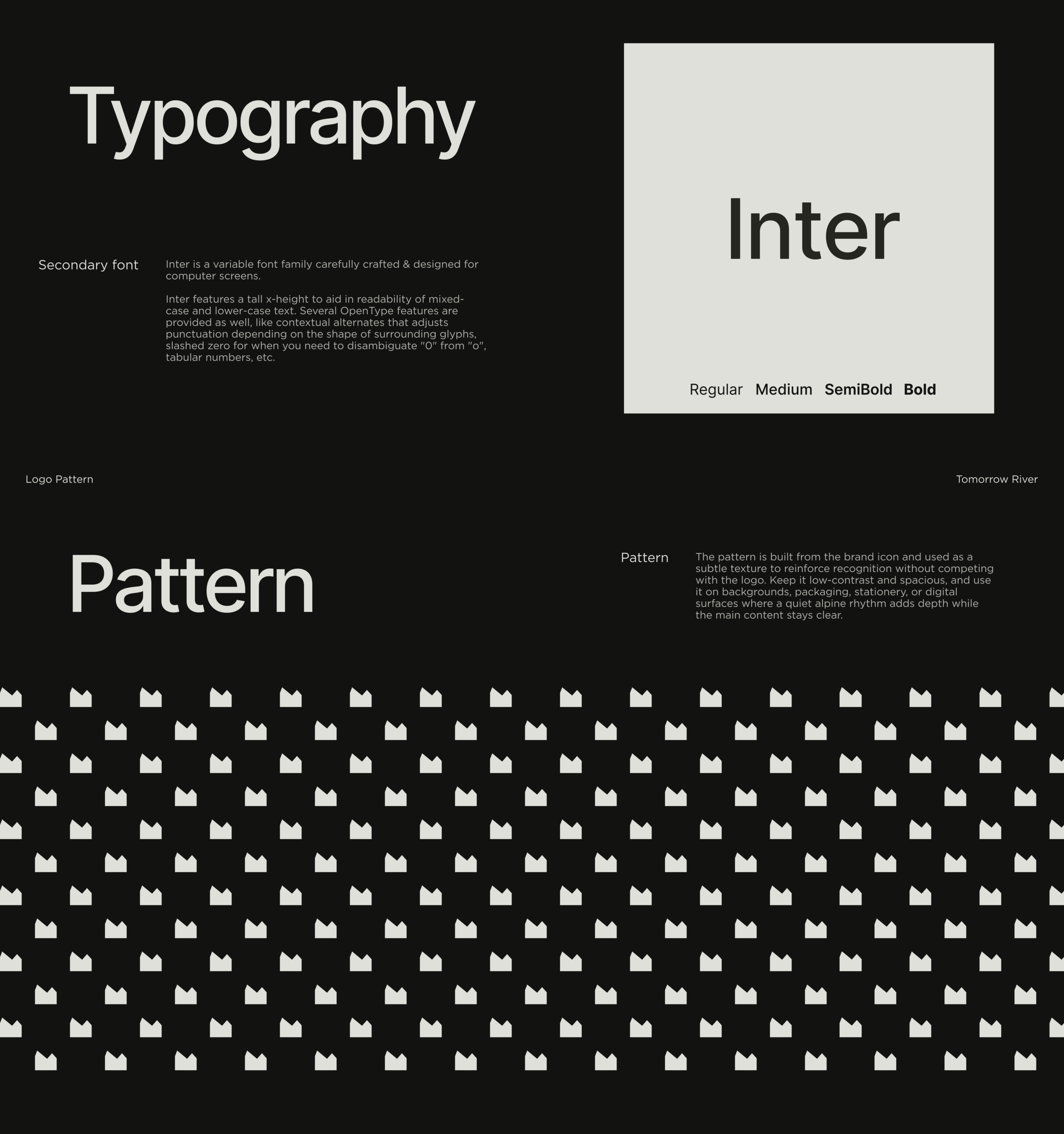
    The full visual identity system included color palette, typography, iconography, and usage guidelines. Every element was designed to work together — and to give the Tomorrow River team a toolkit they could use consistently without a designer in the room.

Research
User Flow
Wireframes
UI Concepts
UI Design
UI kit
Closing

Title

Let`s discuss where you want to get

Taras Oliinyk Photo

Taras Oliinyk

CEO at U1CORE

Book an introduction call

During this call we do a quick intro and discuss your project and its specific needs.

Tell us more about your project

Share your project details with us, and we'll respond promptly.