Discovery & Audit
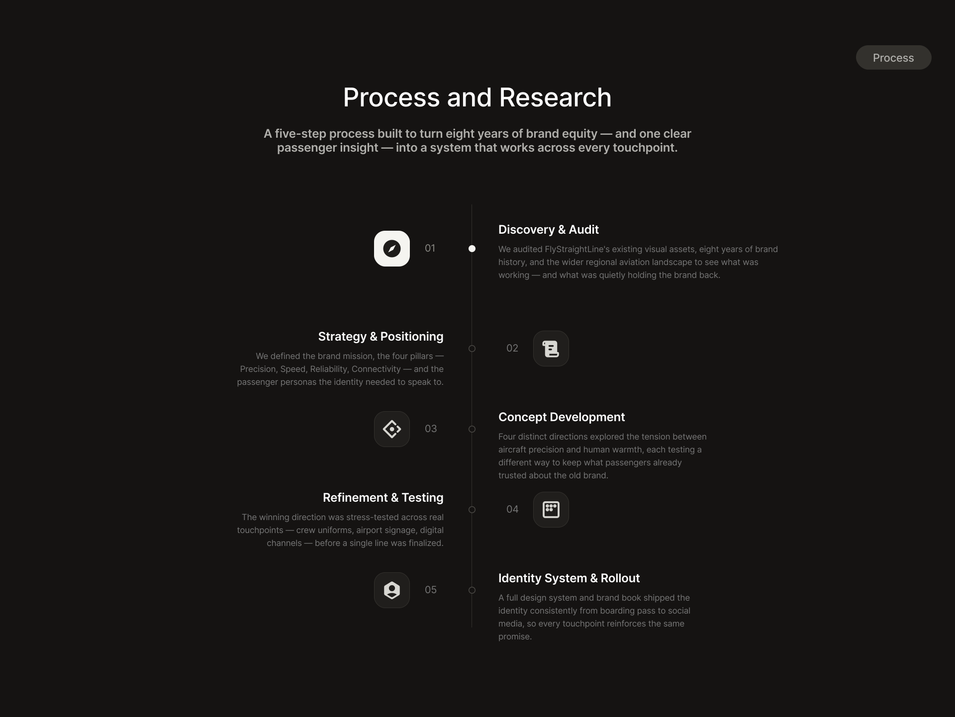
We audited FlyStraightLine’s existing visual assets, eight years of brand history, and the wider regional aviation landscape to see what was working — and what was quietly holding the brand back.

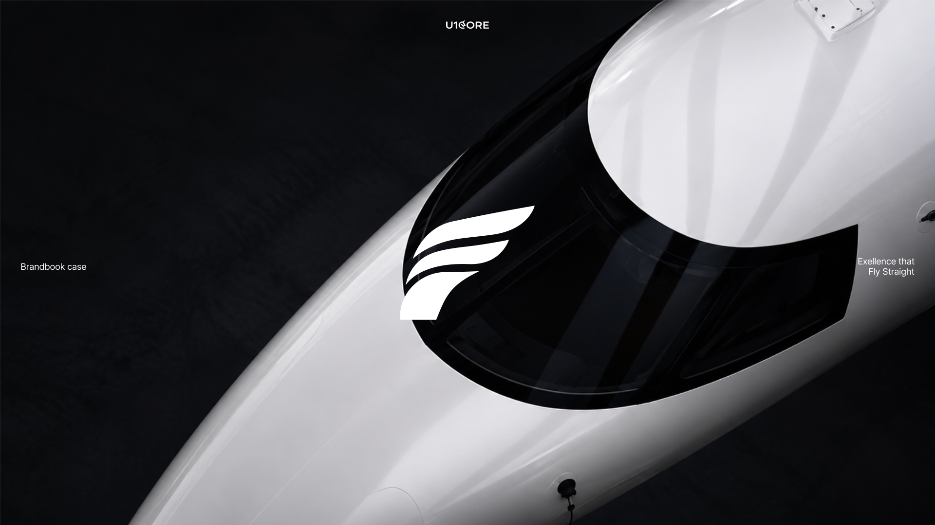
Eight years of patched-together assets, rebuilt into one system around a single promise — nothing flies direct, so we do.
A comprehensive rebrand for a regional airline built on direct, non-stop routes. Logo, global brand system, brand book and UI kit — carrying one identity from crew uniforms and boarding passes to airport signage and digital channels.
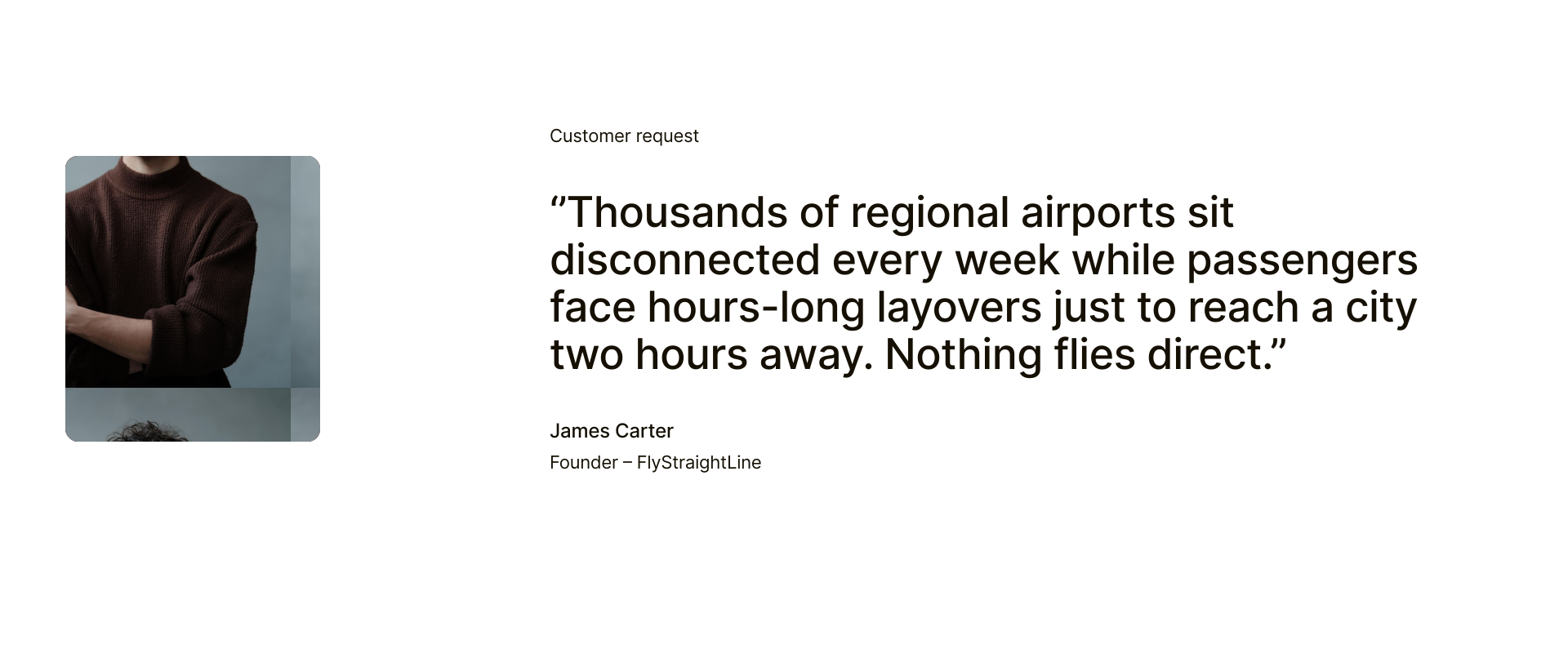
We were invited to conduct a comprehensive rebranding of an airline that had been operating for 8 years. The main goal was to create a clear and recognizable system that reflected the brand’s core advantage — direct flights with no layovers — while conveying the sense of reliability and precision inherent to the aviation industry. A crucial part of the process was identifying and preserving key elements from the previous brand, while redefining them in a modern, streamlined manner that would reinforce the company’s position as a trusted player in regional air travel.
Eight years of brand equity had accumulated into patched-together assets with no system holding them. Meanwhile the category itself is crowded with black-and-blue lookalikes — nothing distinguishes one regional carrier from another at the gate. Research confirmed where the gaps were: 72% of surveyed regional flyers would choose a direct route over a cheaper connecting one, 64% associate legacy regional carriers with delays rather than dependability, and 58% named a rushed, chaotic boarding process their biggest complaint. Those three findings became design principles, not brand words.
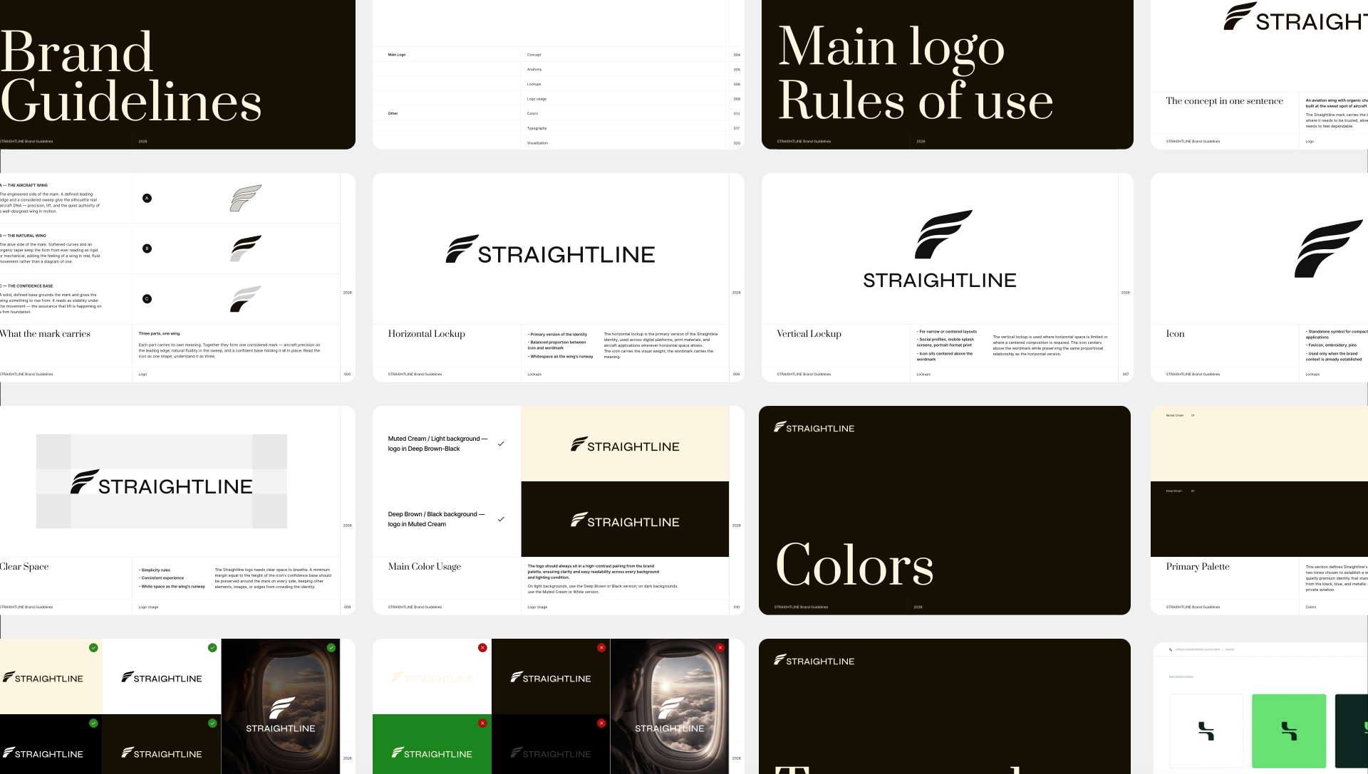
A full identity system covering every touchpoint — from onboard service and crew uniforms to digital channels and airport signage — maintaining a consistent brand voice across all media. Four brand pillars grounded in what passengers actually said: Precision, Speed, Reliability, Connectivity. A distinct wing silhouette and a warm, un-aviation palette that cuts through a category of black-and-blue lookalikes.
We audited FlyStraightLine’s existing visual assets, eight years of brand history, and the wider regional aviation landscape to see what was working — and what was quietly holding the brand back.
We defined the brand mission, the four pillars — Precision, Speed, Reliability, Connectivity — and the passenger personas the identity needed to speak to: the regional sales manager who can’t lose a workday to someone else’s hub schedule, the frequent visiting grandparent who wants a calm boarding process, the founder who needs same-day return trips.
Four distinct directions explored the tension between aircraft precision and human warmth, each testing a different way to keep what passengers already trusted about the old brand.
The winning direction was stress-tested across real touchpoints — crew uniforms, airport signage, digital channels — before a single line was finalized.
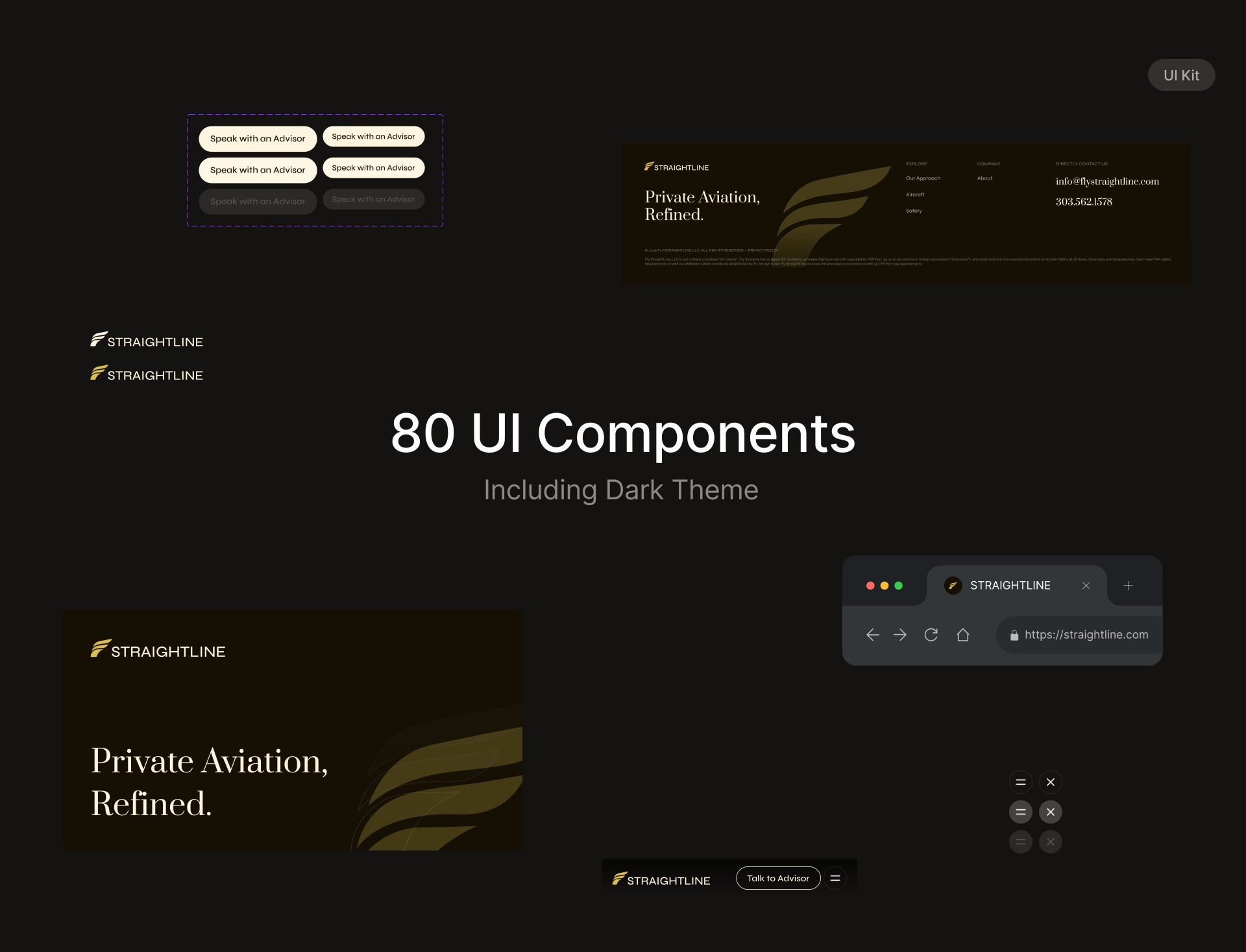
A full design system and brand book shipped the identity consistently from boarding pass to social media, so every touchpoint reinforces the same promise. 80 UI components including a dark theme.

Book an introduction call
During this call we do a quick intro and discuss your project and its specific needs.
Book an introduction call
During this call we do a quick intro and discuss your project and its specific needs.

Book a free consultation with us, so we will frame your product vision and strategy.

We’ve received your request and our team is already reviewing it. We’ll get back to you as soon as possible to discuss how we can help you achieve your goals.
Looking forward to collaborating with you!

We’ve sent the download link to your email. Check your inbox (and spam folder just in case) to access the eBook.
We hope you find it valuable for your Web3 journey. If you have any questions or feedback, feel free to reach out!

We want your Web3 website to be great even if you don't hire us.