Research
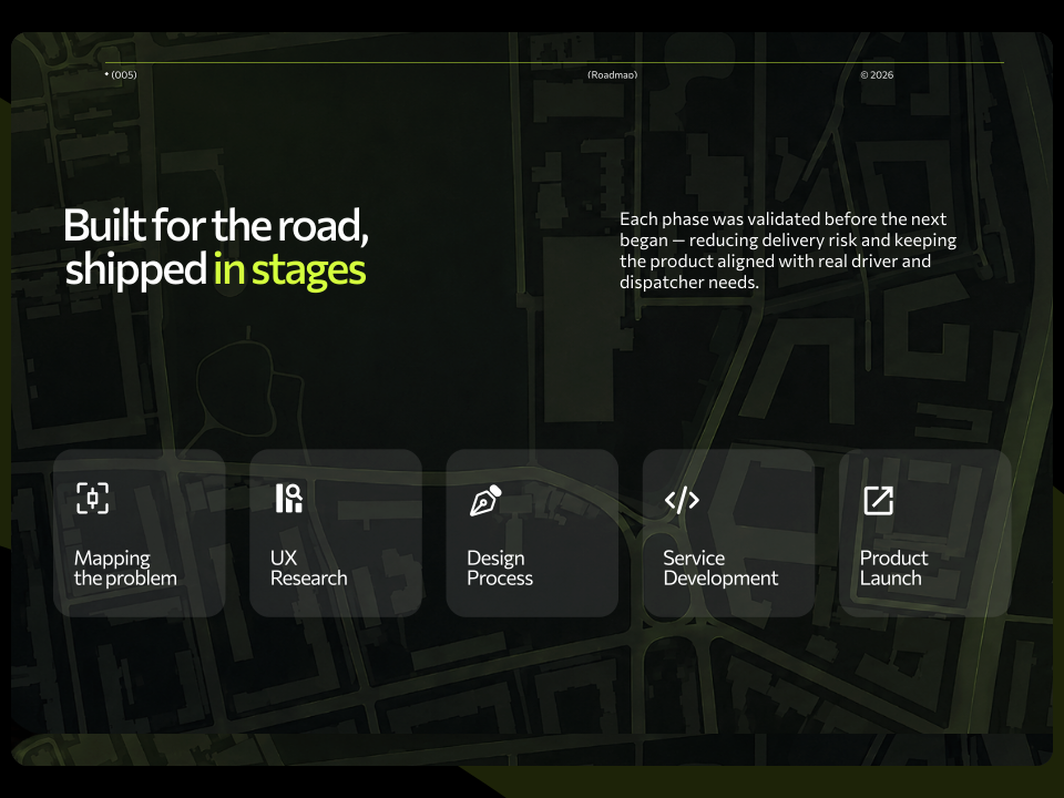
Research revealed three core failures: blind dispatch, hidden earnings and weekly-only revenue data. Each became a design brief.

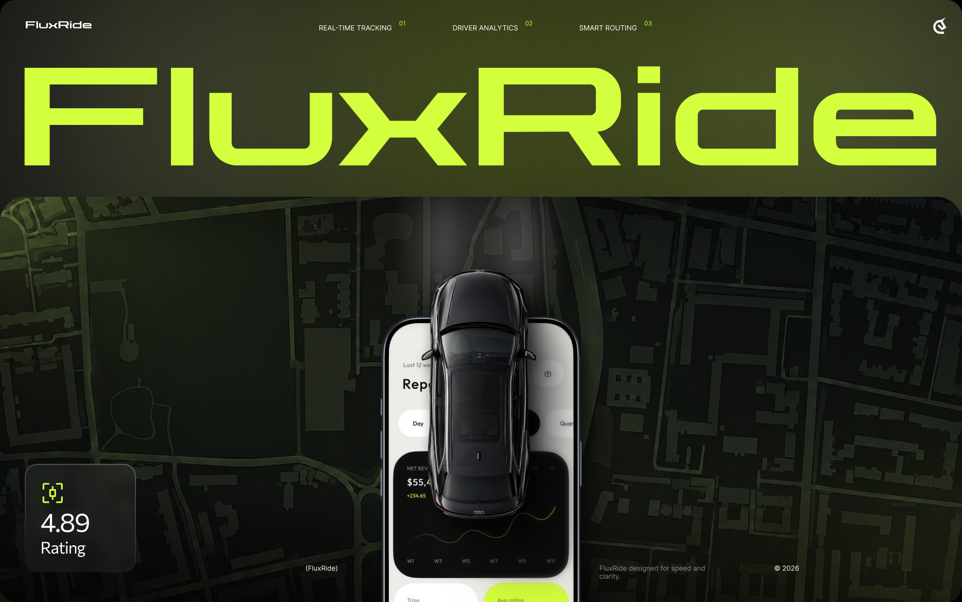
From three disconnected tools to one live fleet brain — rebuilding FluxRide’s entire operation from the ground up.
A unified fleet management platform that replaces spreadsheets, phone calls, and blind dispatch with real-time tracking, driver earnings, and live reporting — built for a fleet running 200+ vehicles and 400 drivers.

The fleet ran on spreadsheets, calls and three separate tools. We designed one place where dispatch, driver status and revenue are visible and every decision runs on live data.

Dispatchers, drivers and managers all worked blind. We gave each a live view of exactly what they need to act fast, without switching between apps.
One real-time system instead of three tools. Faster dispatch, clear driver earnings and live revenue reporting at scale.
Research revealed three core failures: blind dispatch, hidden earnings and weekly-only revenue data. Each became a design brief.
Money was leaking between systems. We set one goal: every handoff from booking to payment visible in one platform.
Dispatchers needed to reroute in seconds. We designed a driver profile with status, rating and current trip on one screen
Drivers couldn’t see their own earnings across apps. We added a weekly earnings view with daily breakdown and demand patterns.
Transport tools often look grey and heavy. We chose black with bold lime accents for speed, energy and clarity.
Too much data slows decisions. We kept the concept built around the next action, not around showing numbers
Revenue surfaced once a week in a spreadsheet. We built live reports with day, week, month and quarter views on mobile.

Book an introduction call
During this call we do a quick intro and discuss your project and its specific needs.
Book an introduction call
During this call we do a quick intro and discuss your project and its specific needs.

Book a free consultation with us, so we will frame your product vision and strategy.

We’ve received your request and our team is already reviewing it. We’ll get back to you as soon as possible to discuss how we can help you achieve your goals.
Looking forward to collaborating with you!

We’ve sent the download link to your email. Check your inbox (and spam folder just in case) to access the eBook.
We hope you find it valuable for your Web3 journey. If you have any questions or feedback, feel free to reach out!

We want your Web3 website to be great even if you don't hire us.