Research
We researched what makes a multi-service financial platform feel trustworthy rather than overwhelming — studying competitors and decision triggers to shape the scope before any design work began.


Wolfe Worldwide offered wealth management, real estate, insurance, and tax services — but through disconnected tools and no unified digital presence. We built one platform where clients manage their entire financial life in a single place.
A unified financial platform bringing wealth management, real estate, and insurance services into one experience.
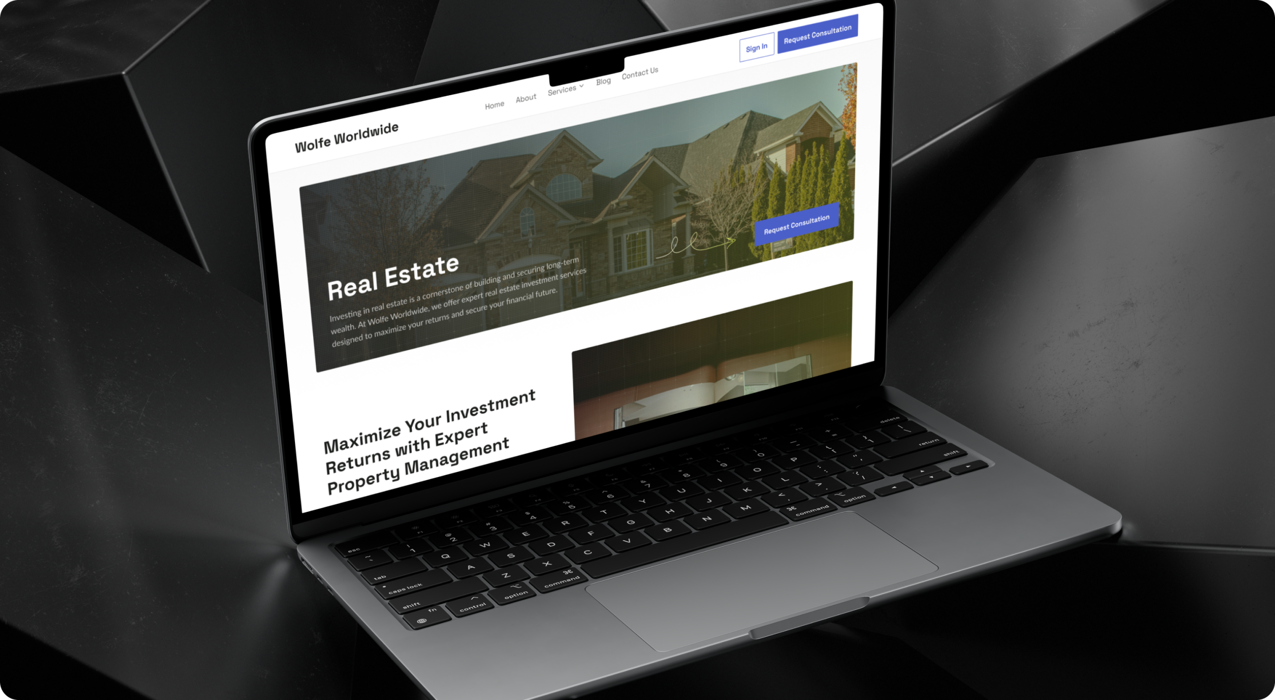
Design a platform credible enough for a Wall Street-caliber firm, yet simple enough that a client could manage investments, real estate, and insurance without ever feeling lost between services.
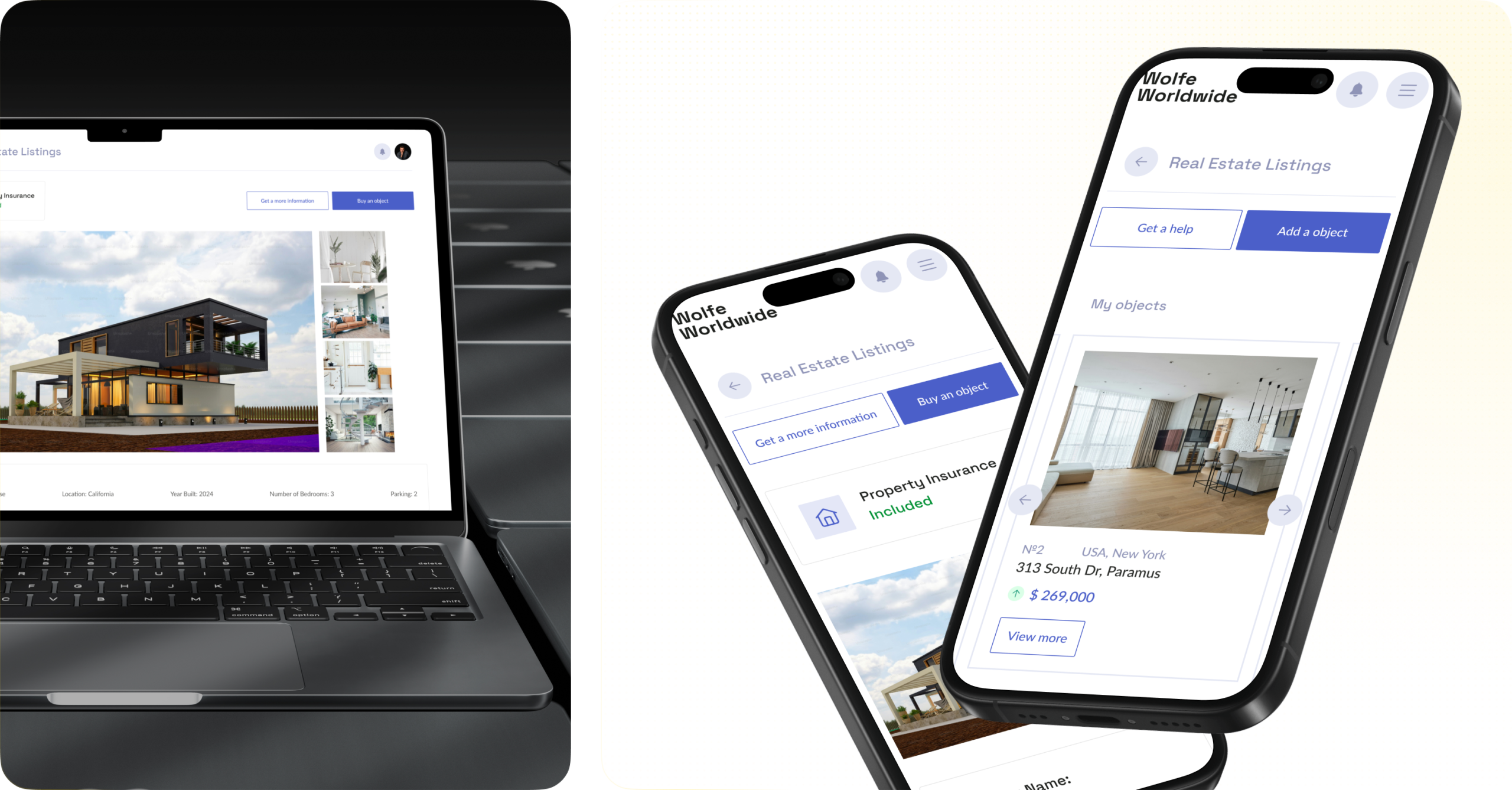
The real challenge was scope: cramming five distinct financial services into one coherent product without it turning into a cluttered dashboard. Branding had to read as established and trustworthy, not templated — and the system had to scale as new services and technologies got added.
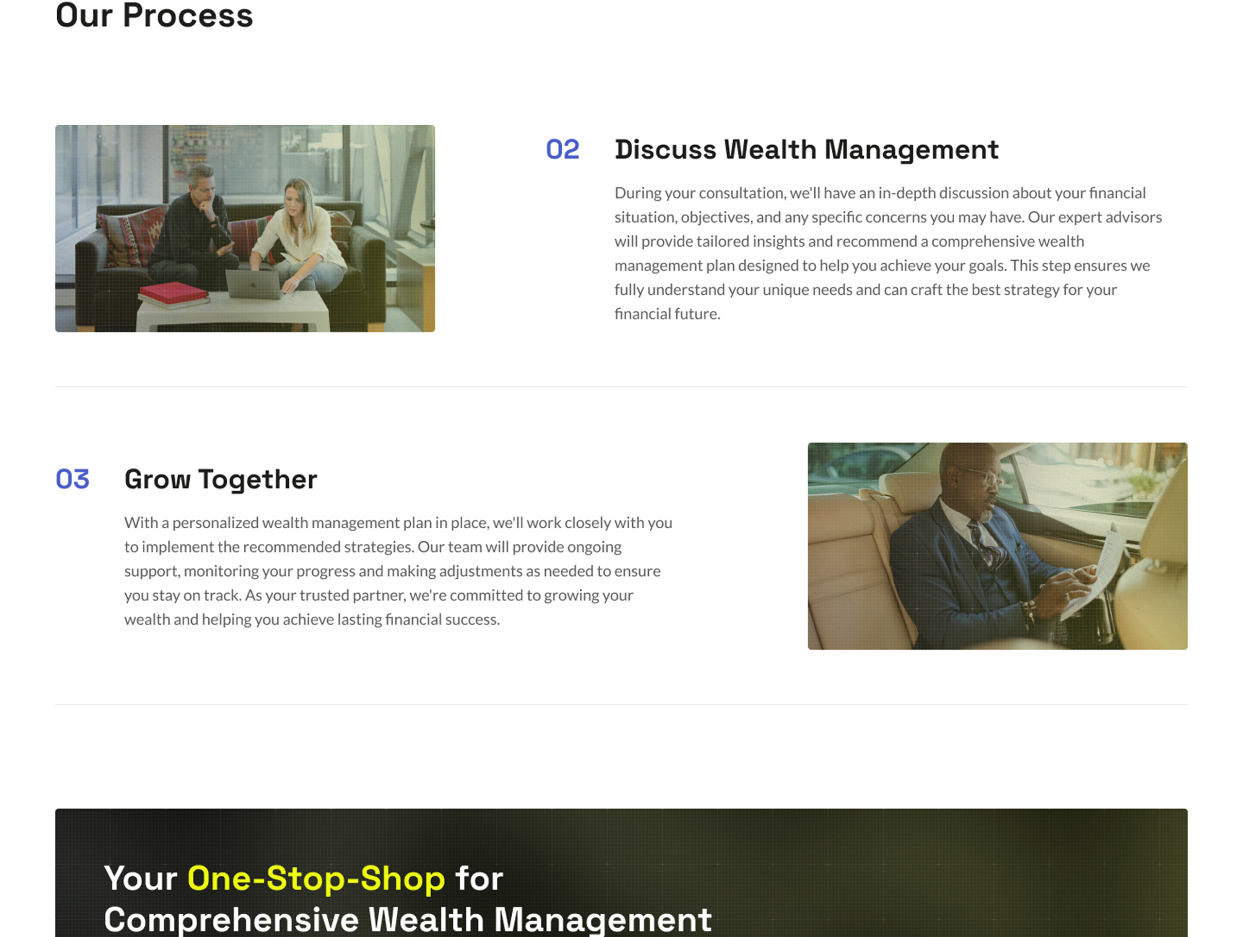
Five disconnected financial services became one platform clients actually want to use — replacing fragmentation with a single, trustworthy experience that still carries the weight of a legacy firm.
We researched what makes a multi-service financial platform feel trustworthy rather than overwhelming — studying competitors and decision triggers to shape the scope before any design work began.
We aligned with stakeholders on the product’s goals, target users, and key differentiators. Together we defined the information architecture, priority pages, and conversion points (consultation, sign-in, contact). This briefing became our single source of truth for scope, tone, and success metrics.
We translated the structure into low-fidelity wireframes to validate layout, hierarchy, and user flow. The focus was clarity: services navigation, trust signals, and fast paths to core actions. Early wireframe testing helped us remove friction and confirm content order before moving into visuals.
We reviewed competitors, user expectations, and common decision triggers in financial services. From insights, we defined primary user journeys and the moments where trust matters most. Findings directly informed messaging, page structure, and the placement of proof points and CTAs
We explored visual directions that communicate credibility, modernity, and calm confidence. Typography, spacing, and a restrained accent palette were chosen to keep content readable while feeling premium. The moodboard helped us unify the team around a consistent design language early
We created multiple concepts to test different levels of boldness, imagery, and emphasis on key offerings. Each concept was built around clear hierarchy, trust-first storytelling, and conversion clarity. After review, we merged the strongest elements into one cohesive direction
We delivered a polished interface system with consistent components, spacing, and responsive behavior. Attention went into micro-details — button states, card depth, contrast, and legibility — to keep the experience clean and accessible. The final UI balances brand character with a professional, finance-ready feel.
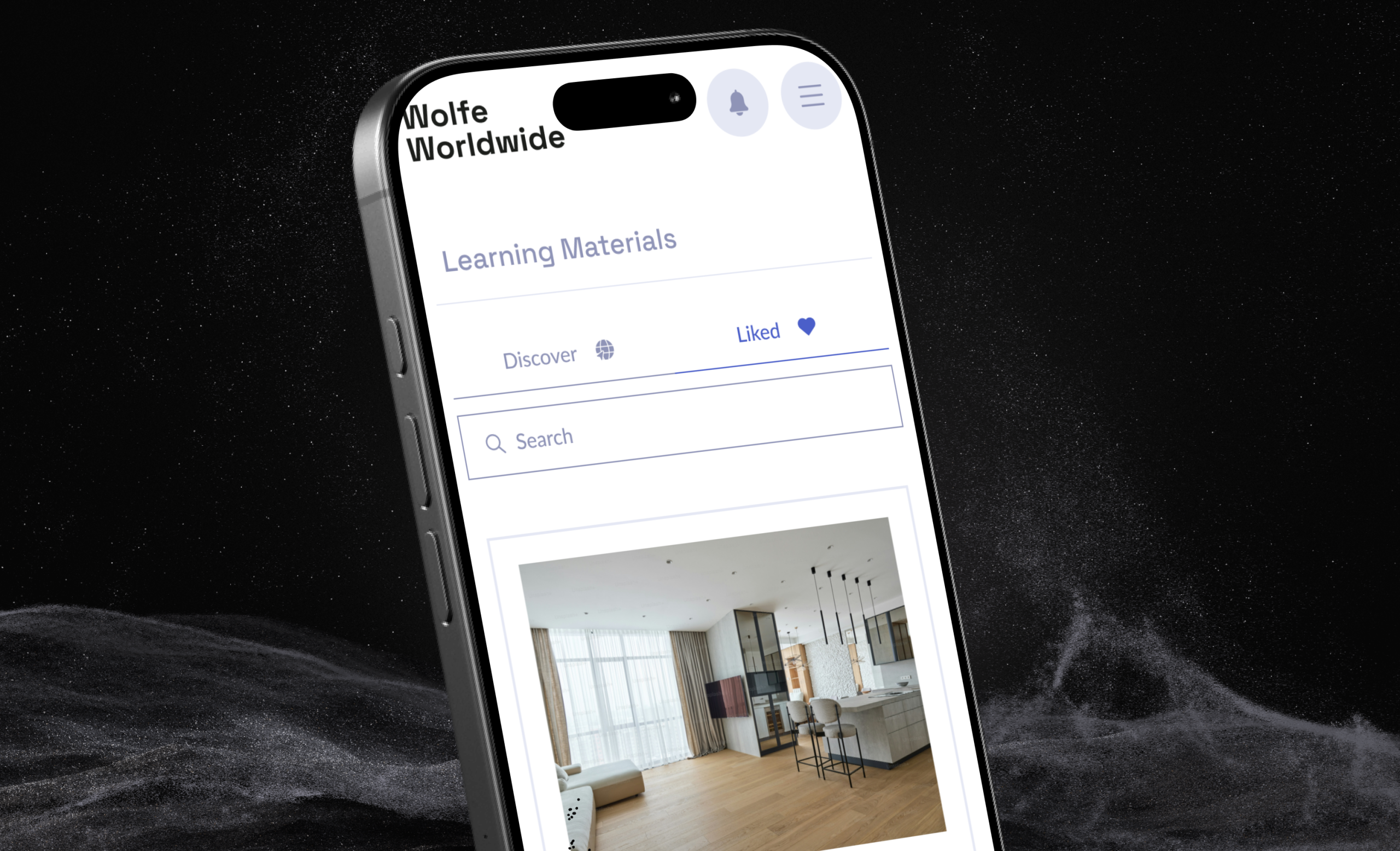

Book an introduction call
During this call we do a quick intro and discuss your project and its specific needs.
Book an introduction call
During this call we do a quick intro and discuss your project and its specific needs.

Book a free consultation with us, so we will frame your product vision and strategy.

We’ve received your request and our team is already reviewing it. We’ll get back to you as soon as possible to discuss how we can help you achieve your goals.
Looking forward to collaborating with you!

We’ve sent the download link to your email. Check your inbox (and spam folder just in case) to access the eBook.
We hope you find it valuable for your Web3 journey. If you have any questions or feedback, feel free to reach out!

We want your Web3 website to be great even if you don't hire us.