
Hyris

  • Custom Product UI/UX Design
  • Mobile Design
  • Branding Development
Hyris

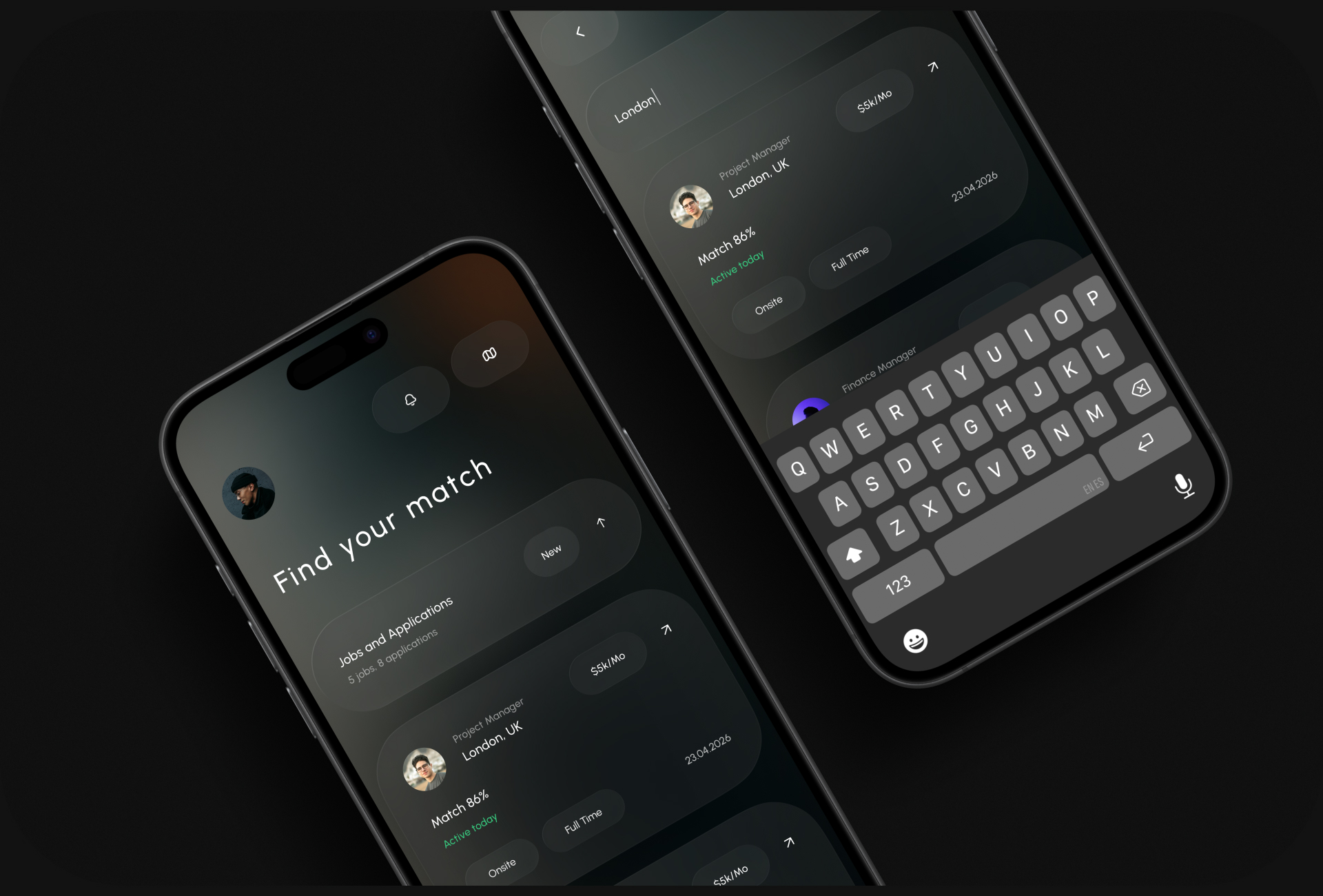
Hyris is an AI-powered hiring platform that helps recruitment teams find the right people faster — turning scattered candidate data into clear, confident hiring decisions.

A visual HR platform combining AI-powered matching, candidate insights, and recruiter workflows into one clear system. Built for modern teams who want to hire with clarity, not chaos.

Title

Task

The task was to design a smarter hiring experience for Hyris — an AI-driven HR platform for recruitment teams. The goal: transform scattered candidate data, match signals, and hiring workflows into a calm visual system that supports confident decision-making.

Title

Challenge

Recruiters drown in disconnected signals — resumes, locations, salary expectations, activity status — with no system to compare candidates or trust a match. Hiring decisions get slower and less confident the more candidates pile up. The challenge was to design an experience that makes AI-powered matching feel transparent and trustworthy, not like a black box.

Results

A complete AI hiring platform across web, mobile, and watch. Match scores, candidate activity signals, and location-based discovery come together in one clear visual system. Recruiters can find, message, and bring in top talent in a fraction of the time — without losing the human judgment that hiring requires.

Screens:
35+
Hours:
70+
Team members:
5+

Project Timeline

  • UX Research

    The research phase focused on how recruitment teams actually evaluate candidates — what signals they trust, where decision fatigue sets in, and what “AI matching” needs to look like to feel credible rather than arbitrary. Key insight: recruiters didn’t need more data, they needed clearer signals.

  • Personas

    We defined key user archetypes — from in-house recruiters managing high candidate volume to hiring managers who need quick, confident comparisons. Each persona had different needs around match transparency, urgency, and depth of detail.

  • Wireframing

    Wireframes focused on structure and flow: a dashboard for active candidates, a map-based discovery view, and a matching system that surfaces percentage scores alongside key signals like salary, location, and activity status.

  • UI Design

    The UI design delivered a full dark-mode system across web and mobile — dashboard, candidate cards, Hire Map, match scoring, and search. Deep dark interface, a warm accent gold (#FDBA74), and a calm visual language built for fast, confident scanning.

  • Strategy

    The strategy centered on one idea: AI hiring intelligence that recruiters can actually trust. Match scores paired with visible signals — not a black-box percentage — so every recommendation feels explainable and actionable.

  • Visual Identity

    The visual system: a refined dark palette of deep black (#18181B), white (#FFFFFF), and signal gold (#FDBA74). Calm, intelligent, and modern — consistent across web, mobile app, watch app, and social touchpoints.

  • Closing

    The final deliverable was a complete hiring intelligence system — dashboard, matching engine UI, candidate discovery, and a responsive product spanning desktop to wrist. A platform that makes hiring decisions feel clear instead of overwhelming.

Research
User Flow
Wireframes
UI Concepts
UI Design
UI kit
Closing

Title

Let`s discuss where you want to get

Taras Oliinyk Photo

Taras Oliinyk

CEO at U1CORE

Book an introduction call

During this call we do a quick intro and discuss your project and its specific needs.

Tell us more about your project

Share your project details with us, and we'll respond promptly.