
- Article
What We Learned from Building Marketplaces for 3 Completely Different Industries in One Year


You’ve been there. You design a component, it looks right, it gets built, and then someone opens it on an Android device in the morning commute and the whole thing falls apart. The tap target is too small, the font is rendering weird, and the navigation pattern that felt intuitive on iOS makes no sense on Android.

Cross-platform design failure is rarely dramatic. It’s death by a thousand small decisions that nobody wrote down.
This checklist is for the product designers who are tired of catching these things in QA instead of preventing them in the design phase. It’s opinionated, it’s specific, and it assumes you’ve already shipped something that didn’t quite work the way you planned.
What does “consistent” actually mean for this product? Not philosophically — practically. Does it mean identical UI across platforms? Does it mean same functionality, different patterns? Does it mean brand consistency only, and everything else adapts?
These aren’t rhetorical questions. Write down the answers. Get your team to sign off on them. You will reference this document in arguments three months from now, and you will be glad it exists.
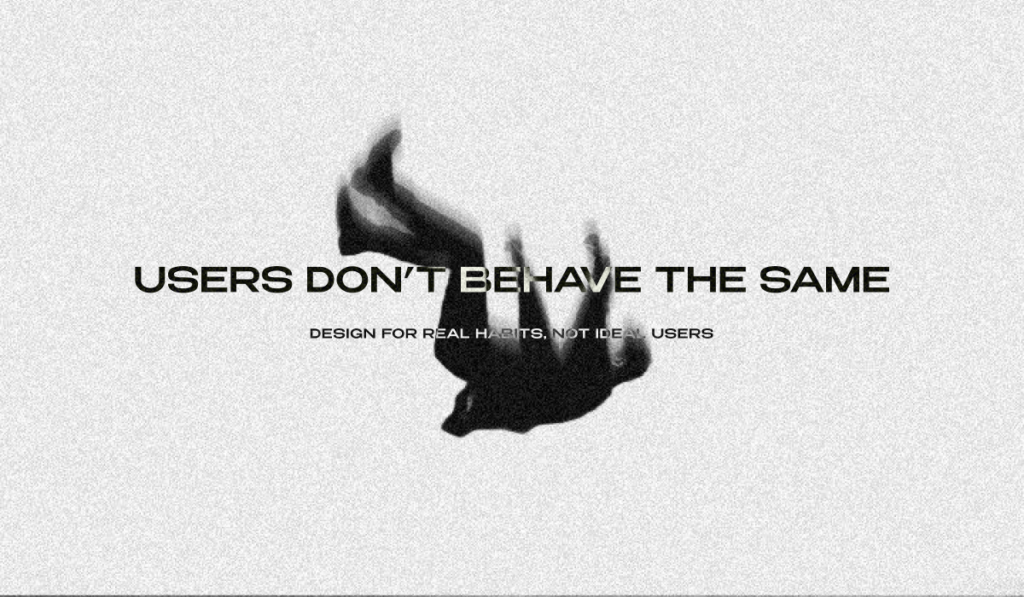
Map the points where your platforms genuinely diverge. Android users have back gestures baked into muscle memory. iOS users expect bottom navigation and swipe-to-dismiss. Web users will try to open links in a new tab, use keyboard shortcuts, and hover over things to preview them before clicking. None of these behaviors exist on mobile. Design for the actual user, not the idealized user who behaves the same way on every surface.
Go through your tokens. Every single one. Your color tokens need to hold up in both light and dark mode, across platform rendering engines, on cheap Android hardware with oversaturated displays and on OLED iPhones that render black as pure black. Test on real devices. A color that looks fine on your calibrated Studio Display can fail on a Samsung mid-range phone under fluorescent office lighting.
Your type scale needs to be built in relative units. Not because it’s best practice — because iOS and Android handle font rendering differently, and if you’ve hardcoded pixel values, you’ll spend a week chasing one-pixel discrepancies that shouldn’t matter but somehow always do.
Your spacing system needs an explicit mobile component standard. The 8-point grid works everywhere, but how you apply it shifts. A minimum tap target of 44x44pt on iOS and 48x48dp on Android is not a guideline you can negotiate around. It’s the minimum viable touch experience. Go below it and you’re just making things worse for your users and generating accessibility issues at the same time.
Your component library needs to document platform variants explicitly and separately. Not “here’s the button component, it works everywhere.” Here’s the iOS button. Here’s the Android button. Here’s the web button. Here’s what they have in common and here’s where they differ, and here’s the reasoning behind every decision. That documentation is going to save a designer six months from now from making a choice that unwraps everything you built.

Users don’t interact with your design system. They interact with their phone. And their phone has years of learned behavior baked into it.
On iOS, follow the Human Interface Guidelines like they’re requirements, not suggestions. Bottom tabs for primary navigation. Modals that come from the bottom. System font scaling that works with accessibility settings. Swipe-from-left-edge for back navigation that doesn’t conflict with your custom gestures. Apple has trained hundreds of millions of users to expect these patterns. When your app breaks them, users don’t think “this app has a unique navigation philosophy.” They think the app is broken.
On Android, Material Design 3 has more room for expressiveness than most teams use. The dynamic color system alone can make your product feel genuinely native to each device. Android users can tell when they’re using an app that was designed for iOS first and ported second. The tells are subtle — the navigation patterns, the way dialogs are positioned, the back button behavior — but they add up into a product that feels like it doesn’t quite belong on their phone.

On web, you have fundamentally different interaction affordances and you need to use them. Hover states aren’t a nice-to-have. Keyboard navigation is a real use case, not an edge case. Your information density can be higher because the viewport is larger and the user has a pointer device with precision. Responsive doesn’t mean taking your mobile layout and scaling it up. It means rethinking information hierarchy for each breakpoint.
Every primary user flow needs to be explicitly designed at five breakpoints: 375px, 768px, 1024px, 1280px, and 1440px. Not comped at 375px and 1440px and assumed to work in between. Designed. With specific decisions documented for each step in between.
Dynamic content needs overflow rules before a single line of code is written. What happens to a username at 40 characters? What happens to a product card when the price has six digits? What happens to a data table on a 375px screen? These questions need answers from the design team, not workarounds from the engineering team.
Every image needs defined behavior at every breakpoint. Not scaling — explicit behavior. Does it crop to a new aspect ratio? Does it reflow to sit above the text instead of beside it? Does it collapse entirely below a certain breakpoint? Undefined responsive behavior is design debt that compounds until it breaks in production in a way that embarrasses everyone.
Every interactive element needs a visible focus state. If your focus states look ugly, that’s a design problem to solve, not a reason to hide them. Invisible focus states break keyboard navigation for everyone who relies on it, and they’re an accessibility failure on every platform simultaneously.
Color cannot be the only way you communicate information. An error state that communicates error through red alone will fail for users with color vision deficiency, fail on certain display types, and fail in high-brightness outdoor environments. Pair color with iconography. Pair it with text. Make the information survive without the color.
Screen reader behavior needs to be tested on the actual tools your users use. VoiceOver on iOS. TalkBack on Android. NVDA on Windows. These tools do not behave identically, and your semantic structure needs to hold up across all of them. Find someone who uses a screen reader daily and watch them use your product. Nothing in your QA checklist will teach you more than that thirty minutes.
Every screen needs a defined loading state that isn’t a spinner. Skeleton screens reduce perceived wait time and maintain layout stability during load. Spinners just make users watch a circle and wonder if something went wrong. This is not a new insight. Teams still ship spinners everywhere.
Every flow needs a defined empty state. First-time user, no data, fresh install. Most products show a blank screen with a small gray label that says “No items yet.” This is a missed opportunity every single time. Empty states are where you set tone, reduce anxiety, and guide the user toward the action that will make the product valuable for them.
Every error state needs to give the user somewhere to go. Not just a message explaining what went wrong. A path forward. This is harder to design than it sounds, which is probably why most error states are still just red text and a dismiss button.
Have you tested every primary flow on a real iOS device, a real Android device, and at least two browser contexts? Not a simulator. A real device.
Have you documented every component variant that differs across platforms, with the reasoning written down?
Have you defined loading states, empty states, and error states for every screen?
Have you run a contrast check on your color usage in both light and dark mode?
Have you tested with a screen reader?
Have you pressure-tested your layouts with real content — long names, long text, missing images, slow connections?
If the answer to any of these is no, that’s not a checklist failure. That’s a conversation to have with your team about where these things belong in your process so they don’t get caught in QA, or worse, in a user’s hands.
Cross-platform design done well is invisible. Users don’t notice it. They just feel like the product works. That invisibility is the goal. This checklist is how you get there.

During this call we do a quick intro and discuss your project and its specific needs.
During this call we do a quick intro and discuss your project and its specific needs.

Book a free consultation with us, so we will frame your product vision and strategy.

We’ve received your request and our team is already reviewing it. We’ll get back to you as soon as possible to discuss how we can help you achieve your goals.
Looking forward to collaborating with you!

We’ve sent the download link to your email. Check your inbox (and spam folder just in case) to access the eBook.
We hope you find it valuable for your Web3 journey. If you have any questions or feedback, feel free to reach out!